
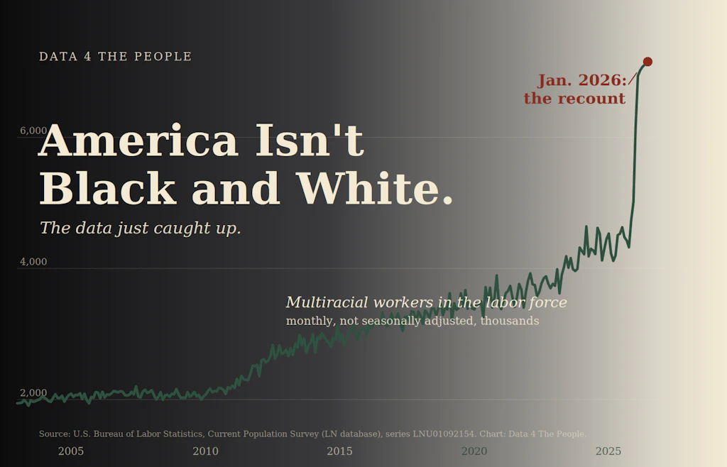
America Isn't Black and White
A quiet data update just redrew the country, less White-alone, less Black-alone, more mixed than we were counting.

Eric Pachman
Published
July 8th 2026
America isn’t Black and White. The Data Just Caught Up.
Yesterday, we handed you the keys to the labor data kingdom. We published our case for looking past the unemployment rate, and at the end we gave you our CPS Monthly Explorer, every labor series the government publishes, back to the 1970s, one official number per view. Pick a dimension, pick a group, watch the trend. Our closing line was a challenge: go find the cut nobody's talking about.
So we took our own challenge. We started clicking through the Explorer ourselves, watching series after series, looking for the cut that would stop us.
It did not take long. And the first thing that stopped us was not the story we went looking for.
One of the first cuts we pulled up was a familiar one: the number of White workers in the labor force, going back to 1954. It climbs for seventy years, dips for COVID, climbs back. Ordinary. Until the last few months, where the line drops off a cliff.
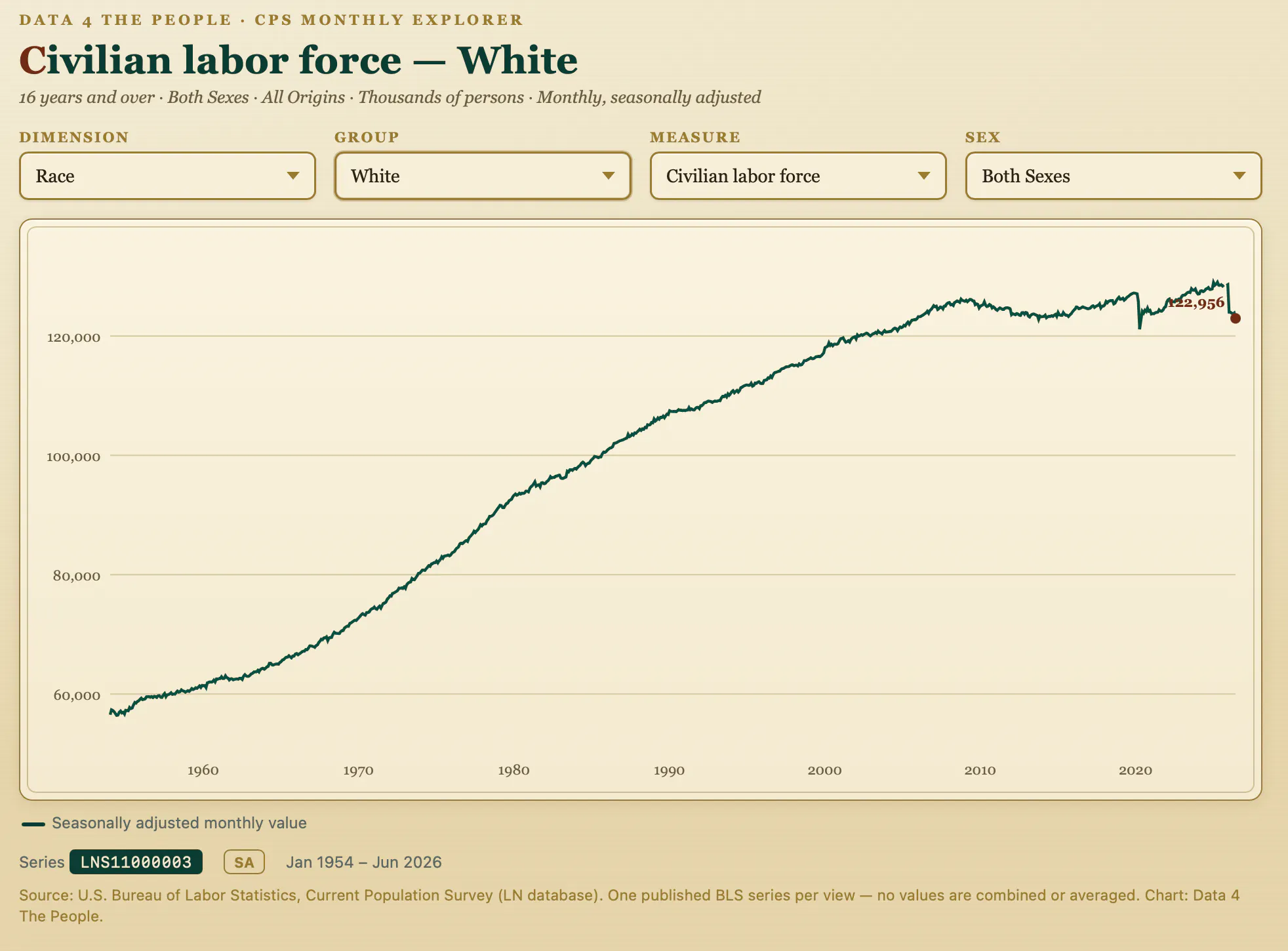
Not a dip. A near-vertical fall of more than four million people in a single month. The kind of drop we had only ever seen once before, in the spring of 2020, when the economy shut down. But nothing shut down this time. No recession. No crisis. Just a number that fell straight through the floor between December and January.
The clue was hiding in a footnote
The answer was not in the number. It was in a single character sitting next to it.
Every value the government publishes can carry a footnote code. Most months, there is nothing there. But the January 2026 value carried the code "12."
Footnote 12 means "population control break." Once a year, with the January data, the Bureau of Labor Statistics updates its estimate of how many people live in the country and who they are. It does not change the survey. It changes the weights the survey is measured against. When those weights move a lot in one year, the published numbers step up or down in a single month, not because anyone's life changed, but because the count of who is out there got an update.
That is what fell off our cliff. Not four million workers. A four million person correction to the government's picture of the population.
So where did the White workers go?
What the correction actually did
The 2026 update did not just shrink one number. It re-cut the whole population by race. And it did not move in one direction. Some groups were revised down. Others were revised up. We pulled all of them.
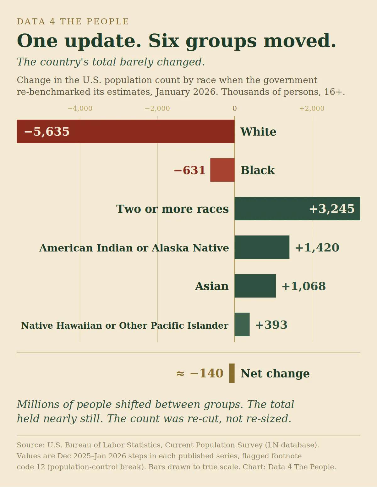
Two groups down. Four groups up. And here is the number that reframes all of it: added together, these changes very nearly cancel out. The total population barely moved. The government did not decide there were suddenly millions more or fewer people in America. It decided that the people already here were a different mix than its old estimates assumed.
Why the mix changed
The Bureau told us why, in plain language, in its own documentation of the update.
The new population estimates draw on updated census information about race. And what that information showed, in the Bureau's own words, is that the population is "much more multiracial than was measured in the past." The old weights undercounted people who identify with more than one race. The new weights fix that.
You can see the scale of that correction most clearly in the group it affected most.
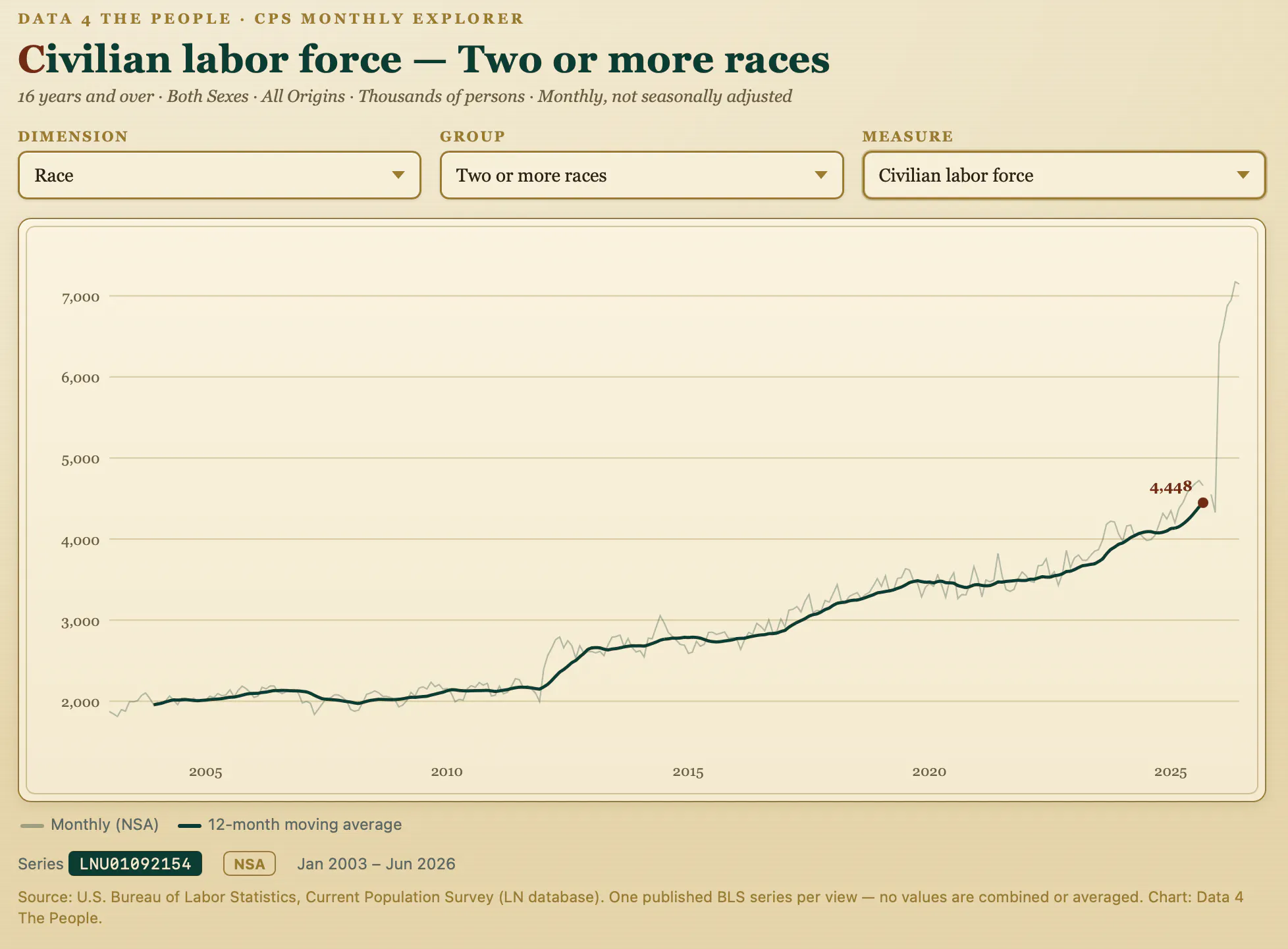
Why did this happen at the start of 2026? Because the 2020 Census changed how it asks about race, capturing people who identify with more than one group far better than the old method did, and its early findings showed there were many more of them than the previous counts assumed. This 2026 update is the first time those findings fully worked their way into the monthly numbers, so the correction fell hardest exactly where the old method had been most wrong.
In summary, it’s not that America became more multiracial in one month. It is that under this new method, fewer people are counted as White or Black alone, and more as multiracial, Asian, or Native. Same country. A more accurate picture of who lives in it.
A closing note
What follows steps beyond the data. It is my personal reflection, not a finding, and I want to be clear about which is which.
I spend my days in the numbers, but I have this terrible habit of reading the news on my phone like nearly everybody else. And the story the phone tells about race in America is one of hardening lines, sorting, sides, tension that seems to climb by the week.
Then I sit with data like this, and it points somewhere else. Quietly, without a headline, the most accurate count the government can produce says the country is less divisible into single racial boxes than it was a year ago on paper, and more full of people who blur the lines of the checkboxes we have long used to categorize Americans. The measurement caught up to a nation that has been blending for a long time.
I cannot prove from these numbers that people are coming together. The data does not reach that far, and I will not pretend it does. What I can say is narrower but, to me, still worth something: when the official portrait of America was redrawn this year, it was redrawn toward the multiracial and the mixed. In a moment that feels like America is pulling apart, the data moved the other way.
That gives me hope. Make of it what you will.
Source: U.S. Bureau of Labor Statistics, Current Population Survey (LN database), civilian labor force and civilian noninstitutional population series, not seasonally adjusted where noted. The January 2026 values carry footnote code 12, indicating a population control break. Figures in this piece are the December-2025-to-January-2026 month-over-month steps in the published series and are rounded. The Bureau's own description of the adjustment, including the official race and age figures and the "more multiracial" finding, is published in "Adjustments to Household Survey Population Estimates in January 2026." We reconstructed the adjustment independently from the raw series and reached the same conclusion the Bureau did: every racial group moved in the same direction it reports, and our largest figure, the White population revision, matched the Bureau's within a fraction of a percent. Our totals differ slightly from the Bureau's published adjustment because we measure the month-over-month change in the released series while the Bureau isolates the control effect on a fixed December base.
Three limits worth stating: these series show category totals, not individual people, so we cannot and do not claim specific people were reclassified from one race to another. The total-population effect of the update was small; the story is redistribution across groups, not net growth or loss. And the closing reflection is explicitly labeled as the author's personal view, not a claim the data supports; the re-benchmark is a measurement correction and cannot by itself show social change in how people live or identify.
Support Data That Serves the Public
Data should empower people, not just institutions. Your support helps us create accessible research, visualizations, and tools that uncover economic inequality and inform better decisions.
Donate
Enjoying this post?
Tell others about it.
More articles like this
Fetching Related Posts
There are no other articles tagged with Data 4 Thought