

We built the labor-market tool that didn't exist
80 years of official data, one series at a time. Free, and yours to break.

Moving Beyond the Unemployment Rate
For almost a century, one number has run the show. The unemployment rate was built in the 1930s, and it became the gold standard for how we talk about jobs and how the Federal Reserve sets policy. It used to be a good number. But the labor market has changed, and the rate is increasingly misleading, flashing green while alarm bells ring elsewhere. It answers one narrow question: of the people actively looking for work, how many can't find it? That mattered more when almost everyone who wasn't working was out looking. It tells us less and less as that stops being true.
Consider the people the rate can't see: the person who gave up looking last month, the retiree, the caregiver, the student, the prime-age (25-54 years old) worker who quietly left the labor force. The headline number drops them all into a single bucket and moves on. But the government doesn't. It publishes an enormous amount of data on exactly those people, sliced dozens of ways, going back decades. That fuller picture has been sitting there the whole time. The only catch is that it's locked inside a database that is genuinely hard to navigate.
So we built the tool to unlock it.
What it is
The CPS Monthly Explorer opens up the Bureau of Labor Statistics' Current Population Survey and lets anyone chart it. Pick a dimension, a group, and a measure, and you get the full monthly history, as far back as the government has published it. Age. Sex. Nativity. Veteran status. Education. Cuts that usually take a data analyst an afternoon now take three clicks.
One rule governs the whole thing: every chart is a single, official BLS series. Nothing is summed, averaged, estimated, or modeled. The exact series number sits under each view, so you can take it straight to bls.gov and check our work. A tool for exploring government data is only worth something if you can trust that what it shows you is really what the government published. This isn't about replacing the unemployment rate. It's about putting it in context, and letting people ask questions the headline number was never built to answer.
People working two jobs to make ends meet
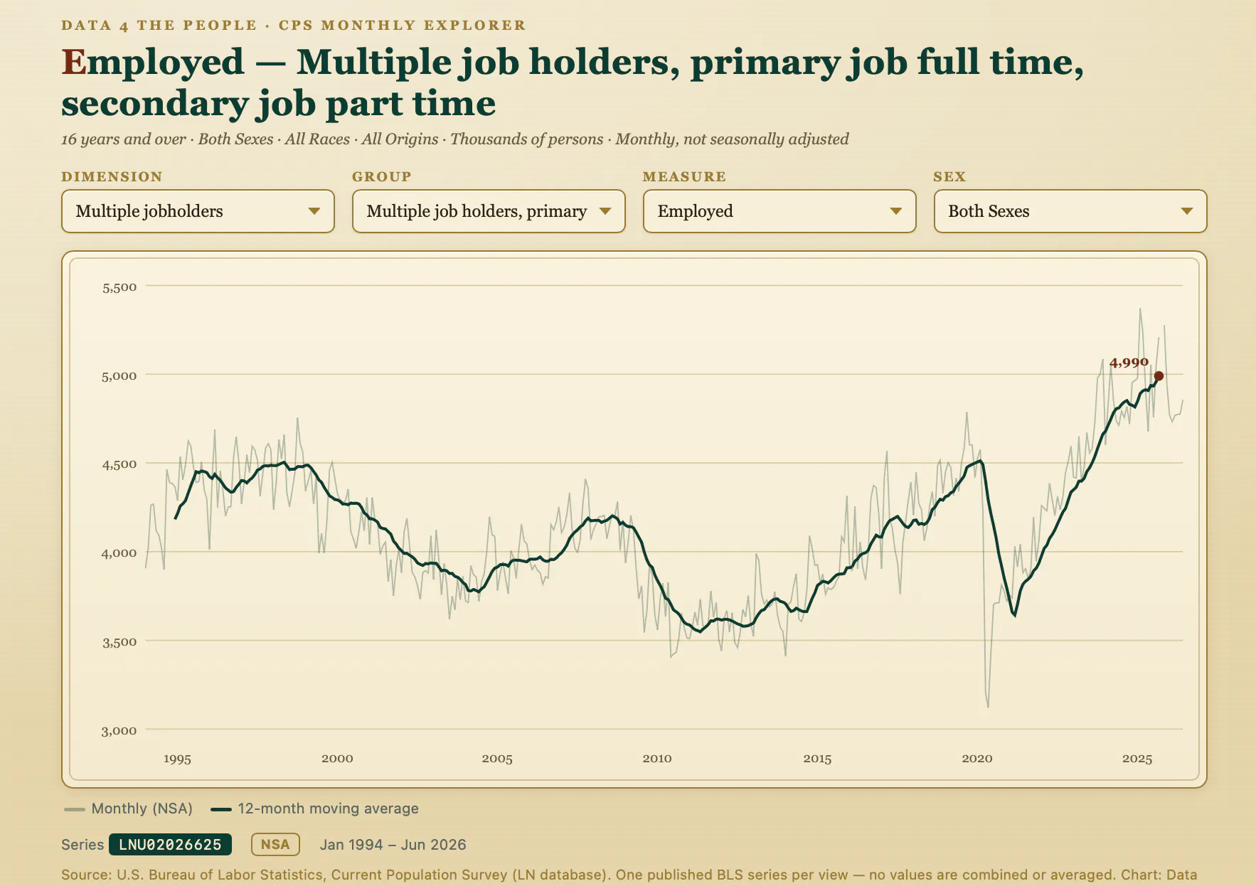
Here is a chart we had never seen before yesterday morning. It shows people working two jobs at once, a full-time primary and a part-time second, going back three decades. Nearly 5 million Americans are pulling that double shift today, on a trailing 12-month basis, more than 700,000 above the peak of the 2008 to 2009 recession.
The decline of foreign-born men in the labor force
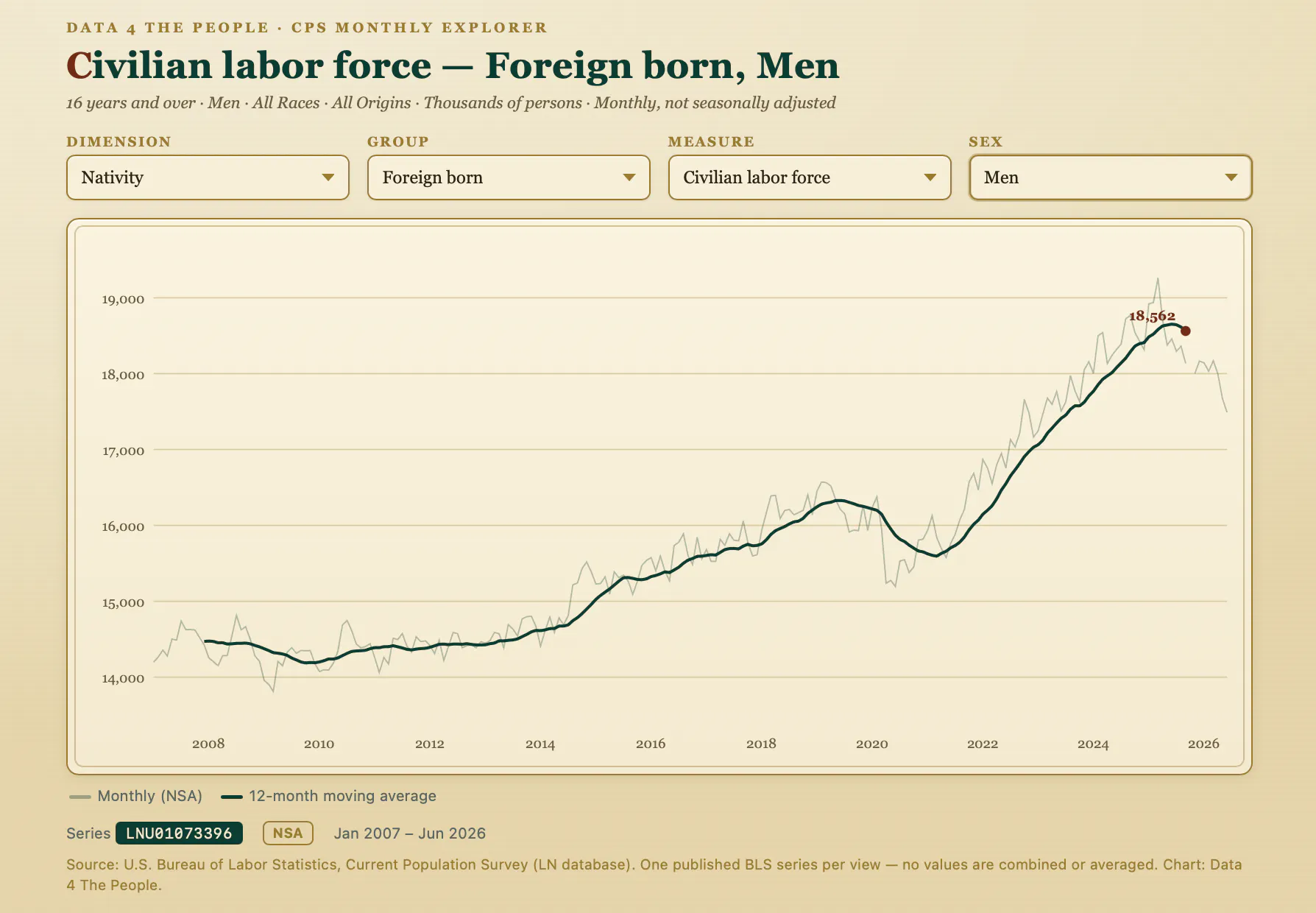
Here is another, on a subject we have covered before: the foreign-born male labor force. It climbed steadily for more than a decade, from about 14 million in 2010 to a peak above 19 million in 2025. Then it turned. The smoothed trend has rolled over and the most recent monthly readings drop sharply, the steepest decline outside the early pandemic. It is too soon to call the bottom, but the direction is unmistakable, and the timing lines up with this year's tighter immigration enforcement.
It's not done, and we need you
This tool is powerful, but it is not yet perfect. The CPS database is a maze of around thirty dimensions, and the data is not published at every intersection. Veterans are counted from age 18, not 16. Education breakdowns start at 25. Some series are seasonally adjusted and some aren't. Some cuts that look like they should exist don't, and some are easy to pair incorrectly. We have already found and fixed several bugs of exactly that kind, each caught because someone looked closely and said "that doesn't add up."
That's the help we're asking for. We want this tool at 99% accuracy (our own testing puts it above 95% right now), and the fastest way there is a community kicking the tires. Pull up a slice you know well. Check whether men and women add up to the total. Compare a number against the official BLS table. If something looks wrong, tell us the series ID and what you expected. We'll fix it and credit the catch. This is public data. It should be checked in the open, by the people who use it.
Try it
Start with what the unemployment rate hides: set the dimension to age, choose 65 and over, then set the measure to "not in labor force.” Then look at other age groups. Start there and see where the data takes you.
Found a bug, a surprising trend, or a story hiding in a slice? We want to hear about it.
The CPS Monthly Explorer draws entirely on the U.S. Bureau of Labor Statistics' Current Population Survey (LN database). Every view is one published BLS series; no values are combined, averaged, or modeled. Built by Data 4 The People. Full methodology.
Enjoying this post?
Tell others about it.
More articles like this
Fetching Related Posts
There are no other articles tagged with Data 4 Thought