
US Fertility Rate by County, 1982-2024
An interactive map of birth rate trends in every American county, and the sources behind it.

Eric Pachman
Published
September 1st 2026
The American fertility rate has fallen from 67.3 births per 1,000 women aged 15 to 44 in 1982 to 53.5 in 2024, its lowest level on record. But that national figure hides the thing worth seeing: the decline is not evenly spread, and for most of those years it was barely happening at all.
This map shows the birth rate in every US county, every year from 1982 to 2024. Press play to run the series, switch between the level and the change since 1982, or zoom to a single state.
What the map shows
The measure is the general fertility rate: live births per 1,000 women aged 15 to 44 living in the county. It already accounts for how many women of childbearing age live in a place, which is what makes a county of 3,000 people comparable with Los Angeles.
Two views are available. Change since 1982 compares each county with its own 1982-84 baseline, so color means how far that place has moved rather than where it stands - red is decline, blue is increase. Fertility rate shows the level instead, on one scale, so counties can be compared with each other.
Rates are three-year pooled averages. Without that, a county with forty births a year swings wildly on chance alone and the map flickers rather than showing a trend.
Three birth rate trends worth knowing
The decline is recent. The national rate went essentially nowhere for twenty-five years - 67.3 in 1982, a peak of 70.8 in 1990, a trough of 63.7 in 1998, back to 69.1 by 2007. Roughly 96% of the net fall has come since 2007.
Rural and urban America traded places twice. In 1982 rural counties had a fertility rate 8.2 points higher than metropolitan ones. That gap closed, inverted by 1987, bottomed in 1994, and has since reopened the other way to 6.6 points. Anyone treating "rural" and "urban" as fixed positions is describing a snapshot, not a trend.
The typical county barely moved. The median county's fertility rate fell about 9%, while the population-weighted national rate fell over 20%, and 27% of counties are higher now than in the early 1980s. The decline is concentrated in populous places - which is exactly what a national average cannot show you and a map can.
Frequently asked questions
What is the current US fertility rate?
In 2024 the general fertility rate was 53.5 births per 1,000 women aged 15 to 44, the lowest in the recorded series. The total fertility rate - the number of children a woman would bear across her lifetime at current rates - was about 1.60, well below the 2.1 needed for a generation to replace itself.
Is the US birth rate declining?
Yes, but recently rather than steadily. The rate was flat on net from 1982 to 2007 and has fallen roughly 23% since. Framing it as a long slow decline misses that it is a sharp, recent break.
What is the difference between the birth rate and the fertility rate?
The crude birth rate counts births per 1,000 people, so it moves when a population's age structure changes. The general fertility rate counts births per 1,000 women aged 15 to 44, which removes that distortion and is the measure used here.
Which counties have the highest and lowest fertility rates?
The highest are concentrated in the rural Great Plains, parts of Utah and Idaho, and counties with large Amish or Hispanic populations. The lowest cluster in Appalachia, northern New England and dense urban cores. The map's level view shows the full distribution.
Where does the county birth rate data come from?
Births come from NCHS natality microdata for 1982-1990 and Census Population Estimates for 1991-2024; the population denominators come from SEER. The method section below covers how they fit together.
The problem this map had to solve
Public US birth data has a hard geographic floor. NCHS removes all geography from natality microdata after 2004, and CDC WONDER - the standard public interface to vital statistics - identifies only counties with 100,000 people or more, pooling everything smaller into an unnamed remainder for each state.
Built the obvious way, a county fertility map leaves roughly 2,500 of 3,100 counties blank. That is most of rural America, and it makes the map useless for exactly the questions people want to ask of it.
Two sources, spliced
1982-1990 - NCHS natality microdata. Before 1989 the public natality files named the county of residence on every birth record. These are the raw records, one row per birth. With the pre-1985 record weight applied and foreign residents excluded as NCHS does, every year reproduces its published national birth total exactly.
1991-2024 - Census Population Estimates. The Census Bureau publishes an annual birth count for every county as an input to its population estimates. Same vital records, not suppressed, because they are an ingredient rather than a release.
Denominators - SEER county population. County population by age and sex, 1969 to 2024, gives the number of women aged 15 to 44 in each county each year.
Where both birth sources overlap - 1995, 1998 and 2001, the years where each names the same 457 large counties - the median county-level difference is about 1%, and its sign tracks the direction of the national trend in each year. That is the signature of the Census series counting July-to-June years rather than calendar years, not a disagreement about what is counted.
Geography held constant
Counties change. Broomfield County, Colorado was created in 2001 out of four others; Dade County became Miami-Dade in 1997; Connecticut replaced its counties with planning regions; Alaska reorganizes boroughs continually.
A map that ignores this shows boundary changes as fertility changes. So every county is mapped to a stable analysis unit, identical in all 43 years - 3,098 of them. Alaska, Connecticut and Hawaii are held as single statewide units, and Broomfield is merged with the four counties it came from, because the sources cannot be reconciled below that level. The same set of units appears in every year of the series.
Where numbers are estimated
Two places, both flagged in the underlying data.
1989 and 1990 are partly modeled. Public microdata for these years names only counties of 100,000 or more - about 73% of births, recorded exactly. State totals are complete, so each state's remaining births are distributed across its smaller counties in proportion to what they recorded in 1988 and 1991. State and national totals come out exact; only the split among small counties is estimated, and those cells are flagged in the data.
Backtested against 1986, where every county is known, the method has no directional tilt - the mean signed error is +0.8% - but its accuracy depends heavily on county size. Half of small counties land within 5%, three quarters within 10%, nine in ten within 16%, and the error scales cleanly with how many births there are to place:
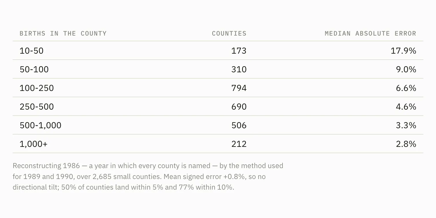
Reconstructing 1986 - a year in which every county is named - by the method used for 1989 and 1990, over 2,685 small counties. The error scales with how many births there are to place.
So a modeled 1989 value is reliable for a mid-sized county and only indicative for a very small one. Because the map shows a three-year pooled rate, 1988 and 1991 also draw a third of their window from modeled years, and the year readout says so. The backtest is reproducible: PYTHONPATH=src .venv/bin/python tests/backtest_allocation.py.
2024 is provisional. A Census vintage's final estimate year is produced before NCHS natality for that year is final, so its county births are partly carried forward rather than counted: in vintage 2024, 263 counties repeat their 2023 figure exactly and 41% move by less than 1%, against roughly 10% in a settled year. A handful move implausibly far in the other direction - Houston County, Minnesota falls 80%, Dewey County, South Dakota doubles. The national total is sound, landing within 0.3% of what SEER's age structure and the NCHS rate schedule imply, but the split between counties will change when the year is revised. Every 2024 cell is labeled provisional.
2000 and 2010 are absent. Every vintage of the Census estimates reports a partial quarter in its launch year, so no published county file covers these two estimate years. They were originally interpolated from the years either side, but an interpolated year carries no information - it is a deterministic function of its neighbors - so it is left out instead. The series runs 1982 to 2024 with those two years missing. The years on either side of a gap, and the first and last in the series, pool over two years rather than three, so they carry slightly more sampling noise than the rest.
A further 59 county-years - 0.05% of the panel - are flagged as isolated anomalies in the source data, Hurricane Katrina in Orleans and St Bernard Parish among them. These are flagged rather than smoothed away, because they are real events; hovering a flagged county says so.
Comparing these rates with published ones
The rates here are built on SEER's intercensal county populations, which were revised after each decennial census. Rates published during the 1990s used postcensal estimates made before the 2000 census revealed how far they had drifted: for 1999 the contemporaneous denominator was about 2.3% below the revised one. So this series reads roughly 2 to 3% lower than a 1990s publication for the same year, and the gap is the denominator revision rather than a disagreement about births.
Against current publications the two line up closely. For 2023, NCHS puts the lowest state at 42.1 (Vermont) and the highest at 65.6 (South Dakota); this panel gives 42.3 and 65.6, and names the same two states. Across twelve states in 2024 the median difference from the NCHS figures is 0.7%, the largest 2.1%, with the residual mostly the July-June estimate year. In the microdata era the national rate matches the published one to the decimal in every year from 1985 to 1990.
What this measure does not capture
The general fertility rate accounts for how many women of childbearing age live in a county, but not their age distribution within 15 to 44 - a county whose women skew older posts a lower rate with identical behavior.
Nor does it know which resident women are settled there. A county built around a university carries thousands of students in its 15-44 denominator who bear few children while enrolled, so its rate reads far below any plausible level: Tompkins County, New York, Hampshire County, Massachusetts and Watauga County, North Carolina all sit under 25 births per 1,000 for this reason. Age standardization does not fix it, because the distortion is in who is counted rather than how old they are.
It is also a period measure. It counts births in a calendar year, so it cannot by itself distinguish between people having fewer children and people having them later.
The code behind this map
Everything used to build this - the data pipeline, the validation suite, the map itself - is open and on GitHub:
github.com/Data4ThePeople/BirthRate
The repository holds the full pipeline: the readers that parse NCHS natality microdata and Census components of change, the crosswalk that holds 3,098 county units stable across 43 years, the fertility measures, and the code that renders this map.
The raw source files run to about 1.4GB and are not committed, but src/birthrate/fetch.py downloads every one of them from the original government sources, so the whole analysis rebuilds from scratch with four commands. The README covers the method in more detail than this page does.
There is also a test suite, tests/validate.py, that runs 18 checks on the finished panel: national totals against published NCHS figures, geographic stability across every year, the two source series against each other where they overlap, and the places where numbers are estimated rather than observed. It passes, and if it ever stops passing the map is wrong.
If you find a mistake, open an issue. Numbers this specific should be checkable, and that is the point of publishing the code alongside them.
Sources
- US Census Bureau, Population Estimates Program - county components of change, vintages 1999, 2009, 2020 and 2024
- NCHS natality detail files, 1982-1990, via the National Bureau of Economic Research
- National Cancer Institute SEER - US county population data by age, sex and race, 1969-2024
- NCHS via data.cdc.gov - birth rates for females by age group, and DQS birth and fertility rates
- USDA Economic Research Service - Rural-Urban Continuum Codes and county typology codes
Every figure has been reconciled with its source: all 51 state series and all 133,214 county-year cells tie back to the underlying panel, and national totals match published NCHS figures.
Support Data That Serves the Public
Data should empower people, not just institutions. Your support helps us create accessible research, visualizations, and tools that uncover economic inequality and inform better decisions.
Donate
Enjoying this post?
Tell others about it.
More articles like this
Fetching Related Posts
There are no other articles tagged with Visualization