

The wages BLS used to hide, now uncovered
The latest BLS occupation wage data reveals a curve shaped like El Capitan.

Eric Pachman
Published
May 27th 2026
The Shape of American Pay
A couple weeks ago, the BLS updated its Occupational Employment and Wage Statistics database with May 2025 wages. We only get this update once a year, and it covers just that single month - May. But oh boy, what a database this is. It offers a snapshot of not only what different occupations earn in America, but it divvies that up by geography (down to the Metropolitan Statistical Area) and by income percentile.
That's right - we get the 10th, 25th, 50th (median), 75th, and 90th percentile pay for more than 800 occupations. Data 4 The People has already used OEWS data as the engine for two of its visualizations: The Single Income Stress Test and Visualizing Wage Dispersion and Occupational Pay Inequality.
But there has always been one "feature" of this database that annoyed me. OEWS hid percentile wages above ~$240k per year, replacing them with a "#."
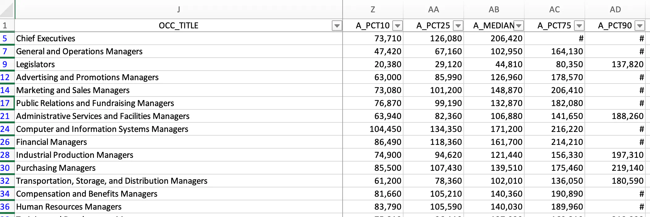
Source: BLS OEWS
See what I mean? Annoying. Why not show these wages? The PEOPLE want to know!
So imagine my surprise when I opened the May 2025 data and - for the national U.S. figures - those pesky "#s" were gone. In their place were real numbers, the kind that let me build wild charts like this one:
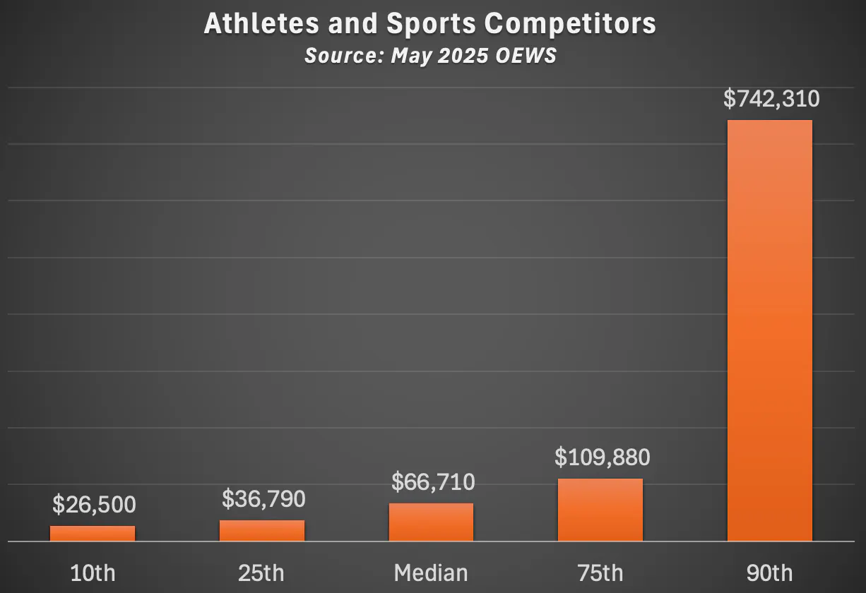
Source: BLS OEWS
There's a whole world of visualization possibilities buried in this database. But that's for another day. For today, I have one chart to share that really hammers home wage inequality in America.
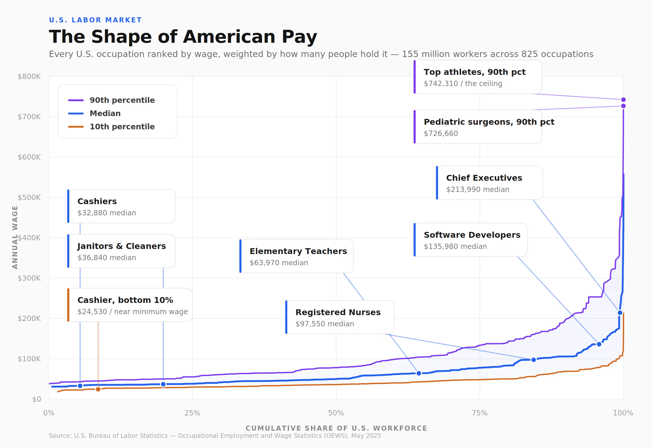
Three series: 10th percentile wages, median wages, and 90th percentile wages. Cumulative share of employees on the x-axis, annual wages on the y-axis.
What jumps out is how late the chart gets interesting. For roughly the first 80% of the workforce, all three lines crawl along the valley floor, barely separating. It's only in the final stretch - the last fifth of workers - that wages break upward, the 90th-percentile line rearing up into a sheer wall, the wage distribution's own El Capitan.
And that wall was always there. What's new is that we can finally see the top of it. For years, OEWS showed us the climb and then cut us off partway up, hiding the summit behind a "#." Not anymore.
Support Data That Serves the Public
Data should empower people, not just institutions. Your support helps us create accessible research, visualizations, and tools that uncover economic inequality and inform better decisions.
Donate
Enjoying this post?
Tell others about it.
More articles like this
Fetching Related Posts
There are no other articles tagged with Data 4 Thought