
Sometimes you don't need new data. Just a new angle.
How taking something you can find anywhere, and turning it a few degrees, made the story finally visible.

Yesterday I showed you three charts. Today I hand them over to you.
Yesterday's piece leaned on three inventory charts (crude, gasoline, distillate) to argue that something unusual is happening beneath the noise of the oil market. Today I'm giving you those charts to explore yourself. Pick a product, hover over any year, and find this year's line in the tangle of the last four decades.
Click here for methodology.
But before you go play with it, I want to be honest about what this is, and what it isn't.
None of the data here is new. Not one number. It all comes straight from the U.S. Energy Information Administration: free, public, updated weekly. Bloomberg has it. Half the energy desks on Wall Street have it on a screen right now. If you want a chart of U.S. crude inventories over time, the EIA will hand it to you in about four clicks.
So I'm not claiming I found something nobody else has. I didn't.
What I did was smaller than that. And I've come to believe that "smaller than that" is where a lot of the value actually lives.
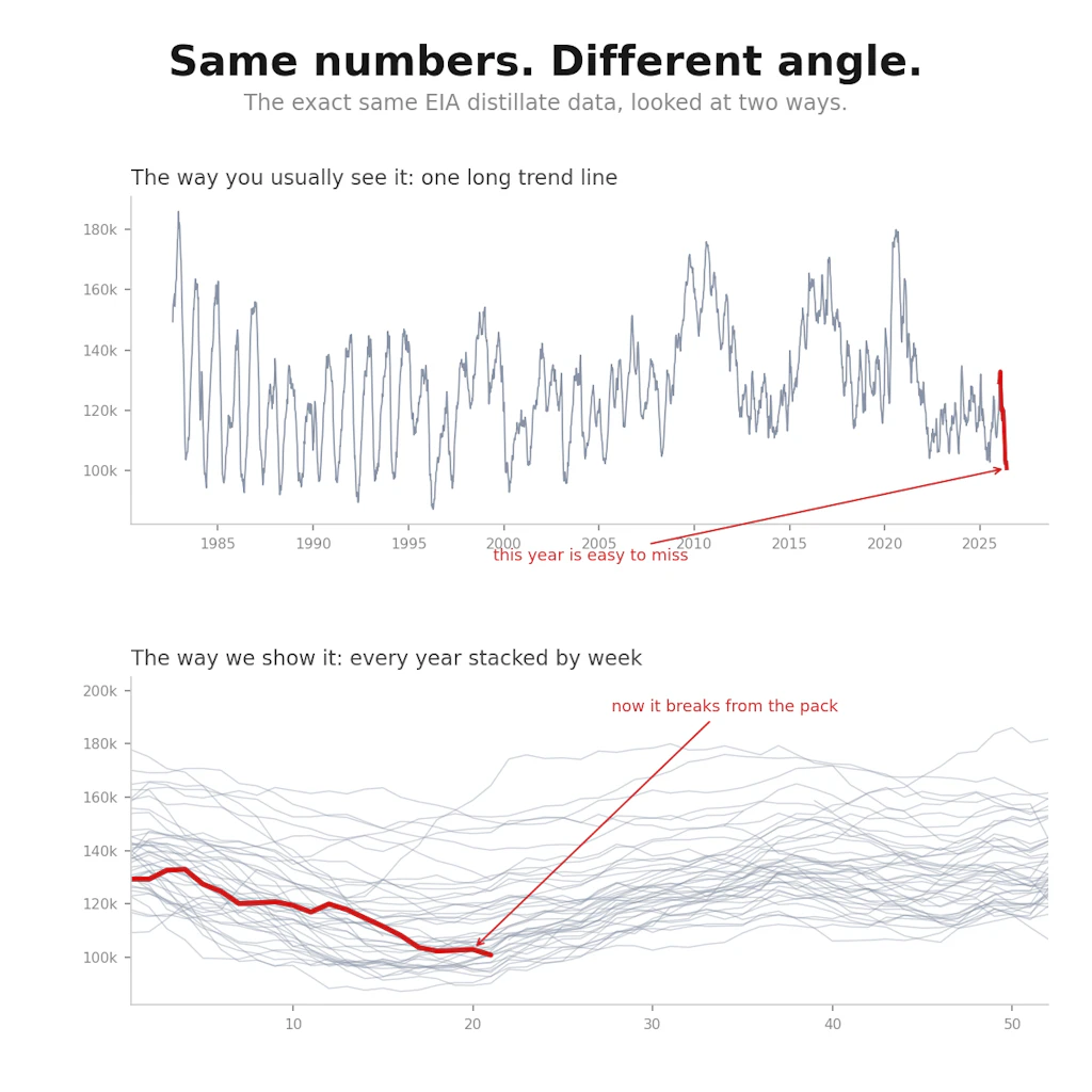
Here's the whole trick. The EIA gives you inventories as a long trend line, decades marching left to right, this year tacked onto the end. It's accurate, and it's nearly impossible to feel anything from. The current moment is just the rightmost pixel on a forty-year line.
So I did one boring thing. I cut the timeline into years and stacked them, by week. January to December, every year its own line, all laid over one another. That's the entire innovation, if you can even call it that.
And suddenly the same data said something completely different. Stacked that way, you can see the rhythm: the seasonal breathing of inventories, building and drawing in the same pattern year after year. Once you can see the normal, this year's line stops being a pixel and becomes a character. You watch it break from the pack. You see, instantly, that its slope looks like no year before it.
Then I did one more small thing. I let you hover. Pull up any single year and trace it. Find the one grey line dragging along the bottom and discover it's 1996.
For me, that was the moment the data turned into a story. Not because I'd uncovered a secret, but because I'd changed the angle. The information was in plain sight the whole time. It just needed to be turned a few degrees to go from "a number you'd scroll past" to "wait, what is happening this year?"
I'm telling you this because it cuts against the instinct most of us have, that to earn someone's attention you have to discover something nobody knew. That the bar is novelty.
Plenty of what we do here is novel. A lot of our work genuinely hasn't been done before, and that won't change. But I've come to think novelty is a punishing bar to hold yourself to, and quietly a damaging one. Chase it exclusively and you stay silent most of the time, sitting on things that could help people simply because they aren't new. You start mistaking "has anyone done this?" for "does this help anyone?" And those are not the same question.
The more honest bar is lower and more useful: did you help someone see? Sometimes that takes a genuinely new dataset, and we'll keep building those. But just as often it takes something already public, turned a few degrees until it catches the light. The contribution isn't the data. It's the angle.
So that's the other half of what Data 4 The People will be. Yes, the original work, the analysis you can't get anywhere else. But also, more and more, these small pivots: taking what's sitting in plain sight in front of all of us and turning it just far enough to become a story.
Today's tool is exactly that. Public data, turned a few degrees. Go do it yourself. Pick a product, find this year's line, and watch it break from forty years of company.
Support Data That Serves the Public
Data should empower people, not just institutions. Your support helps us create accessible research, visualizations, and tools that uncover economic inequality and inform better decisions.
Donate
Enjoying this post?
Tell others about it.
More articles like this
Fetching Related Posts
There are no other articles tagged with Data 4 Thought