

Has America given up fighting the War on Poverty?
Access to food assistance for people in poverty depends more on their zip code than on their income

Eric Pachman
Published
December 18th 2025
This post includes several interactive data visualizations, which are best viewed on a computer or tablet. However, if you must use your phone, at least turn it landscape.
SNAP in the spotlight
Recent headlines featured Agriculture Secretary Brooke Rollins claiming to have discovered massive SNAP fraud - 186,000 dead people receiving benefits, 500,000 double-counted. The total: 686,000 wrongfully issued benefits. Sound alarming? It's 1.6% of the program.
That 1.6% became the entire story. Nobody asked the harder question: What about the other 41 million people? Is this the right number to meet the needs of ALL people living in poverty? Does the answer to this question depend on where you live?
I decided to find out.
SNAP and the "War on Poverty"
SNAP was created in 1964 as part of LBJ's "War on Poverty."
The name matters.
When you declare war on something, you're declaring intent to eradicate it. Not manage it. Not contain it. End it.
One tool to eradicate poverty is job creation. But jobs may not be enough given that you can work a full time minimum wage job in 21 U.S. states right now and still live below the poverty line. As such, SNAP benefits are essential for many folks in our nation's work force.
Given this reality, the question is straightforward: are we deploying SNAP effectively to fight this war?
The national numbers suggest - somewhat. 42 million Americans on SNAP, 41 million living in poverty (defined as living at or below the Federal Poverty Level, or "FPL," which for an individual is a shockingly low $15,650 per year). That's a SNAP Coverage of the Poverty Population (i.e., "SNAP Coverage Rate") of 102%.
There should be some concern with this ratio, since SNAP should (at a minimum) be available for people with gross incomes up to 130% of the FPL. However, at the very least the U.S. is offering food assistance to all people living in poverty... right?
Unfortunately, when you zoom to the state level, we find that this isn't the case.
SNAP coverage varies widely between states
It's a story of haves and have nots, based on state.
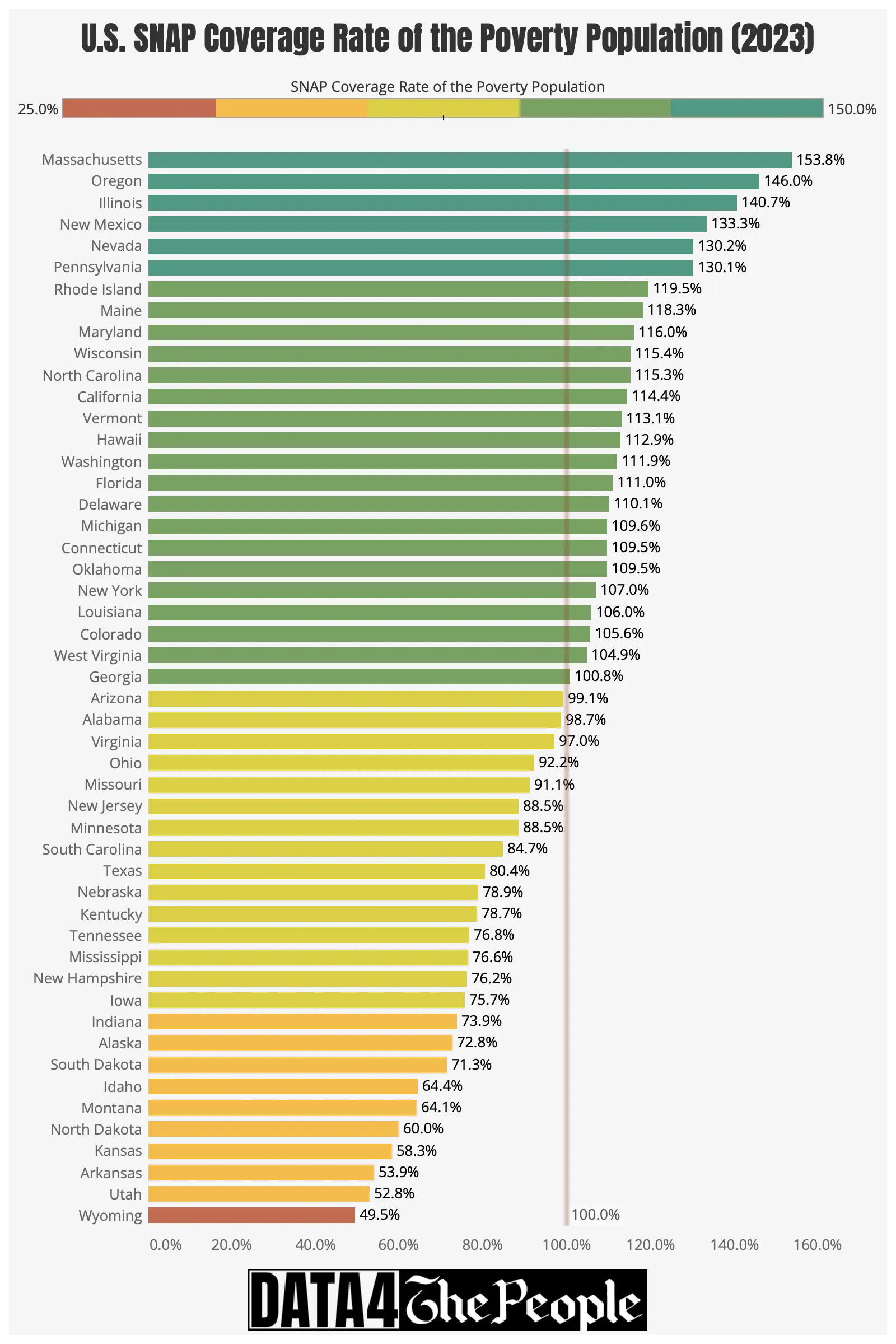
My first interactive visualization shows that half the states had a SNAP Coverage Rate below 100% in 2023 with 17 states below 80% and 7 below 70%.

Here's a static visual I created to make it easier to see this.
Source: Census.gov, USDA, Data 4 The People
The visualization also has the functionality to see how the SNAP Coverage Rate has changed over time. There are a few fascinating case studies when we look at this.
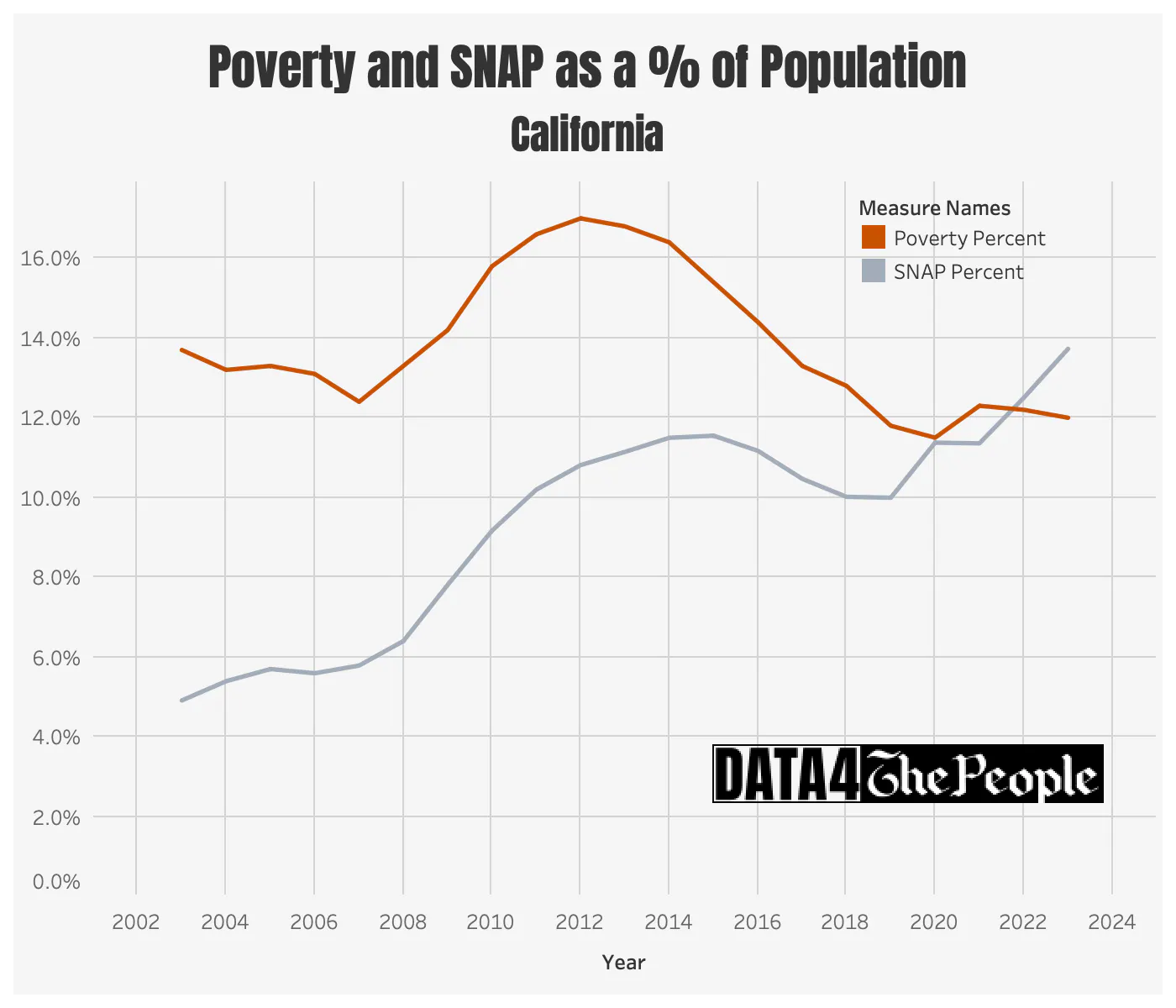
I’ll start with California, which has dramatically expanded SNAP over the past two decades.
When I initially saw the significant growth in the number of people on SNAP in California, I thought, that makes sense, because conventional wisdom is California is a liberal state, and you know, that's something a liberal state would do.
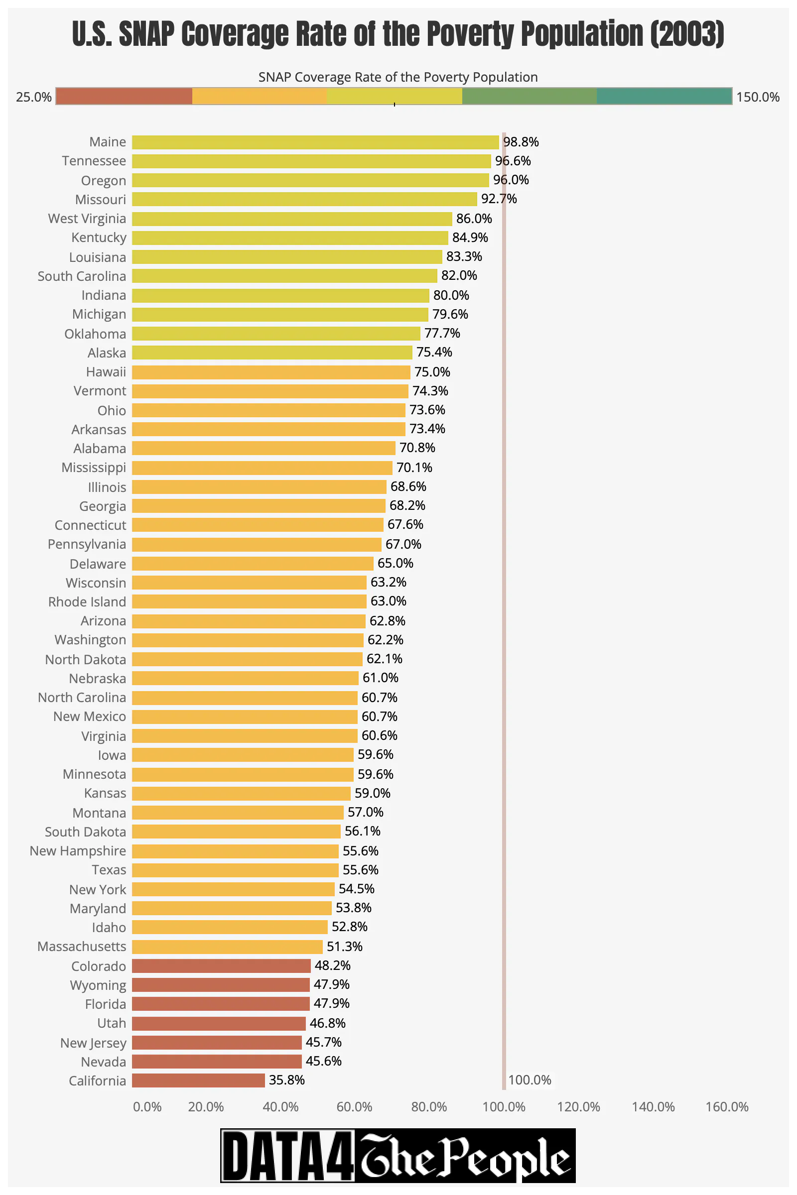
Turns out that story is incomplete. When I joined the poverty rate data with the SNAP data, I found that California had an abysmal SNAP Coverage Rate for most of the 2000s. In fact, in 2003 California’s SNAP Coverage Rate was dead last amongst all states at 35.8%.
Source: Census.gov, USDA, Data 4 The People
So, what really happened over the past twenty years is California played catch up, expanding its SNAP access to cover more people in poverty.
Source: Census.gov, USDA, Data 4 The People
The other thing you’ll immediately notice when looking at the 2023 and 2003 state bar charts is that back in 2003 all 50 states had SNAP Coverage Rates below 100%. If you go back to the visualization and hover over each state, you’ll find that the next decade or so was one of near-universal expansion of SNAP.
Here’s the pattern: in the 2000s, essentially all states - liberal and conservative alike - expanded SNAP coverage.
But pay attention to what happens in the early 2010s in these charts. SNAP Coverage Rates of states started to diverge between liberal and conservative states. Some states, like Massachusetts, kept expanding SNAP well beyond its poverty level. Other states, like Kansas, slashed SNAP Coverage Rates back to 2003 levels.
What happened? To answer this question, we'll use my second data visualization.
Implications of the 2010 Red Wave on SNAP
Before I explain the next data visualization, a bit of context is in order.
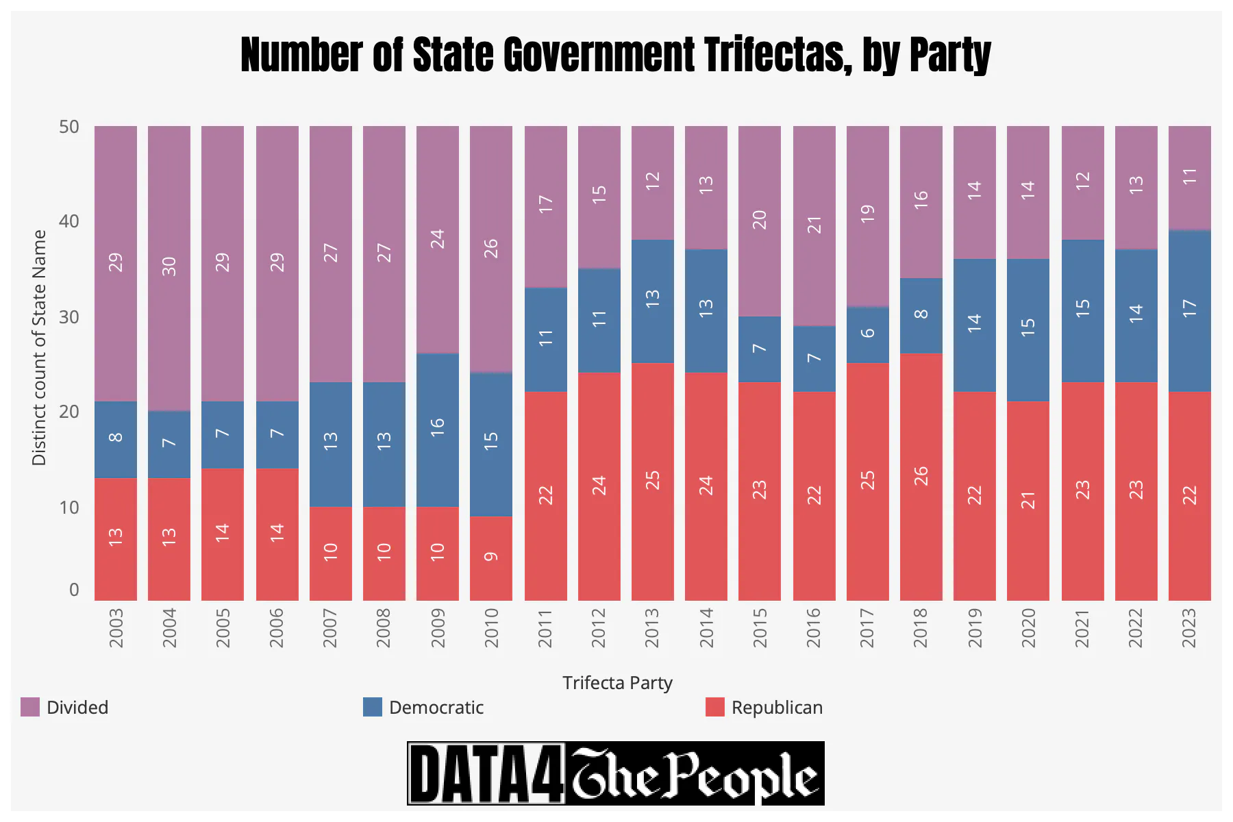
In 2010, Republicans gained unified control (i.e., "a trifecta") of an unprecedented number of state governments. A trifecta is the term used to describe when a single political party holds majorities in the three key positions of a state's government:
- The Governorship.
- The State Senate.
- The State House of Representatives (or State Assembly).
In simple terms, it means one party has unified control over both the executive and legislative branches of a state government.
What went down 15 years ago was called “the 2010 Red Wave.” To get a sense of how significant of a “wave” this was, look at the following chart, which shows a count of state government trifectas by year.
Source: Ballotpedia, Data 4 The People
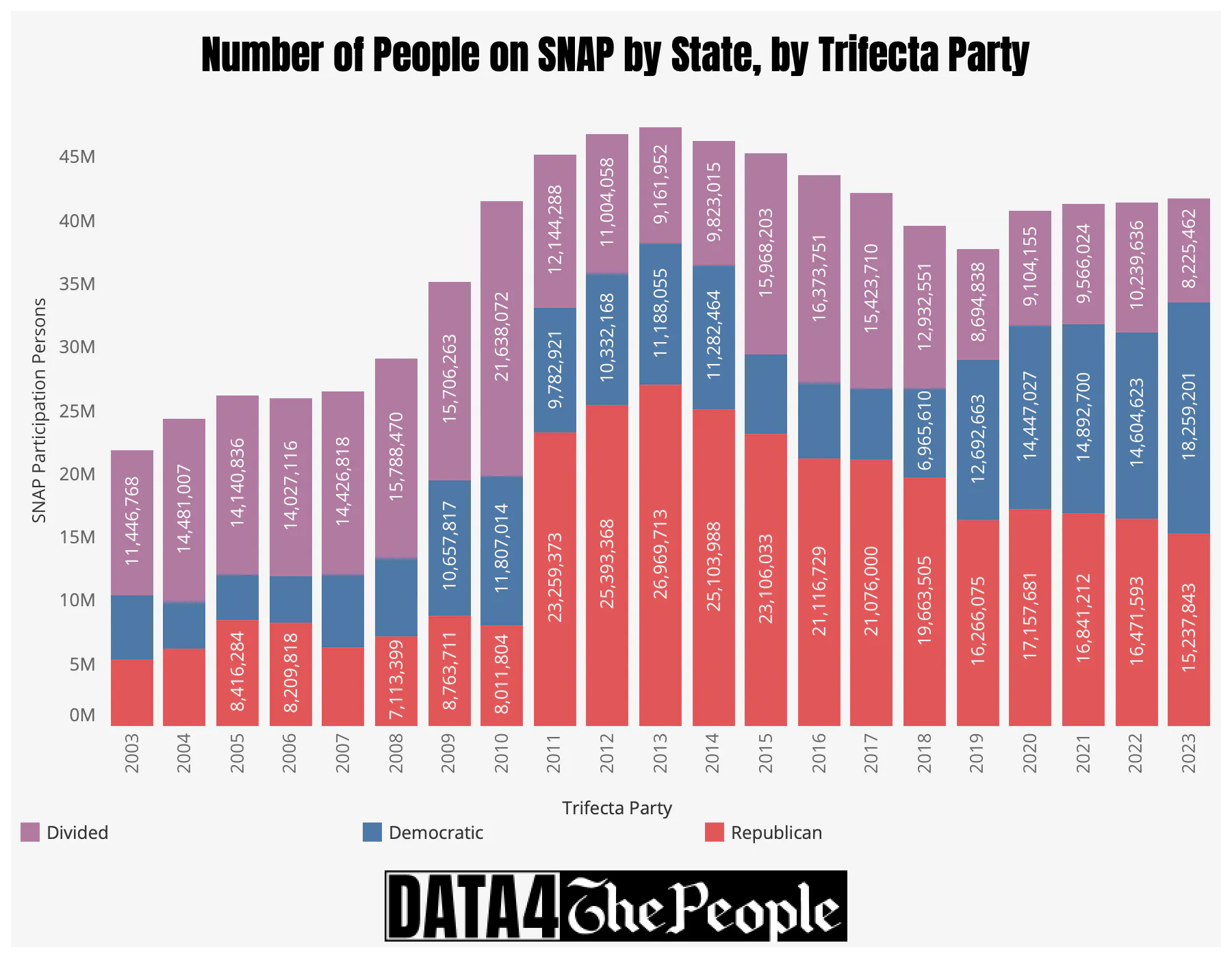
The following chart shows how many lives on SNAP lived in trifecta states (by party) versus divided states. In 2010, 21.6 million out of 41.5 million people on SNAP lived in divided states. In 2011, that dropped to just 12.1 million out of 45.2 million people. Fast forward to 2023 and only 8.2 million people on SNAP live in divided states out of a total 41.7 million people on SNAP.
Source: Ballotpedia, USDA, Data 4 The People
In short, the divided state appears to be dying off with the rise of political polarization in the 2010s, leaving people on SNAP subject to more politicized views on food assistance.
With that as context, my second data visualization helps highlight the increasing political polarization of the SNAP program in the 2010s.

I've extracted these views for you in the image carousel below, which show the general downward trend in SNAP Coverage Rate in the 2010s and 2020s when you flip from Democrat trifecta to divided government to Republican trifecta.
An Arkansas case study
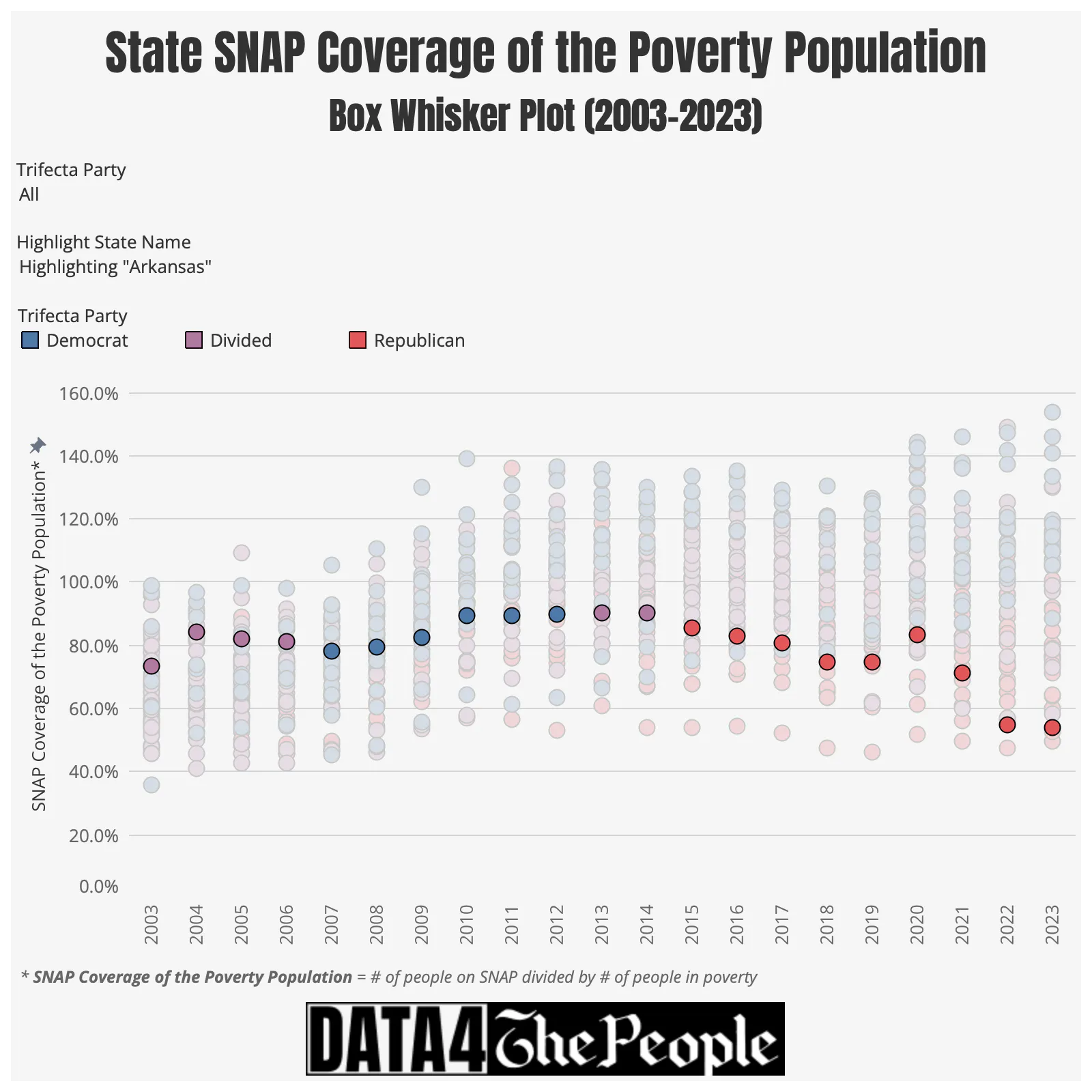
One of the most fascinating states, in my view, is Arkansas. This is because Arkansas went from a divided government (2003-2006) to a Democratic trifecta (2007-2011) back to a divided government (2012-2015) then to a Republican trifecta (2015-Present). It’s striking to see how precipitously the SNAP Coverage Rate fell since Republicans gained full control of Arkansas' state government in 2015 - its SNAP Coverage Rate dropped from 90.3% in 2014 to 53.9% in 2023.
Source: Ballotpedia, Census.gov, USDA, Data 4 The People
Note, this data point gets even more fascinating when we look at it on a relative basis. In 2003, Arkansas had the 16th highest Coverage Rate in the country. Twenty years later, it had the third lowest Coverage Rate in the country (scroll back up to the bar charts and see for yourself).
63% of all U.S. counties failed to cover their poverty population with SNAP benefits in 2022
That’s the story at the state level.
But we can do better than that.
We can drill all the way down to the county level to see the discrepancies in SNAP Coverage Rate by county over time. Could it be possible that SNAP Coverage Rates vary widely from one county to the next, even in states that are controlled by one party?
As shown in my third data visualization, SNAP Coverage Rate of the Poverty Population by County (Heat Map), the answer to that question is a resounding, Yes.

Earlier on, I provided the stat that half the states in the U.S. had a SNAP Coverage Rate less than 100% in 2023 (latest year of state data). I did this same analysis for counties in 2022 (latest year of county data) and found that 1,971 counties (out of 3,142 total) had a SNAP Coverage Rate below 100%. That means that 63% of all counties in the U.S. failed to cover their poverty population with SNAP benefits.
There is considerable variability in SNAP coverage across counties in the same state
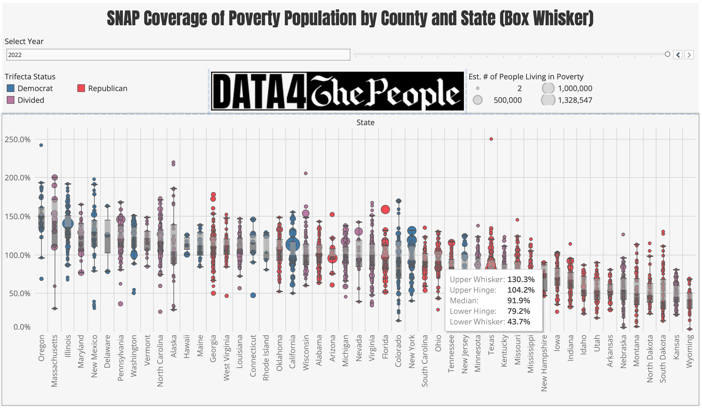
I created one more data visualization - SNAP Coverage Rate of the Poverty Population by County and State (Box Whisker) - to quantify the variability in SNAP Coverage Rate across counties.

By way of example, I figured out the variability by county for my home state of Ohio by hovering over its "box."
Source: Census.gov, USDA, Ballotpedia, Data 4 The People
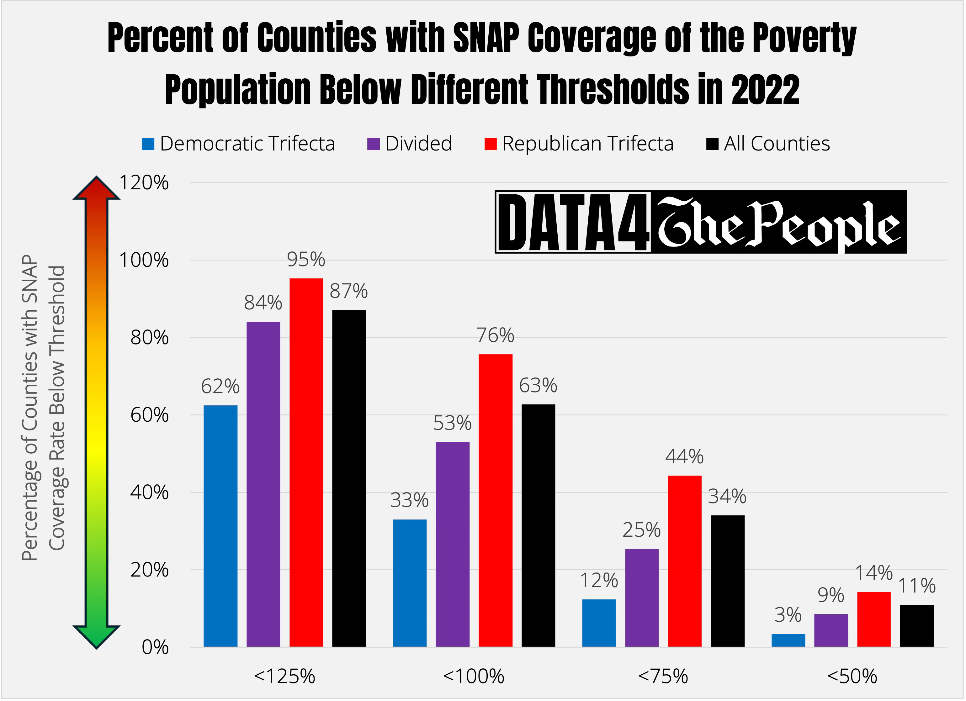
I also used the data in this last visualization to see if there was a meaningful difference between the SNAP Coverage Rate of counties in states with different political party trifectas.
To do this, I counted the number of counties (by political trifecta) below different SNAP Coverage Rate thresholds. The chart below shows the results. Note that the bars represent the percentage of counties falling below a given SNAP Coverage Rate threshold. A higher bar indicates a higher percentage of counties that missed the coverage threshold. For example, 12% of Democratic trifecta counties and 44% of Republican trifecta counties had a SNAP Coverage Rate of less than 75% in 2022, respectively.
No matter how you cut it, the data show considerable evidence that it is harder to get SNAP benefits in Republican trifecta states, and vice versa for Democratic trifecta states.
Source: Census.gov, USDA, Ballotpedia, Data 4 The People
Why is there such extreme variability in SNAP coverage by state party control and locality?
You may be wondering what is driving the gap in SNAP Coverage Rate from state to state and county to county. I certainly was after I stared dumfounded at this data for weeks.
The reason is that states and counties have a lot of control over SNAP. It is true that the Federal Government sets broad ground rules, but states can either expand or restrict access to SNAP through several mechanisms. My intent here is not to exhaustively present and describe the myriad ways a state and/or county can make it easier or harder for people to receive SNAP, but just list some of the key tools used. Feel free to research these further. Also, if you do want to go deeper into this rabbit hole, I would strongly encourage you to read this article from the Center on Budget and Policy Priorities, which explains the byzantine set of calculations undergone to determine SNAP eligibility. After reading this, you’ll better understand what I mean when I write terms like “federal asset test” below.
Here are some of the key policy levers that can be pulled by states/counties to influence the SNAP Coverage Rate:
- Adopting (or not adopting) expansive Broad Based Categorical Eligibility (BBCE) - States can choose to waive the federal asset test and raise the gross income level to 200% the Federal Poverty Level (FPL)
- Streamlining recertification (or making it more onerous) - States can extend the certification period (e.g., from 6 to 12 months) for stable households, reducing administrative effort and benefit lapses.
- Community outreach partnerships (or lack thereof) - States/counties can fund community and non-profit groups to help eligible elderly, disabled, and non-English speakers navigate the application process.
- Strict work requirements (or lack thereof) - States can choose to enforce all federal work requirements (ABAWD rules) and minimize the use of geographic waivers and individual exemptions.
- Increasing administrative burden (or easing it) - States/counties can require mandatory in-person interviews, shorten recertification periods, and slow down processing times, making it harder to enroll or stay enrolled.
While this is not an exhaustive list, it should give you a feel for how many levers can be pulled at the state and local level to impact SNAP accessibility and usage.
Florida: a case study on why its critical to analyze SNAP coverage at a county level
Now that I’ve introduced all four visualizations and provided some reasons why there is so much variability in SNAP Coverage Rate from one location to another, I wanted to share a case study as an example of how to use these four data visualizations together to better understand and quantify granular drivers of the SNAP Coverage Rate in one state.
Let’s look at Florida.
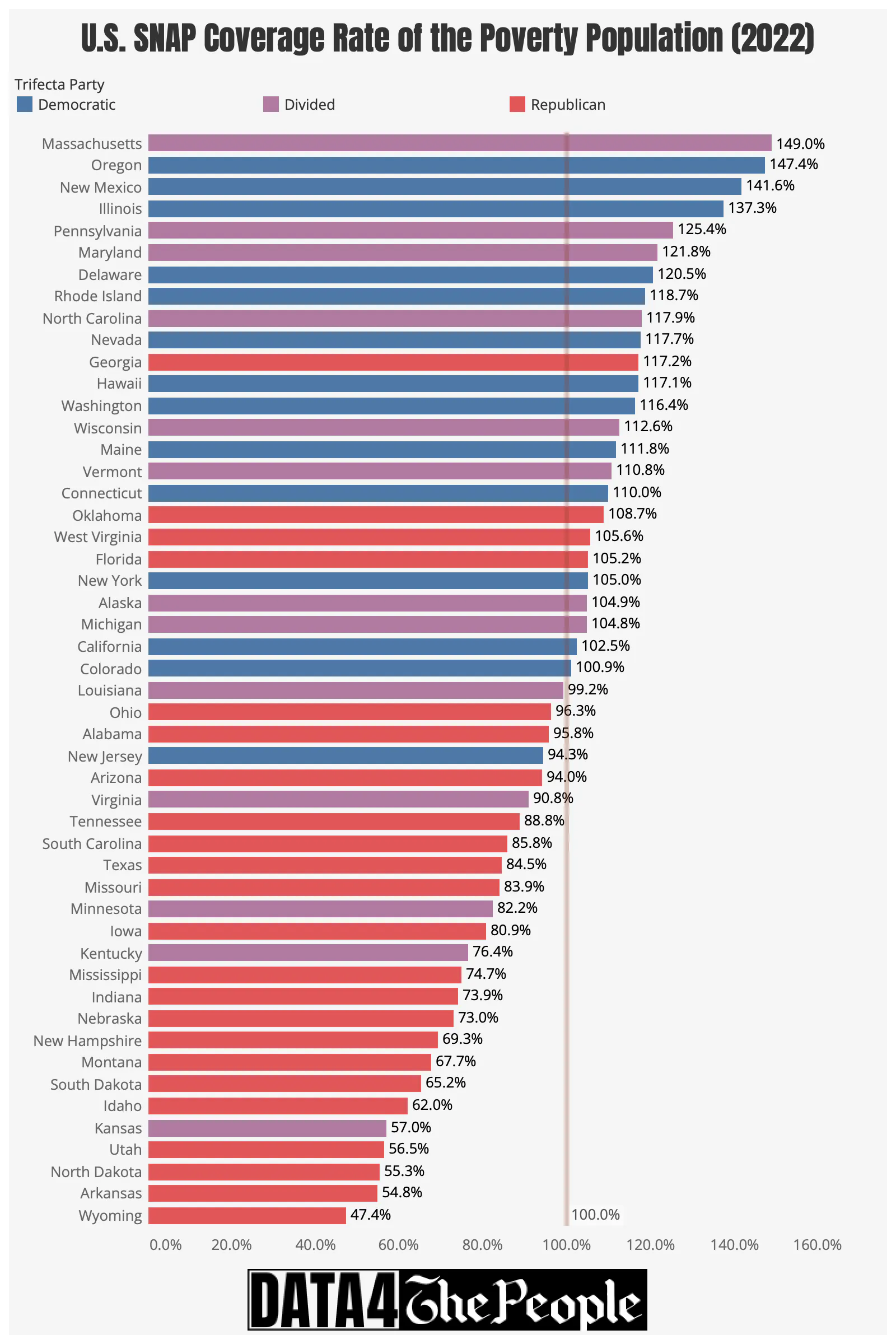
If you glance at either of the two state dashboards, you’ll see that Florida is an example of a Republican trifecta state with a relatively high SNAP Coverage Rate. Either state visualization will show you that in 2022 (the year I will use for this case study) Florida’s SNAP Coverage Rate was 105%. As shown below, this ranked 20th in the nation, and was higher than four states with Democratic trifectas (New York, California, Colorado, and New Jersey).
Source: Census.gov, USDA, Ballotpedia, Data 4 The People
But what if we are not satisfied with understanding the SNAP Coverage Rate at a state level. What if we want to better understand what's driving Florida’s relatively strong SNAP Coverage Rate? Could it be that a few counties are pulling up its overall SNAP Coverage Rate, or is the SNAP Coverage Rate relatively equal across all counties in the state?
Well, that’s what the county visualizations are for.
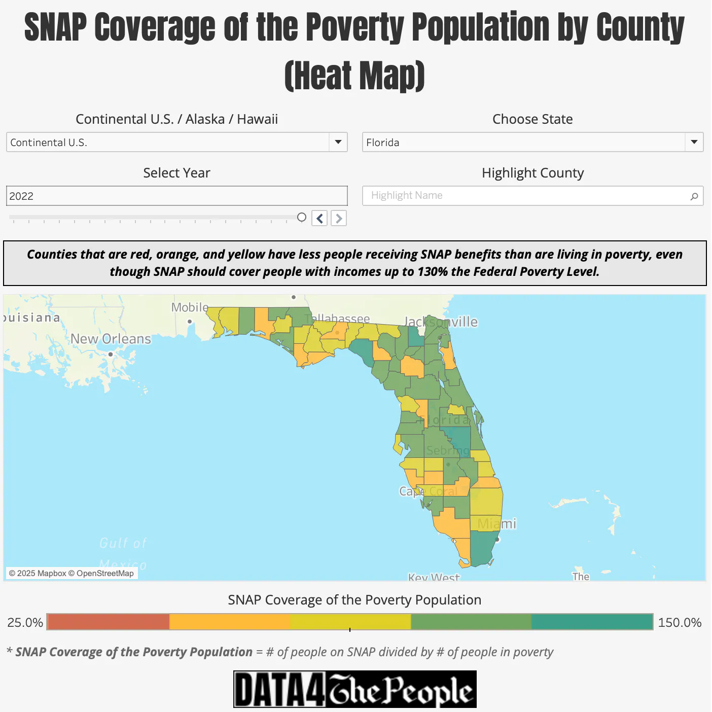
First, we can quickly answer my last question by consulting the county map. As shown below, we can quickly see that the SNAP Coverage Rate varies quite a bit from one county to the next.
Source: Census.gov, Data 4 The People
Looking at the above map, my attention was immediately drawn to Miami-Dade County, whose dark green shading tells me it has a high SNAP Coverage Rate. So, I hovered over it and found it to be 158.4%.
Why is it so high? I don’t precisely know, but based on some quick research, Miami-Dade County appears to have:
- A large contingent of elderly people that meet the strict federal poverty guidelines,
- A high population density (making SNAP easier to administer),
- A high percentage of people living in food deserts, and
- Excellent community outreach.
I did some more digging and found Miami-Dade County to have the highest SNAP Coverage Rate of all “large counties” (which I define as >100,000 people living in poverty) in the entire country! For reference, Cook County, IL (home of Chicago) had a SNAP Coverage Rate of 140.3% in the same year.
I then flipped over to the county level box-whisker visualization and highlighted Florida. That large bubble at the top is Miami-Dade County.

Source: Census.gov, Ballotpedia, Data 4 The People
When I hovered over the Miami-Dade bubble I learned that in 2022 there were:
- 381,423 people living in poverty, and
- 604,250 people receiving SNAP benefits
Flipping back to the state box-whisker chart, I learned that in 2022, Florida had:
- 2,770,789 people living in poverty, and
- 2,913,561 people receiving SNAP benefits
So, how much is Miami-Dade County contributing to Florida’s SNAP Coverage Rate? Turns out Florida’s 2022 SNAP Coverage Rate after removing Miami-Dade County was 97%, which is now below the 100% dividing line. We now see the story more clearly. Florida is fully covering its poverty population with SNAP thanks to Miami-Dade County. Without Miami-Dade, it's not.
So... Has the U.S. given up fighting the War on Poverty?
It depends on where you live.
If you live in a state controlled by Democrats or with divided governments - Massachusetts, Oregon, New Mexico - the answer is, more often than not, no. The SNAP Coverage Rate in many of these state has expanded considerably over the past 20-years. The war is still being fought.
If you live in a state controlled by Republicans - Arkansas, Kansas, Wyoming - the answer is, more often than not, yes. As discussed, the SNAP Coverage Rate in many Republican-led states increased in the 2000s, but then stalled or was cut considerably since then; in some cases back to where they were in 2003. The war has been deprioritized.
This isn't about whether poverty got better or worse in red or blue states. It also isn't about the 1.6% of SNAP benefits that were wrongfully issued. Rather, it's about whether we are collectively OK with so many people living in poverty going without food assistance, simply because of where they happen to live and the politics of their state.
The data shows what happened. It doesn't tell you whether it's right or wrong. But it tells you what your state chose, and shows the outcome this choice has had on our most vulnerable Americans.
Thank you for reading Data 4 The People’s inaugural deep dive into the variability of SNAP Coverage of the Poverty Population by state and county. Have thoughts you want to share? Want to connect on future project ideas? Have topic areas that need some data love? Reach out at connect@data4thepeople.com.
Enjoying this post?
Tell others about it.
More articles like this
Fetching Related Posts
There are no other articles tagged with Research