

Squeezed on Both Ends: Why Renting Is Becoming an Impossible Math Problem
Why it feels like you can’t get ahead - and the media coverage that finally explains why the numbers don’t add up.

Eric Pachman
Published
February 19th 2026
Last week I had the privilege to record a short segment with Scripps News exploring the latest five-year (2020-2024) American Community Survey ("ACS") data. I specifically researched which groups of Americans struggled more than others in comparison to the prior five-year ACS survey (2014-2019).
The segment was released shortly after I was interviewed and aired on local news networks in more than 20 cities across the country. I've embedded the full segment below.
The data behind the segment
Clearly, there is only so much detail you can provide the general public during their evening news. However, you (dear reader) are not the general public. If you are reading Data 4 The People, I think I can safely assume you want me to throw all the data at you, so you can really "see" the struggle that this clip discussed.
That said, here's the story.
Seniors and rural Americans
I'm going to start with the data on seniors and rural Americans first, as while it is compelling, it's not nearly as infuriating as my analysis of the plight of renters and the broader realization that high inflation accelerates income inequality.
To perform the analysis for seniors and rural Americans, here is what I did:
- Go to data.census.gov and search for table "B19049"
- Add a "geographies" filter to the table. Click on "nation" then "show geographic components." I checked, United States, United States -- In metropolitan statistical area, United States -- In micropolitan statistical area, and United States -- Not in metropolitan or micropolitan statistical area. Looking to better understand the difference between metropolitan and micropolitan statistical areas? Read more here.
- Click on the 2024: ACS 5-Year Estimates Detailed Tables for the survey. It will not default to this.
- Download this table. Then switch the survey to the 2019: ACS 5-Year Estimates Detailed Tables. Download that.
- Lastly, download the CPI-U-RS inflation values to use as the basis for inflation adjustment.
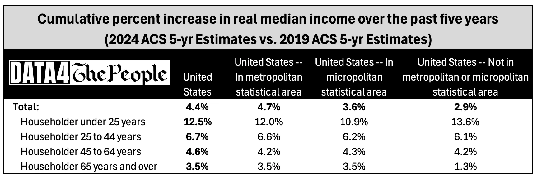
With all this data, I then inflation adjusted the 2019 survey data to bring it to 2024 dollars to create the following table, which shows the cumulative rise in inflation adjusted incomes for each group of Americans.
Source: data.census.gov, Data 4 The People
First off, let me just hammer home that these increases are cumulative, not annualized. That means that if the median American made $100 in 2019, after adjusting for inflation, they make just $104.40 in 2024.
When we look at the table, it's clear that on one dimension, seniors (65+) had the lowest increase in median real income at just +3.5%. On the other dimension, people living in areas outside metropolitan and micropolitan (i.e., "rural") had the lowest increase in real median income at just +2.9%. When we combine the two dimensions, the group of Americans that had the lowest increase in real median income was rural Seniors, at just +1.3% over five years.
The plight of renters
The last five years for renters was arguably far worse. However, it takes some digging to really bring this to light.
First off, all the data you need to "see" the plight of renters is in Table S2503 on data.census.gov. If you like playing with the data yourself, I highly encourage you to start with this table. Also, I am only discussing overall U.S. stats for renters vs. homeowners in this post. But you can pull this data for any state, city, or county in the country. In other words, you can take this analysis down to the local level... which come to think of it, would make for a great interactive visualization (I'll add that to my list)!
First off, there is a ton of data in this table. But I focused in on two rows in particular:
- Median household income for renters vs. homeowners, and
- Median monthly housing costs for renters vs. homeowners.
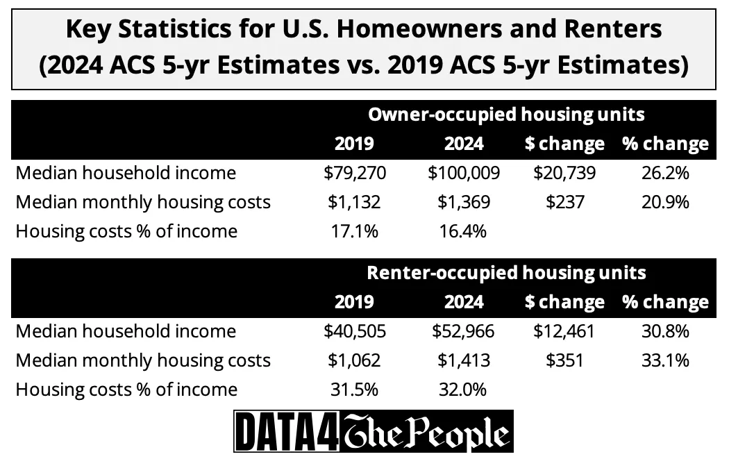
The following table shows the change in these stats from the 2019 five-year ACS survey to the 2024 five-year ACS survey.
Source: data.census.gov, Data 4 The People
As shown above, the good news for renters is their median income rose 30.8% over five years, eclipsing the 26.2% increase in the median income for home-owners.
The bad news for renters is percentages don't pay for the roof over their heads. Dollars do that. This is the danger in relying on percentages to normalize gains. Percentages ignore the difference in the starting point, and therefore, don't tell us anything about the impact to the people they are trying to measure.
Let me hammer home this point using this data, because we're going to need to agree on this before we move on.
Here are two offers. Think about which one you would prefer to take.
- A 30.8% increase, or
- A 26.2% increase.
So, which one do you want?
This is obviously a ridiculous question because I left off the "to what" part. A 30.8% increase to $1 is clearly far less valuable than a 26.2% increase to $100.
So, let me revise these offers to give you more complete information.
- A 30.8% increase to $40,505, or
- A 26.2% increase to $79,270
Ahh, now the answer is obvious. Option #2 is worth $20,739 while option #1 is worth $12,461. In other words, option #2 is worth 1.66x option #1. So, everyone would take option #2... which to beat a dead horse, is the lower percent increase option.
Again, I belabor this point so the next time you are presented with a comparison of only percentages on some random social media chart you will be skeptical because you KNOW someone is hiding the base effect.
OK, now that we are all in agreement that percentages can be misleading, go back and look at the table. Renters make 47% less than home-owners, but pay 3% more than home-owners for housing costs. Put it all together and renters are shelling out 32% of their income for housing while home-owners pay just 16% of income for housing.
This is a striking contrast, which stopped me in my tracks. The question that has perplexed me since I did this work was, "how can the median renter ever hope to buy a house?" I think the answer is, "They can't."
The math just doesn't work for the median renter.
- First, renter incomes are very low to start, just $10,000 and change above the poverty threshold to support a family of four (depending on where you live).
- Second, rents are rising faster than those low entry-level incomes, making it very difficult to build and savings for a downpayment.
- Third, the median house price rose by nearly 50% from 2019 to 2024, accelerating even faster than the median rental price, which only gets worse when we couple it with one of the most dramatic increases in mortgage rates over any five-year period.
To offer an analogy, in 2019 buying a home for the median renter was like a distant light at the end of the tunnel. It was faint, but you could see it. By 2024, the light was gone and the tunnel was completely dark.
Rental supply up, but only if you have the money
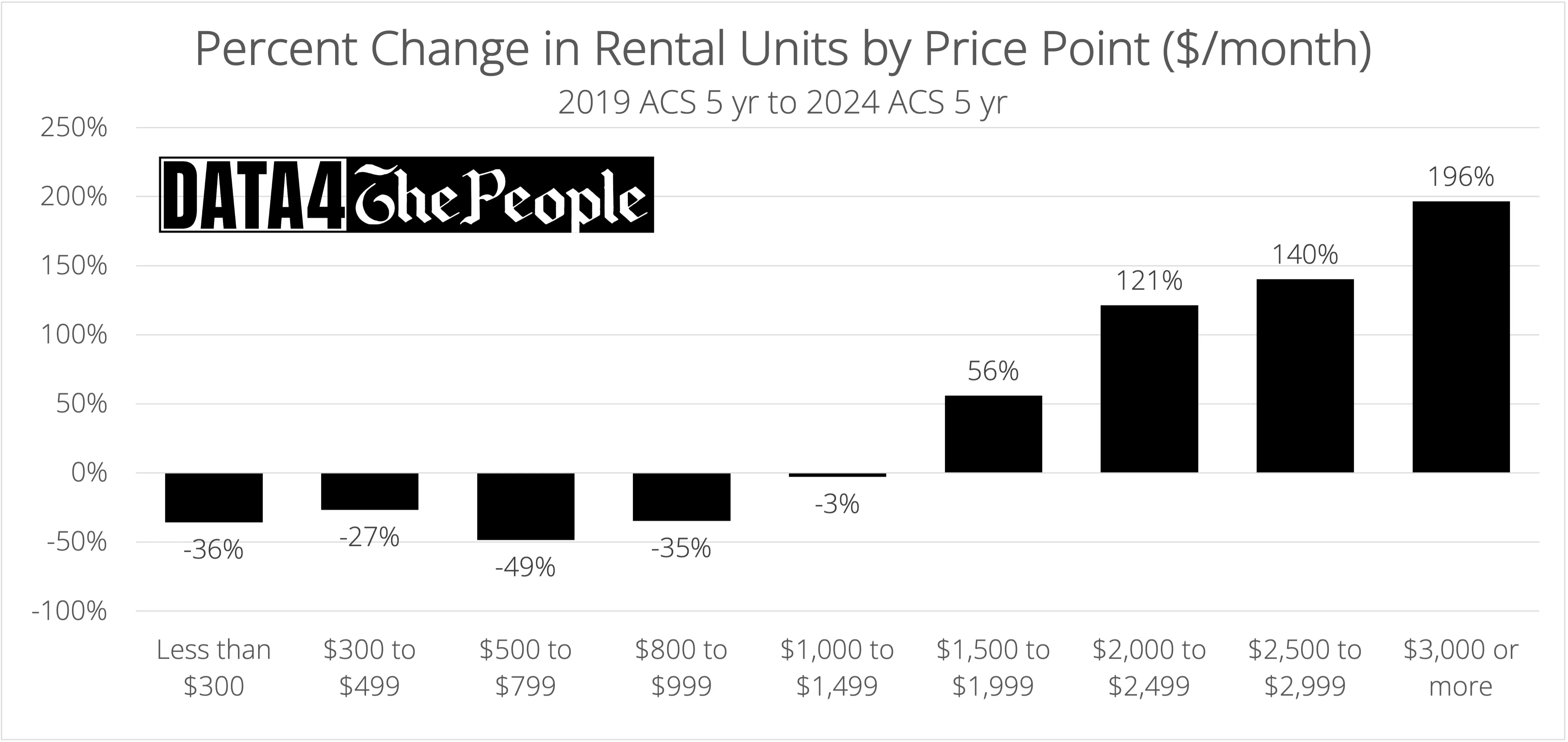
Before I wrap analysis of the rental segment, I have to throw another wrench in traditional economic analysis. The chart below shows the change in supply of rental units by price point from the 2019 5-yr ACS survey to the 2024 5-yr ACS survey.
Source: data.census.gov, Data 4 The People
Overall, there were 1.5 million additional occupied rental units in the U.S. in the 2024 survey vs. the 2019 survey.
However, in the 2019 survey there were 18.8 million occupied rental units that cost less than $1,000 per month - 46% of total units. This dropped to just 11.3 million units under $1,000 per month in 2024, which was only 26% of total units.
This is a critical datapoint, especially as we think about how our government sets the Federal Poverty Limit (FPL).
Let's assume the 2019 FPL for a family of four of $25,750 was "correct" (even though that is HIGHLY debatable) just so I can proceed with this thought experiment. Let's also assume the government expects a family to spend 1/3 of their income on rent. This would mean an American family of four living at the FPL would could afford $715 per month on rent in 2019.
Now, according to the federal government, the FPL in 2024 for this same family rose to $31,200 per year. Doing the same math gets us to rent of $867 per month.
That may work on paper, but go back to the last chart and you'll see the problem with these paper calculations. The occupied supply of rentals in the $800 to $999 price bracket dropped 35% over five years. Without any support from the government to ensure there are enough units on the market that low income families can afford, the market killed the supply of affordable units through a combination of rent inflation and gentrification/renovation to boost profit.
Don't blame the market. This is what markets do, when left to their own devices.
So, how does this make us feel about how "realistic" the poverty income truly is in America? I'll answer that for myself. Not good. I don't trust these numbers at all because they appear to be cooked up on spreadsheets rather than anchored in reality.
Now consider that there are ~87 millions Americans whose economic fate is tied to these (highly) suspect FPLs as they determine eligibility for both SNAP and Medicaid.
It's unconscionable that we can use technology to create just about any deep fake video we want but can't use it to more accurately determine a true market-based poverty income.
The rich get richer
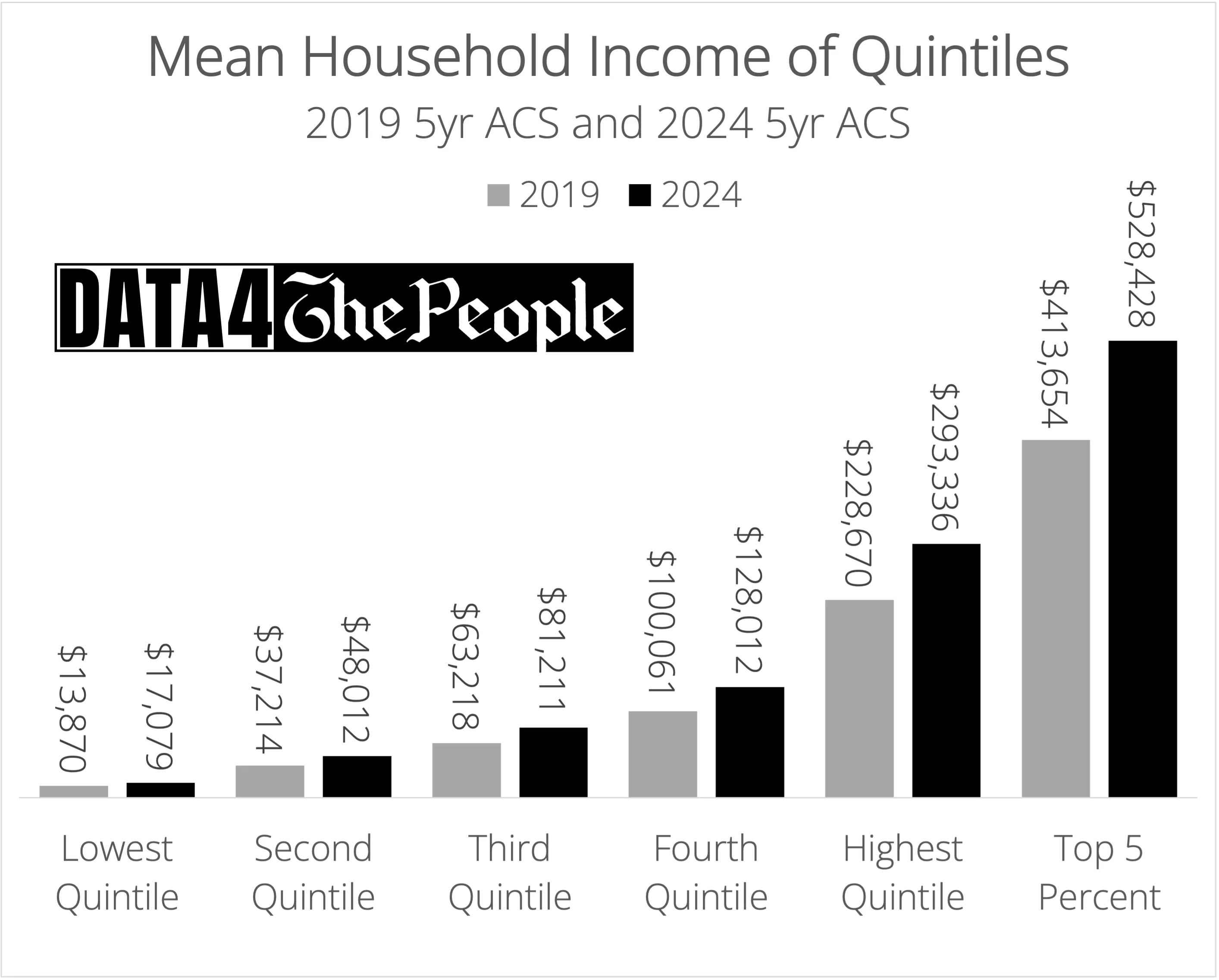
I am going to end with what in my view is the most egregious finding from this census data exploration project. The following chart shows the mean household income of quintiles (plus the top 5%) for both the 2019 and 2024 5-yr ACS surveys.
Source: data.census.gov, Data 4 The People
To me, this chart is immensely powerful to help us "see" and "feel" the experience of families in lower income brackets. Look at the bottom quintile. Had I not put the data labels on this chart, the bars are so unbelievable small that they look unchanged. Sure, the nominal income of the lowest quintile increased by 23%, but to just $17,079 for a household? If you are lucky enough to be in the top 5%, think of what it would be like to live on that, then realize that roughly 20% of Americans are doing this each and every day.
Again, this chart shows you why percentages have no business in trying to explain inequality in America. Do the math... the third quintile's nominal income rose 28%, the same percentage as the nominal income of the top 5%. For the third quintile, this added just under $18,000 to their income over five years. For the top 5%, the same percentage increase added nearly $115,000 to their income over the same period. In fact, the rise in the nominal income of the top 5% was more than the absolute income of the third quintile in the 2024 survey ($81,211).
All I am trying to explain here is compounding. Investors know this when it comes to their portfolios, but we seem to forget it when it comes to things like income inequality (or <cough> climate change).
Here's an example to hammer this home. Let's say I give you $100,000. And then I give your neighbor $10,000. You have $90,000 more than your neighbor.
But then you both go and invest this money in the exact same basket of securities and over the next five years and compound at an annualized rate of 5%. Five years from now you have $115,000 more than your neighbor.
Now what if we change the rate of compounding to 20% over this period? At the end of five years you will have $224,000 more than your neighbor.
See the problem here? If high inflation environments (like we lived through with COVID) lift all boats by the same percentage, the laws of math dictate that the fancy yachts will suck up the majority of the cash, leaving all the canoes, kayaks, and dinghies treading water.
Different experiences of America
There seems to be this confusion amongst people lucky enough to not have to live in canoes, kayaks, and dinghies about this economy. Is it good? Bad?
Some call it "K-shaped," which I hate because you get this visual that the two diagonal parts of the "K" are equal. They are not. When I think of the "K-shaped" economy, I see this visual:
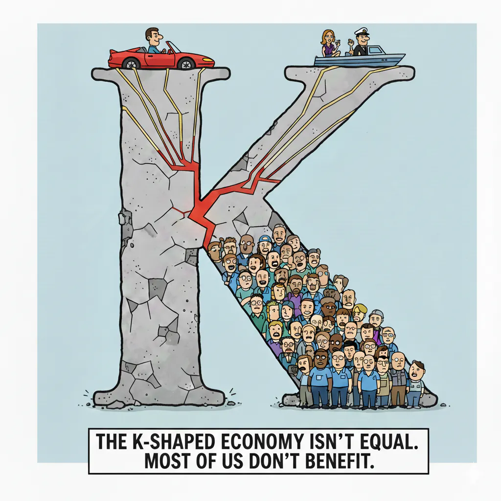
Source: Gemini
Hopefully this post shed some light on the math that supports my interpretation of the K. I have shown that economy is more difficult for the majority of Americans in 2024 than it was in 2019, but simultaneously far better for the privileged few.
Ultimately, I walked away from this analysis with the view that higher inflation over the past five years was akin to pouring gasoline on the raging fire of income inequality that has been growing for the last 50 years. How much larger can this fire get before it consumes us all? Will we adopt policies that can mitigate the spread of the fire before it's too late? I have no idea. But I am sure we will soon find out.
Support Data That Serves the Public
Data should empower people, not just institutions. Your support helps us create accessible research, visualizations, and tools that uncover economic inequality and inform better decisions.
Donate
Enjoying this post?
Tell others about it.
More articles like this
Fetching Related Posts
There are no other articles tagged with Research