

One workforce. Four Stories.
What Friday's jobs data shows once you split it four ways - by birthplace and sex

Eric Pachman
Published
June 8th 2026
One Workforce. Four Stories.
A few weeks ago I flagged something in the participation data: since COVID, immigrant men and native-born men had split apart - immigrant men holding steady, native-born men sliding. And immigrant women had just edged past native-born women for the first time ever.
I called those two threads and moved on. Last Friday's Current Population Survey data made me go back and pull the whole picture - labor force participation by nativity and sex, back to 2007. What I found is that those weren't two threads. There were four, and they're pulling in four different directions.
Here's the contrast that stops me cold, and it's the whole piece in one line: over the past year, the foreign-born women's labor force grew by about 580,000. Over that same year, the foreign-born men's shrank by about 854,000.
Let me show you how we got there.
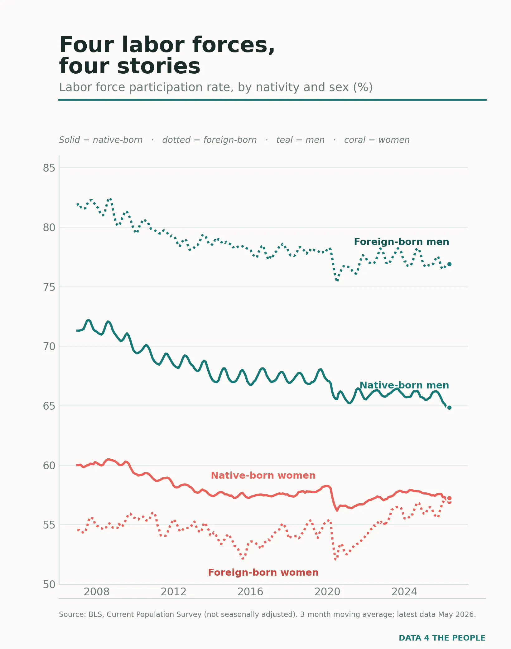
Four groups. Four stores.
Native-born men, sliding for two decades.
Native-born women, flat-then-softening.
Foreign-born men, high but wobbling.
Foreign-born women, climbing.
Whatever "the labor market" is doing, it isn't doing one thing. Let's take them in turn.
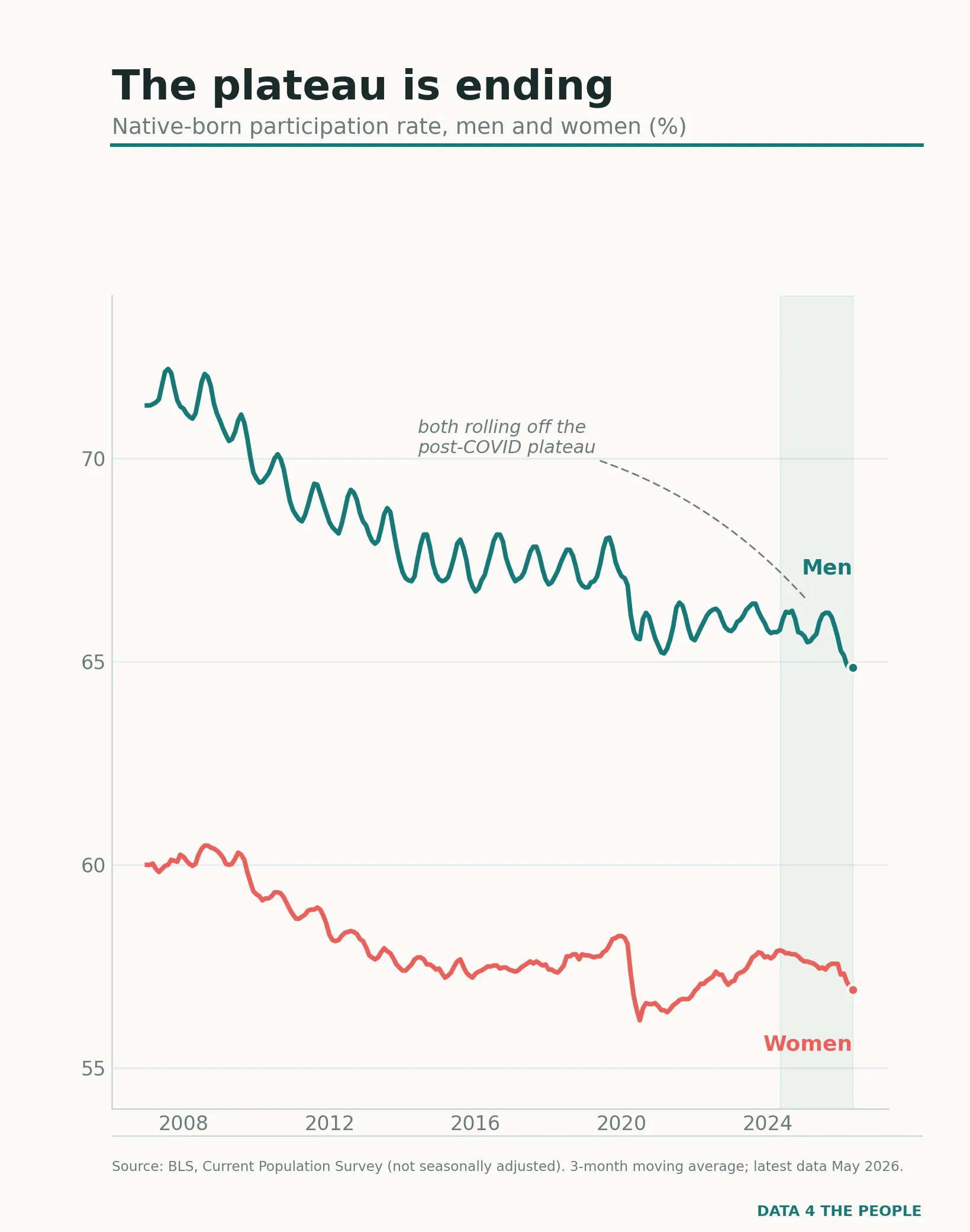
This is the divergence I flagged before, now with more road behind it. Native-born participation - men and women both - climbed out of the COVID hole onto a plateau, and that plateau is rolling over. The men's drop at the right edge is the sharper of the two; the women come off a lower perch. It's early and it's noisy, but both lines are bending the same way: down.
That alone might read as a tired economy - a general cooling. Except the next chart says it can't be that simple.
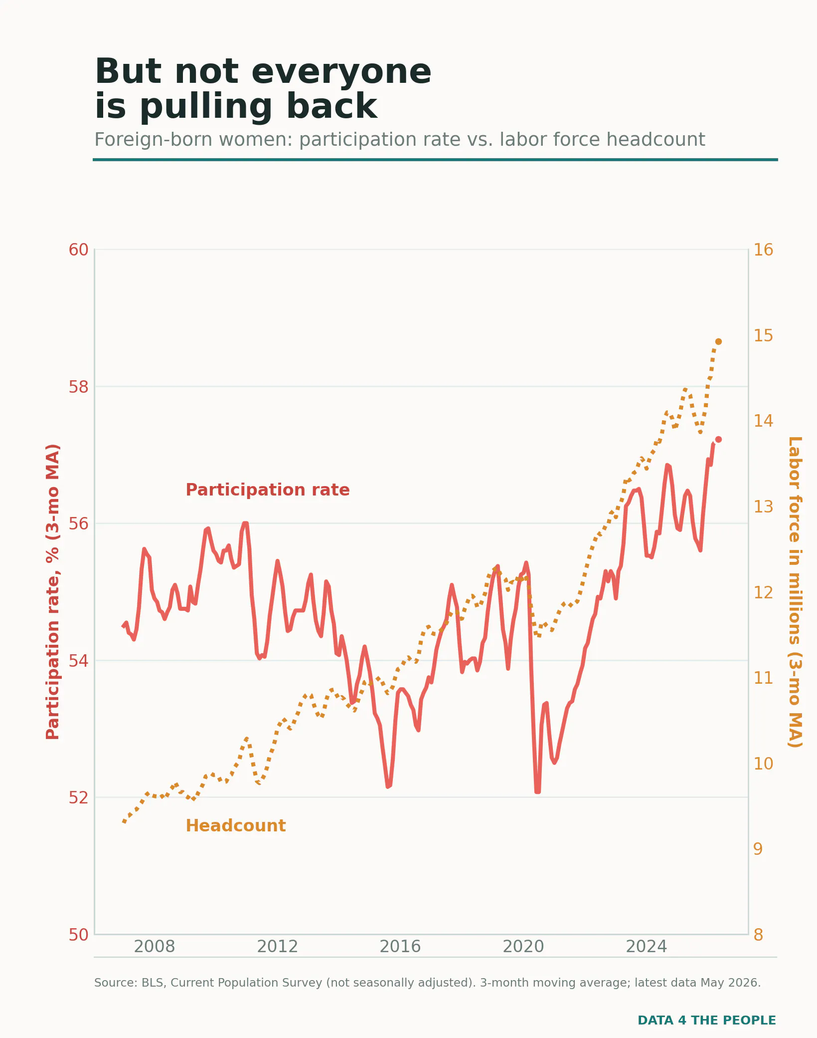
Remember the crossover I mentioned - immigrant women passing native-born women for the first time? It wasn't a blip. Their labor force just hit a series high of 14.9 million, up 61% since 2007, and their participation rate is at a high to match. More women, working at higher rates, exactly when native-born participation is softening. A general slowdown doesn't do that. Something selective is going on.
Which brings me to this chart:
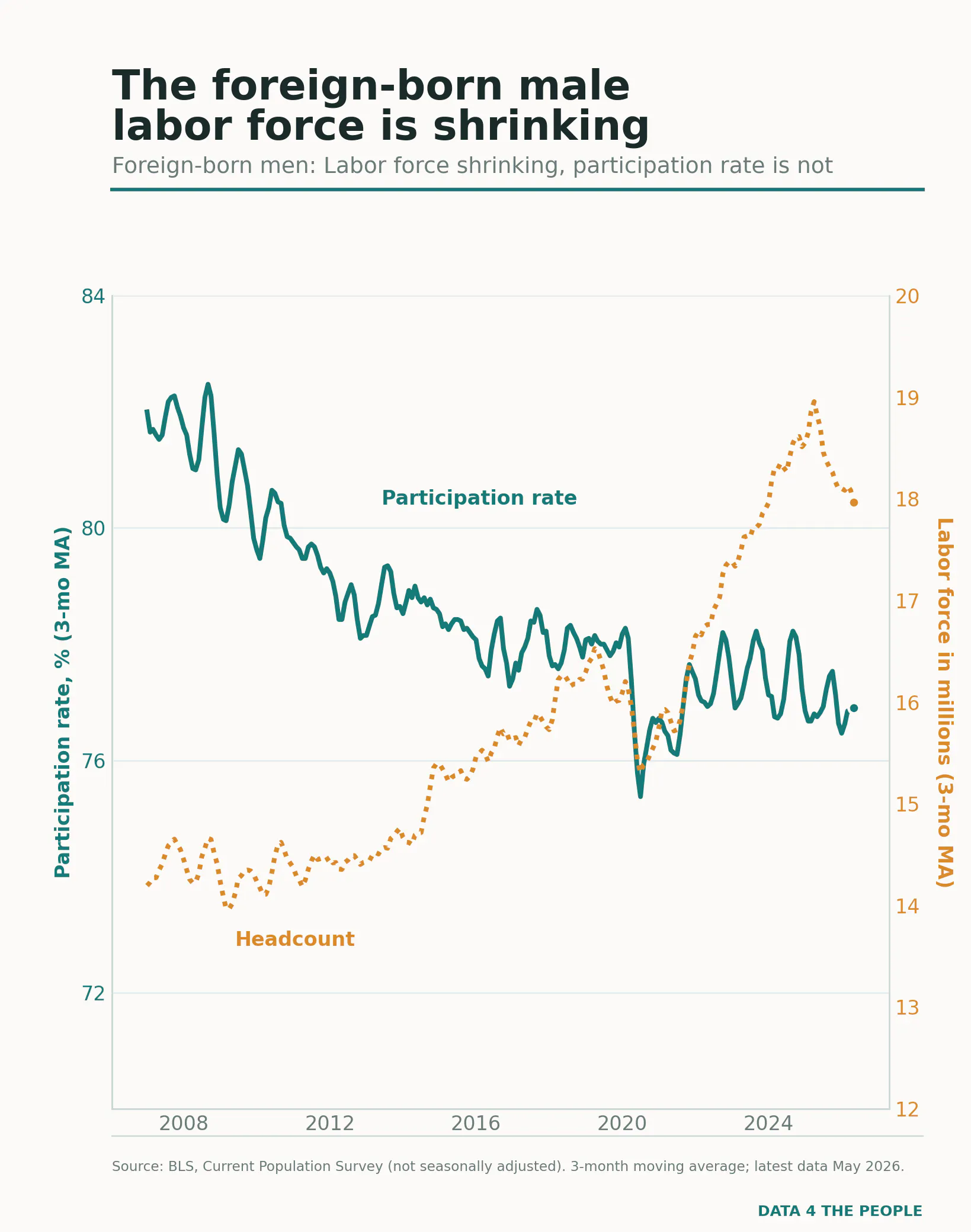
Here's the tell. When a group pulls back from work, you normally see it in the rate - people give up, stop looking, the participation rate sags. That's not what's happening. The foreign-born male participation rate has barely moved. The men who are here are still looking for work.
What's falling is the headcount. The foreign-born male labor force peaked at 18.96 million in April 2025 and has dropped almost every month since - to 17.97 million by this May. That's nearly a million men gone in just over a year, a 5.2% decline. And notice it's a steady march down, not a one-month blip - exactly what you'd expect from a base that's actually shrinking, and not what you'd see from statistical noise.
A flat rate with a shrinking base doesn't describe people sitting on the couch. It describes people who are no longer being counted at all, because the base itself is getting smaller.
That's a different kind of decline. Not disengagement. Departure.
So what's actually happening?
Here's where I slow down, because the data does too.
These four charts tell me what: native-born participation softening, immigrant women rising, and an immigrant male labor force shrinking by subtraction rather than by people giving up. They don't tell me why. A shrinking base is consistent with several stories - fewer people arriving, more people leaving, enforcement, return migration - and this chart can't referee between them. I've controlled for age before, and the nativity gap holds up; what I haven't done yet is the occupation cut that would test the thread I'm about to pull. So treat the next paragraph as a hunch, not a finding.
The fastest-growing occupation in the country is home health and personal-care aides - a heavily female, heavily immigrant workforce. And here's the part that gets me: it's being pulled by the same gravitational force that's dragging the native-born labor force down in Chart 2. An aging population. The very demographics pushing native-born workers past 65 and out of the labor force are creating a surge of elderly people who need care - and someone has to provide it. If immigrant women are flowing toward that care work while immigrant men face whatever is shrinking their base, the two halves of this story might be one labor market sorting itself around a single demographic tide. Might be. Until I pull the industry detail, it stays a question.
Here's what isn't a question.
I wrote it a few weeks ago and the new data only sharpens it: Social Security needs workers. That's math, not opinion. Immigrants - and older immigrants especially - participate in the workforce at higher rates than the native-born. And the chart above shows the ranks of foreign-born men thinning by nearly a million in a year, quietly, without ever passing through unemployment on the way out. As of last Friday, their current unemployment rate (three month moving average) was just 3.75% - near the lowest in the ~20 year series. But the unemployment rate has quietly become a magic trick. Watch it alone, and you'll miss what's actually happening.
One workforce, four stories. One of them is leaving. We can argue about why. We shouldn't pretend it isn't happening.
Data: BLS, Current Population Survey, not seasonally adjusted (the only form published for the nativity breakdown), 3-month moving averages. Latest data May 2026.
Support Data That Serves the Public
Data should empower people, not just institutions. Your support helps us create accessible research, visualizations, and tools that uncover economic inequality and inform better decisions.
Donate
Enjoying this post?
Tell others about it.
More articles like this
Fetching Related Posts
There are no other articles tagged with Data 4 Thought