

America's aging is fueling extreme concentration in job growth
For the first time, see it state by state - where Medicaid-funded care work has become the line between job growth and decline.

Eric Pachman
Published
June 20th 2026
When you spend enough time inside America's data, you stop being surprised by what's in it and start being unsettled by what isn't. One pattern, though, keeps surfacing no matter what we're working on: America is aging, fast, and the implications haven't fully sunk in.
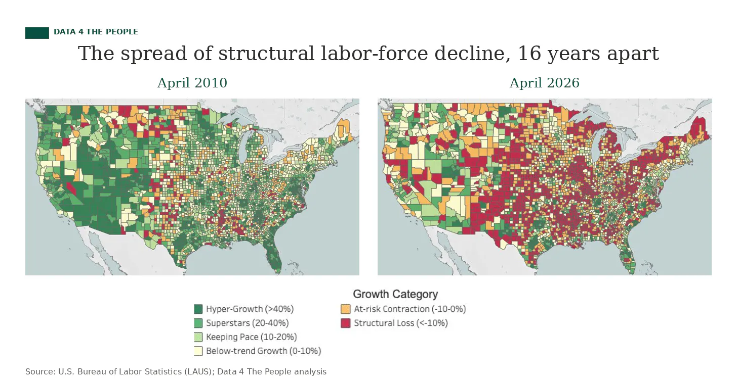
The clearest signal is the labor force participation rate, which has been sliding for years not because Americans don't want to work but because there are fewer of us in the years where work is the default. As prime-age workers (25-54) get pushed out the top end of the demographic, falling birth rates aren't filling the bottom. The geographic version of this story, with rural counties hollowing out while a handful of metros absorb the growth, is something we've been mapping for months on Data 4 The People.
Someone has to take care of all these people
But there's an upshot to all this aging. Someone has to take care of these people. A lot of someones. We started really paying attention to the who about a year ago, when we built this chart:
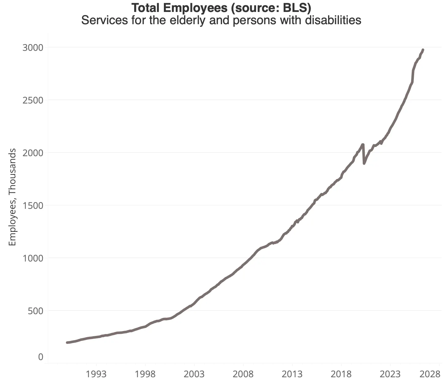
That's employment in the NAICS industry called "Services for the elderly and persons with disabilities." Through April 2026, the U.S. has added 2,164,000 jobs to this industry over the past 20 years, a growth rate of 266%. Total nonfarm payrolls? Up 17% over the same period.
Here's the line that stopped us cold when the latest data dropped earlier this month: this one industry, with under three million workers, was responsible for 57% of all U.S. job growth over the past year.
Caring for our elderly (and disabled) has quietly become one of the last reliable growth engines in the U.S. job market.
Follow the money, hit a wall
In isolation, that's a great data story. It became something else entirely when the One Big Beautiful Bill (OBBB) started moving through Washington and the Medicaid cuts came into view. Why does that matter for jobs? Because Medicaid is the primary funder of eldercare in America.
Follow the money in this corner of the economy and most paths lead back to Medicaid. Sometimes the connection is direct. The home health care industry runs largely on a Medicaid waiver program called Home and Community Based Services (HCBS), and HCBS is widely expected to be first on the chopping block when cuts hit in January 2027. Sometimes the connection is indirect, routed through state matching funds, staffing agencies, and a tangle of payment programs that vary state by state.
However, when we tried to map how money actually flows from Medicaid to the home health aide at someone's bedside, we hit a wall. Every state runs it differently. Very little of it is documented in any place a normal person can find. Data 4 The People is built on government data sources, and on this question, the government data ran out before the question could be answered.
So we asked a different question
Instead of trying to trace the funding flows, I asked something more answerable: how exposed is each state's job market to the Medicaid-funded care economy, right now?
That meant building a working definition. There is no official BLS category for "Medicaid Care Economy," so we built one, pulling together 11 six-digit NAICS codes that our reading of the literature suggests are largely Medicaid-funded: nursing care facilities, residential intellectual and developmental disability facilities, home health care, services for the elderly, vocational rehabilitation, and several others.
Then we asked a simple question of each state, for each quarter going back to 2015: of all the jobs the state added (or lost) over a given window, what share came from these 11 industries?
That's the viz below. Here is what we found.
How to read it
First, the detailed methodology for anyone who wants it. For everyone else, a quick orientation before you start clicking:
The color shows the share of state job growth attributable to the Medicaid Care Economy over your selected window. Default is the most recent year. The darker the red, the more dependent that state's job growth has been on these care industries. By the time a state lands in the 30 to 100% "critical reliance" tier, the rest of the state economy is contributing comparatively little. Click the play button in the top right corner of the visualization to see how the U.S. job market's concentration in this group of industries has changed over time.
The darkest red, hatched tier denotes states with net job losses and Medicaid Care Economy job growth. In other words, care jobs in these states continued to grow despite a declining overall job market.
The solid darkest red tier captures states that did grow on net, but where Medicaid Care Economy growth was larger than the state's total, meaning every other sector combined lost jobs. Click on any state, scroll down, and we do the math on how the state's job count would have changed without it.
The white hatched tier is the opposite case. States where the Medicaid Care Economy shrank, either dragging the state down with it or growing too slowly to matter.
38 states, load-bearing
On the most recent one-year window, the result is hard to ignore. Of 51 US jurisdictions, 38 are "load-bearing," meaning their job markets would have lost jobs over the past year (or lost more jobs) without the Medicaid Care Economy. Three-quarters of the country.
The most extreme cases are not small states. California's economy added 14,467 net jobs over the past year, but the Medicaid Care Economy alone added 114,301, meaning the rest of the California economy lost 99,834 jobs. New York: net +20,667, with +35,283 from industry and -14,616 everywhere else. Florida, Pennsylvania, Minnesota, New Jersey, Connecticut, Alabama: same story, smaller magnitudes.
In 30 states, the math is even more stark. Total employment shrank outright over the past year. The Medicaid Care Economy grew anyway, but it wasn't enough to keep the headline positive. Maryland shows the scale: the sector added 7,993 jobs while the state shed 60,100. Ohio shows the masking: the state's 13,067-job loss came alongside 15,209 new Medicaid Care Economy jobs, hiding a far steeper decline.
Try a longer window. The map looks different but no better. The recent year shows the acute case: 38 states that need this sector to mask declines elsewhere. The two and three-year views show why that matters: the structural exposure has been building for a while. This isn't a one-year story.
Where D4TP stops, Megan starts
This is the part we can show you. The part we can't, which is what actually happens to these workers, this funding, and these communities when the cuts hit in 2027, is where our data discovery ends and Megan Leonhardt's reporting begins.
Megan and D4TP's founder, Eric Pachman, have been here before. About a year ago, when the OBBB Medicaid cuts were first taking shape, they worked together on a Barron's piece looking at the national picture: how much of the U.S. job market had become quietly dependent on Medicaid-funded care work. That was the first time we really understood the scale of what was at stake.
What's new this time is the map. Until now, the only public view of this story has been static charts at the national level. The visualization above is the first state-by-state look at where the exposure actually sits. It changes the conversation. The "national picture" obscures the fact that for 38 jurisdictions, the Medicaid Care Economy isn't a contributing factor to growth, it's the line between a state's headline job number being positive or negative.
Megan is one of the country's most respected labor economics reporters, and her investigative piece for Barron's ran this morning. It's the rabbit hole we couldn't map ourselves - the hidden mechanics of how we fund care for our elderly and disabled, and how the 2027 Medicaid cuts could pull it apart. Worth following all the way down.
Support Data That Serves the Public
Data should empower people, not just institutions. Your support helps us create accessible research, visualizations, and tools that uncover economic inequality and inform better decisions.
Donate
Enjoying this post?
Tell others about it.
More articles like this
Fetching Related Posts
There are no other articles tagged with Research