
Wage Inequality by City and State: An Interactive Chart of Who Gets the Pay
A free, interactive chart of how payroll wages are split across occupations in 585 places, with how that split has changed since 2013 for states and since 2016 for most metro areas, and the income it leaves out.

Eric Pachman
Published
September 27th 2026
Open the full visualization for a larger chart, dark mode, and a link you can share to any place and year.
Updated September 27, 2026
We rebuilt this chart on the newest data, May 2025. It now shows how states have changed since 2013 and most metro areas since 2016, lets you compare two places, and shows the income the chart leaves out. The first version, published February 4, 2026, used May 2024 data in Tableau. Its method is saved here.
Purpose
This chart shows how the pay from payroll jobs is split across occupations in each place in the United States. Pick a state, a metro area or a rural region, and you can see how much of the area's wages go to its lowest-paid workers, how much go to its highest-paid workers, and which occupations sit where. The chart is free to use and needs no sign-in. It is built from the U.S. Bureau of Labor Statistics' Occupational Employment and Wage Statistics survey.
We first published this chart on February 4, 2026, built in Tableau from May 2024 data. This version is rebuilt from scratch on the newest data, May 2025, and adds three things. It shows how the U.S. and every state have changed since 2013, and most metro areas since 2016. It lets you compare any two places. And it shows the income the chart leaves out.
Read this first
This chart covers payroll (W-2) wages only. It leaves out business owners, the self-employed, and income from investments such as dividends, interest, rent and capital gains. That is where most of the very highest incomes are. On 2023 tax returns reporting $10 million or more, wages were 17.0% of total income, and capital gains, dividends, interest and partnership income made up 76.4% (IRS). Across all returns, wages were 66.1%. So this chart can tell you how pay is split among people who draw a paycheck. It cannot tell you whether overall income inequality in a place rose or fell. The "What this chart can't see" tab shows how much of each place's income falls outside the chart.
The chart below shows why this matters. It uses IRS data on 2023 federal tax returns, grouped by how much income each return reported. On returns under $500,000, wages were 69% to 80% of total income. On returns of $10 million or more, they were 17%, and capital gains, dividends, interest and partnership income made up most of the rest.
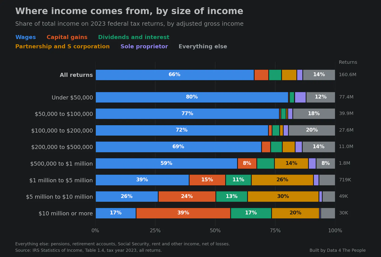
Source: IRS Statistics of Income, Table 1.4, tax year 2023, all returns. Built by Data 4 The People.
Using the visualization
1. Pick a place. Use "Place type" to choose the U.S., a state, a metro area, a nonmetro area (the rural parts of a state) or a territory. Then click the "Place" box. A list opens. Start typing a name and the list narrows, and the box fills in the rest of the best match. Press Enter or click a name.
2. Look at the curve. Each bubble is one occupation, such as cashiers or registered nurses. A bigger bubble means more people work in that job. The bubbles run from the lowest-paid job on the left to the highest-paid job on the right.
3. Compare the curve to the straight line. The dashed straight line shows what the chart would look like if every job paid the same. The curve sags below that line because lower-paid jobs earn less than their share. The shaded space between the line and the curve is the pay gap. The more the curve sags, the bigger the gap.
4. Point at any bubble. On a computer, move your mouse over it. On a phone or tablet, tap it. A box shows the job's name, how many people do it, what it pays on average, and how its pay compares with the area's average.
5. Read the numbers on the right. "What the curve says" gives five numbers for the place you picked. The first is the Gini, a single number for the size of the gap (see "How to read it" below). The next two show how much of the area's wages go to the lowest-paid half of workers and to the top-paid 10%. Then comes the average yearly wage. The last shows how much more it takes to be in the top 10% of earners than the median worker makes.
6. Light up a job group. Every occupation belongs to one of 22 larger groups, such as "Healthcare Support" or "Management." The bubble colors show the groups. Click a group's name in the "Major groups" list to highlight it on the curve. Click it again to turn it off. You can light up as many groups as you like.
7. Compare two places. Type a second place in "Compare with." Its curve appears as a dashed line, and its numbers appear next to the first place's. Click the × in the box to remove it.
8. Watch it change over time. Click "Change over time," then click Play. The chart moves through May 2013, 2016, 2019, 2022 and 2025 (metro areas start at 2016). The dotted line stays behind to show where the curve started. Under the chart, a short verdict says whether the gap narrowed, widened, or showed no clear change. You can also click any year to jump to it.
9. See what the chart leaves out. Click the "What this chart can't see" tab. It shows how much of the place's total income comes from wages and how much comes from other sources, such as business profits and investments.
How to read it
- Lorenz curve. The name for this kind of chart. It lines people up from lowest to highest pay and shows how much of the total pay has been reached at each point.
- Gini. A single number for the gap, from 0 to 1. Zero would mean every job pays the same. The higher the number, the bigger the gap. Here it measures gaps between occupations' average pay among payroll workers, so it runs lower than income Gini figures you may see elsewhere.
- Noise range. Every number here comes from a survey, so each one has some uncertainty. The noise range next to the Gini shows how much it could move from survey error alone.
- "The gap between occupations narrowed." The change is larger than the noise range and passes our other checks. "No clear change" means it does not.
- Top 10% vs. the median. The pay needed to be in the top 10% of workers, compared with the median (middle) wage. It comes straight from BLS's wage estimates for all workers in the place, so unlike the curve it also counts pay differences inside an occupation.
- Ranking strip. The row of gray ticks shows every place of the same type. The blue tick is the place you picked. Ticks to the left are more equal.
- Dollars are in the dollars of each year, not adjusted for inflation.
What it shows right now
In May 2025, across the whole U.S., the lowest-paid half of payroll workers earned 30.2% of payroll wages. The top-paid 10% earned 23.2%. The U.S. Gini was 0.2837. It took $128,560 a year to be in the top 10% of workers, 152% more than the median wage of $50,980.
Among the 393 metro areas, San Jose-Sunnyvale-Santa Clara, CA had the largest gap (Gini 0.3321), and New York-Newark-Jersey City, NY-NJ had the second largest (0.3171). In the New York metro, the lowest-paid half of workers earned 27.4% of wages.
Nationally, the gap between occupations has narrowed since 2013. Since 2022, states and metro areas are mixed: 11 states and 56 metro areas widened while 15 states and 108 metro areas narrowed. At the same time, the share of U.S. personal income that comes from wages fell from 50.5% in 2013 to 49.7% in 2024, and the share from dividends, interest and rent rose from 18.2% to 21.0%.
Where the gap is widest and narrowest
These rankings use the Gini of payroll wages across occupations for May 2025. A higher Gini means a bigger gap.
Metro areas with the largest gap:
- San Jose-Sunnyvale-Santa Clara, CA (0.3321)
- New York-Newark-Jersey City, NY-NJ (0.3171)
- Bridgeport-Stamford-Danbury, CT (0.3161)
- San Francisco-Oakland-Fremont, CA (0.3114)
- Huntsville, AL (0.3108)
- Durham-Chapel Hill, NC (0.3106)
- Atlanta-Sandy Springs-Roswell, GA (0.3100)
- Houston-Pasadena-The Woodlands, TX (0.3077)
- Slidell-Mandeville-Covington, LA (0.3052)
- Dallas-Fort Worth-Arlington, TX (0.3040)
Metro areas with the smallest gap, not counting Puerto Rico:
- Grants Pass, OR (0.2003)
- Joplin, MO-KS (0.2091)
- Lewiston-Auburn, ME (0.2092)
- Elkhart-Goshen, IN (0.2096)
- Albany, OR (0.2103)
- Kahului-Wailuku, HI (0.2105)
- Lake Havasu City-Kingman, AZ (0.2137)
- Longview-Kelso, WA (0.2149)
- Minot, ND (0.2174)
- Lewiston, ID-WA (0.2178)
The six Puerto Rico metro areas have Gini values from 0.1754 to 0.2390, but wages there are much lower overall.
Among states, the largest gaps are in New York (0.3084), Georgia (0.3039), Texas (0.3019), California (0.2984) and New Jersey (0.2978). The smallest are in Maine (0.2308), North Dakota (0.2385), Montana (0.2397), Wyoming (0.2412) and Hawaii (0.2412).
By the other common measure, the pay needed to be in the top 10% compared with the median wage, the widest gaps are in California (173%), New York (164%), Texas (158%), Massachusetts (156%) and Georgia (154%). The narrowest are in North Dakota (97%), Vermont (98%) and South Dakota (102%).
Tomorrow: five takeaways from the chart, including how home health and personal care aides grew to become the largest occupation in the New York metro.
What this page is
Every chart we publish should be something you can check, question and rebuild yourself. This page documents how we built this one: where the data comes from, every step we took, and the judgment calls we made. The code, the data and the built files are in a public repository, linked at the end.
The data sources
Occupational Employment and Wage Statistics (OEWS), U.S. Bureau of Labor Statistics. A survey of about 1.1 million workplaces that reports how many people work in each occupation and what they are paid, for the U.S., every state, every metro area and every nonmetro area. We use the May "All data" file for each year from 2011 to 2025. For each place and occupation we use two numbers: the number of jobs and the average (mean) annual wage. For the top 10% vs. median readout, we use BLS's 90th-percentile and median wages for all workers in each place.
Personal income by county (CAINC4), U.S. Bureau of Economic Analysis. BEA's estimate of all income received by the people who live in each county, split by source: wages and salaries, employer-paid benefits, business owners' income, dividends, interest and rent, and government transfers such as Social Security. We use 2013 through 2024. It feeds the "What this chart can't see" tab only.
Quarterly Census of Employment and Wages (QCEW), U.S. Bureau of Labor Statistics. A count of jobs in every county, from employers' unemployment insurance filings. We use the 2024 annual average only to measure how much metro area boundaries changed.
Individual income tax returns (Statistics of Income, Table 1.4), Internal Revenue Service. Income by source for all 2023 federal tax returns, grouped by adjusted gross income. It is used only for the chart of where income comes from, above.
BLS reference files. The official crosswalks between occupation codes (the 2010 and 2018 versions of the Standard Occupational Classification, or SOC, plus BLS's tables for its 2011 and 2019 mixed code lists), and the OEWS lists of which counties make up each metro and nonmetro area in 2016, 2019, 2022 and 2024.
How we built it
Step 0: What BLS does before we get the data
We start from BLS's published estimates, so their limits are our limits.
OEWS surveys employers, not households. It counts jobs on company payrolls. It does not cover the self-employed, owners of unincorporated businesses, or people who work for a private household. It reports pay only: wages, salaries, tips and commissions. It does not report investment income or business profits.
Each May estimate combines six survey rounds collected over three years. Neighboring years share most of their data, so the estimates are not designed to track year-to-year change. With the May 2021 estimates, BLS also switched to a new estimation method that models data for employers who were not surveyed or did not respond.
BLS withholds a number when too few employers reported it or to protect an employer's identity. When a job count or an average wage is withheld for a place, that occupation drops off the curve for that place. BLS also withholds wages above a top-code limit. The chart states how much of each place's jobs are on the curve.
Step 1: Rebuild the original
We rebuilt the February chart's method in Python. For each place, we take every detailed occupation with both a job count and an average annual wage. Total wages for an occupation are its jobs times its average wage. We sort occupations from lowest to highest average wage, add up jobs and wages as we go, and plot the running shares. The Gini is one minus twice the area under the curve, measured with the trapezoid rule.
As a check, we ran the rebuilt method on the same May 2024 data the February chart used. It matches the published figures exactly: a Gini of 0.3148 for the New York metro, and in California, the lowest-paid 40.2% of workers earning 21.7% of wages.
Step 2: Count each worker once
BLS publishes the same workers at several levels: all occupations, 22 major groups, and finer levels down to about 830 detailed occupations. The curve uses only the detailed level, so no worker is counted twice. It also uses only the rows for all industries combined.
We use the average wage rather than the median or other percentiles because BLS publishes it for more occupations. The one place we use percentiles is the top 10% vs. median readout, which uses BLS's figures for all workers in the place, so it also reflects pay differences inside occupations. BLS publishes those figures for every place in every year we use.
Step 3: Make occupations match across years
BLS names and numbers occupations with the Standard Occupational Classification (SOC). The SOC was revised in 2010 and again in 2018, and OEWS phased in each revision over a few years, with mixed code lists in 2011 and in 2019 and 2020. Along the way, some occupations were split into several codes, some were merged into one, and some moved to a different major group.
We did our best to make the years comparable, but these year-to-year changes in how BLS lists occupations complicate any comparison over time. Where BLS split or merged occupations, we combine them into one group, so every year counts the same jobs. Each combined bubble is labeled with the occupation in the group that has the most U.S. jobs, and the tooltip lists the others.
Home health and personal care aides are an example of a merge. Through May 2018, BLS published them as two separate occupations in two different major groups: Home Health Aides (31-1011), under Healthcare Support, and Personal Care Aides (39-9021), under Personal Care and Service. Starting with May 2019, OEWS publishes one combined occupation, Home Health and Personal Care Aides (31-1120), under Healthcare Support. This was not just a name change. Two occupations became one.
BLS publishes crosswalk files that show how each old code maps to each new one. We used those files to link every code across all 15 years. When codes were split or merged, all of the codes involved become one group. For home health and personal care aides, the 2013 and 2016 bubbles are the two old occupations added together, and the 2019 through 2025 bubbles are the combined code, so the bubble counts the same jobs in every year. Because jobs and total wages add up, a group's average wage is simply its total wages divided by its total jobs. The group keeps one color, Healthcare Support, in every year.
This turns about 830 codes a year into 753 to 755 groups that mean the same thing in every year. Every detailed code in every year matched a group.
One limit: if BLS withheld one of the old codes for a place in an earlier year, that year's group includes only the other code. This happens mostly in small metro areas. The change tests in Step 6 treat it like any other withheld number, and the May 2025 view is not affected, because it uses BLS's codes as published.
Catch-all codes can chain several occupations together. When BLS split its old "all other" codes in 2018, parts of them went to new occupations such as Project Management Specialists and Software Quality Assurance Analysts. Because those links connect to software developers, the largest group joins Software Developers with 13 other codes, including Project Management Specialists and Managers, All Other.
Combining codes lowers the Gini by 0.0015 for the U.S. in May 2025 and by about 0.001 for a typical metro area. In a few places with many software, management and business jobs it lowers it more, up to 0.0065 in Morgantown, WV and 0.0055 in San Jose. Because the same groups are used in every year, most of this cancels out when comparing years: for a typical place, combining codes moves the change between two years by about 0.0003, and by at most 0.0059 (Morgantown, WV). If combining would change the direction of a change, the chart says "No clear change" (Step 6). The change-over-time view states each place's own difference, which is why the Gini there can differ from the May 2025 view.
Step 4: Use years that share no survey data
Because each estimate pools three years of surveys, we compare only years that share none: May 2013, 2016, 2019, 2022 and 2025. That gives five frames instead of 13 overlapping ones.
Step 5: Keep boundaries the same
States do not change. Metro areas do. BLS redrew them in 2015 and again starting with May 2024 data. We compared the counties in each metro area in 2016, 2019 and 2022 with its counties in 2025, and used QCEW job counts to measure what share of jobs sat in counties that were added or removed. A metro area gets the change-over-time view only if that share is under 2%.
For a few metro areas that lost whole counties to a new metro area, we rebuilt the old boundary by adding the new area back in. New York lost Dutchess and Orange counties, 2.9% of jobs. Rebuilding its old boundary moves its 2025 Gini by 0.0009, so New York keeps its history, with a note.
In all, 305 of 393 metro areas have history from 2016. Nonmetro areas were redrawn in both 2018 and 2024, and we did not build history for territories, so both show May 2025 only. Metro history starts in 2016 because county lists for earlier years are not available.
Step 6: Decide what counts as a clear change
A change from the first year to 2025 counts as clear only if it passes three tests:
- It is bigger than the noise. BLS publishes a margin of error for each job count and average wage. We used those to estimate a noise range for every Gini. A change has to be more than twice the combined noise. For states and metros whose comparison crosses 2021, it also has to clear an extra 0.005, because states and metros moved more than the U.S. as a whole in the years BLS changed its method. We cannot tell how much of that was the method, so we set it aside.
- It holds when we count only occupations published in both years. This checks that the change is not caused by occupations appearing or disappearing from the data.
- It holds at full detail. The change must point the same way before and after combining codes in Step 3.
If any test fails, the chart says "No clear change."
Step 7: Fix what we found in BLS's files
We checked every occupation, nationally and in every state, in every year for one-year jumps that are too large to be real, since real change phases in over the three pooled years. Two affect this chart:
- The May 2013 national file lists 99,999 hunters and trappers. BLS did not publish this occupation nationally in 2012 or 2014, and exactly 99,999 is very likely a placeholder. We treat it as missing. It moved the U.S. Gini by 0.0001.
- In California, BLS's count of home health and personal care aides went from 170,220 in May 2016 to 545,840 in May 2017. A November 2017 UC Berkeley Labor Center report found 558,000 such aides in California in 2014, 410,000 of them paid through the state's In-Home Supportive Services program, while OEWS counted 136,800 that year. We believe OEWS began counting most of those caregivers in 2017. BLS does not note it. With this group left out of both years, every California verdict still holds. The chart notes it for California places.
Step 8: Add what the chart can't see
For the "What this chart can't see" tab, we added up BEA's county figures into the same areas the chart uses, so the boundaries match. Each place gets one bar per year showing the share of personal income that comes from wages (on the curve) and the share that does not. Below the bars, the rows break the "not on the curve" part into its sources.
Step 9: Check the numbers
Before publishing, a script recomputes the page's main numbers (the Gini, the lowest-paid half's share, the top-paid 10%'s share and the average wage) two ways, once in Python from BLS's files and once with the page's own code, and compares them for every place and year. They match. It also re-runs the February check from Step 1, and checks the BEA figures against BEA's own U.S. and state totals.
Updating
BLS publishes new OEWS estimates each spring, and BEA publishes county income once a year. We plan to add May 2026 when BLS releases it. Every number on the chart is computed by the build scripts, and every number on this page comes from their output.
Honest notes and limitations
Payroll wages only. The chart leaves out business owners, the self-employed, investment income and capital gains. Those are where most of the highest incomes are. A narrower gap between occupations does not mean overall inequality fell. The "What this chart can't see" tab shows how much income is outside the chart, not who receives it.
Gaps between occupations, not between people. Each occupation is one bubble at its average wage. Differences in pay within an occupation, such as between a new cashier and one with 20 years on the job, are not counted. That is one reason the Gini here is lower than income Gini figures published elsewhere.
Some jobs are not on the curve. When BLS withholds a job count or wage, that occupation drops off. The highest-paid jobs are sometimes withheld because of the top-code limit, which slightly understates the gap. The chart shows the share of jobs covered for each place. It is 99.9% for the U.S., about 99% for a typical state, and lower for small metro areas.
Three-year pooling. Each May estimate draws on three years of surveys. A change shown for May 2025 reflects surveys from late 2022 to May 2025.
The 2021 method change. BLS's new method in 2021 affects comparisons that cross it. Our tests set aside up to 0.005 of any state or metro change for this reason.
California's home care count. See Step 7. The home health and personal care aide bubble grows in California partly because of a counting change.
Dollars are not adjusted for inflation. The Gini and all shares are unaffected, because they are ratios.
Wages and income are measured in different places. BEA counts wages where people work and other income where people live. In areas with many commuters, the income tab can look unusual.
Reproduce it yourself
The code, the build steps and the published files are at github.com/Data4ThePeople/WageLorenzCurve. You need the OEWS May "All data" files, BEA's CAINC4 file, QCEW's 2024 county file, the BLS crosswalks and area definitions, and Python. Every step above is in the scripts, in order. If you get a different number from us, tell us, and we will look.
Common questions
Does this include business owners, the self-employed or investment income?
No. The chart covers payroll (W-2) wages only. It leaves out business owners, the self-employed, and income from dividends, interest, rent and capital gains. That is where most of the very highest incomes are: on 2023 tax returns reporting $10 million or more, wages were 17.0% of total income. So this chart cannot tell you whether overall income inequality rose or fell. The "What this chart can't see" tab shows how much of each place's income comes from outside payroll wages.
What is a Lorenz curve?
A chart that lines people up from lowest to highest pay and shows how much of the total pay has been reached at each point. If everyone earned the same, it would be a straight diagonal line. The more it sags below that line, the more unequal the pay.
What is a Gini coefficient?
A single number for the size of the gap, from 0 to 1. Zero means everyone is paid the same. Here it measures gaps between occupations' average pay among payroll workers.
Why is the Gini lower than numbers I have seen for the U.S.?
Those figures usually measure all income, for households or individuals. This one covers payroll wages only, and it compares occupations' average pay, so differences within an occupation and income from outside payroll are not included. In our view, for payroll wages compared this way, 0.30 is a large gap and 0.20 is a small one.
Does this chart show that inequality is falling?
Over the long run, it shows the gap in payroll wages between occupations narrowing: in 49 of 51 states since 2013, and in 229 of 305 metro areas since 2016. Since 2022 the picture is mixed. Among states, 15 narrowed, 11 widened and 25 show no clear change. Among 307 metro areas, 108 narrowed, 56 widened and 143 show no clear change. Either way, it does not show whether overall inequality fell, because it leaves out business and investment income. Over the same years, the share of U.S. personal income that comes from dividends, interest and rent rose from 18.2% to 21.0%.
Which city has the biggest wage gap?
By the Gini of payroll wages across occupations, San Jose-Sunnyvale-Santa Clara, CA had the largest gap of the 393 metro areas in May 2025 (0.3321), followed by New York-Newark-Jersey City, NY-NJ (0.3171) and Bridgeport-Stamford-Danbury, CT (0.3161). Grants Pass, OR had the smallest (0.2003), not counting Puerto Rico.
Which state has the most wage inequality?
New York, by the Gini of payroll wages across occupations (0.3084 in May 2025), followed by Georgia and Texas. By the pay needed to be in the top 10% compared with the median wage, California is first (173%), then New York (164%). Maine has the smallest gap by the Gini (0.2308), and North Dakota by the top 10% measure (97%).
Is wage inequality getting worse?
Measured as the gap in payroll wages between occupations, no over the long run: it narrowed in 49 of 51 states since 2013 and in 229 of 305 metro areas since 2016. Since 2022 the picture is mixed, with 11 states and 56 metro areas widening. Comparing one May to the next says little, because neighboring BLS estimates share most of their survey data, so we compare only years three apart. None of this covers business or investment income, where the highest incomes are.
Why can't I see change over time for some places?
Metro area boundaries changed in 2024. If more than 2% of a metro area's jobs are in counties that were added or removed, we do not compare it across years. Nonmetro areas were redrawn in 2018 and 2024, so they show May 2025 only. The chart says why for each place.
Why does the home health aide bubble jump in California?
BLS's count of home health and personal care aides in California rose 221% between May 2016 and May 2017, very likely because caregivers paid through the state's In-Home Supportive Services program began to be counted. Part of that bubble's growth in California is a counting change. Our verdicts for California hold with that group left out.
Are the dollars adjusted for inflation?
No. They are in the dollars of each year. The Gini, the curve and the shares are not affected, because they are ratios.
Where does the data come from?
The U.S. Bureau of Labor Statistics' Occupational Employment and Wage Statistics survey, May 2013 to May 2025, the U.S. Bureau of Economic Analysis's personal income by county, 2013 to 2024, and the IRS's income tax statistics for 2023.
How often is the chart updated?
Once a year, after BLS releases the next May estimates in the spring.
Can I embed the chart?
Yes. It is free to use and embed. Add #embed=1 to the end of the full visualization's address for the 780-pixel version shown on this page.
Support Data That Serves the Public
Data should empower people, not just institutions. Your support helps us create accessible research, visualizations, and tools that uncover economic inequality and inform better decisions.
Donate
Enjoying this post?
Tell others about it.
More articles like this
Fetching Related Posts
There are no other articles tagged with Visualization