
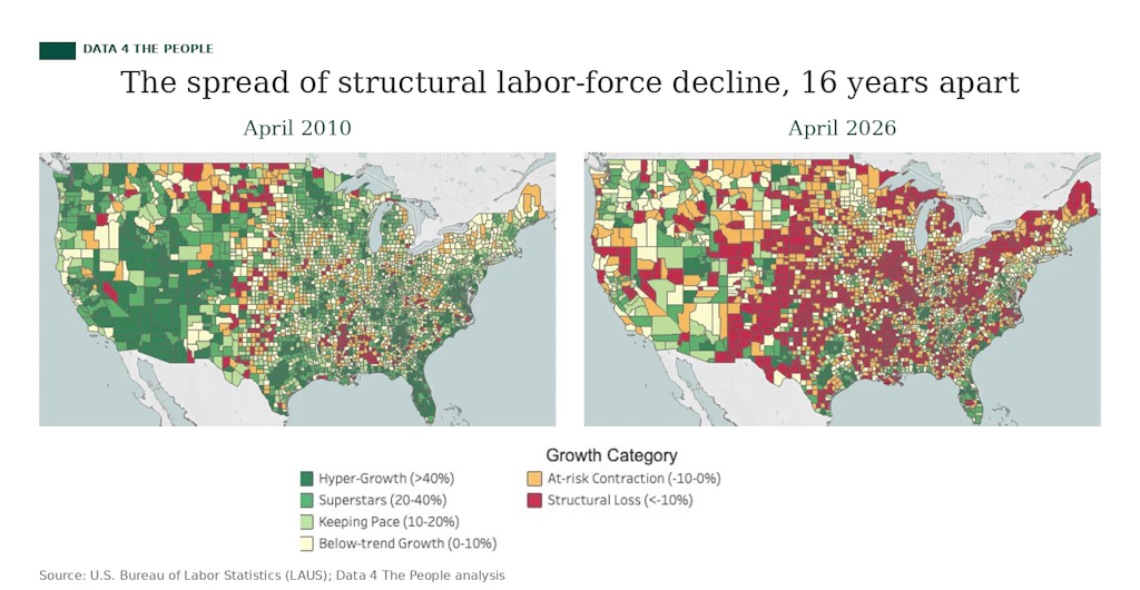
Remember that 'geographic virus'? It's accelerating.
Counties with labor forces in structural decline rise from 1,028 to 1,160 in a single year

Eric Pachman
Published
June 10th 2026
Contagion.
In March, we showed you how structural labor force decline had spread across America like a virus - from 8% of counties in 2010 to 32% by 2025. We called it a geographic contagion, and we noted it took 15 years to get there. With more data now in hand, the 2010-to-2026 spread covers 16 years - and the picture has only gotten more bleak.
Over the past year, the number of counties with labor forces in structural decline - i.e., down at least 10% over the prior two decades - rose from 1,028 to 1,160. That's 132 more counties in a single year.
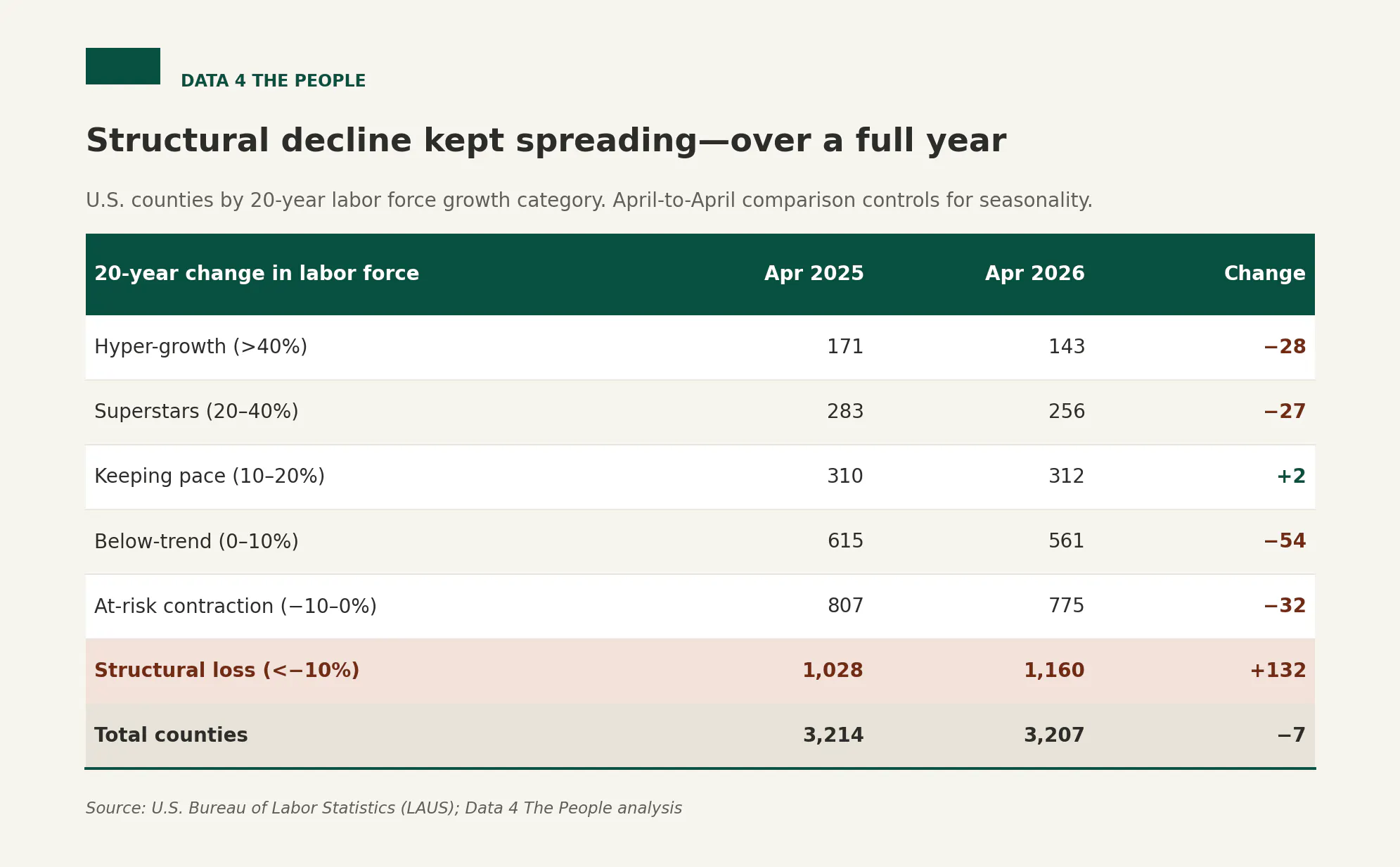
Here's what makes that number worse than it looks: it's a one-way street. Of the six growth categories, only one - "keeping pace" - didn't shrink, and it barely moved. Hyper-growth lost 28 counties. Superstars lost 27. Below-trend lost 54. Even the at-risk category, the waiting room just above structural loss, lost 32.
This is the gravity we wrote about a few months back, and it's pulling harder now. When the entire distribution shifts the same way and the worst bucket is the only one that grows, that's not statistical noise. Counties do not drift randomly across a 20-year measure.
A few places worth watching.
The new entrants
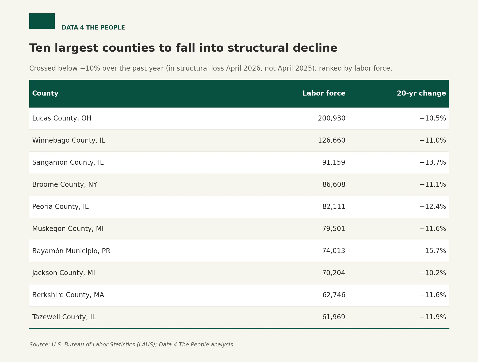
The counties that crossed into structural decline in the latest data are not just small rural outposts. Lucas County, Ohio - home to Toledo, with a labor force over 200,000 - fell below the line. So did a striking cluster of Illinois: Winnebago (Rockford), Sangamon (Springfield), Peoria, and Tazewell all crossed over together. Michigan added Muskegon and Jackson. Bayamón, Puerto Rico, with a labor force of 74,000, joined as well.
The ones getting worse
Falling into structural decline is one thing. Sinking deeper once you're there is another, and plenty of counties did. We measured which counties already in structural loss in April 2025 saw the steepest additional drop over the year, limiting the list to labor forces above 20,000 so the story isn't dominated by tiny counties where a few hundred workers swing the percentage.
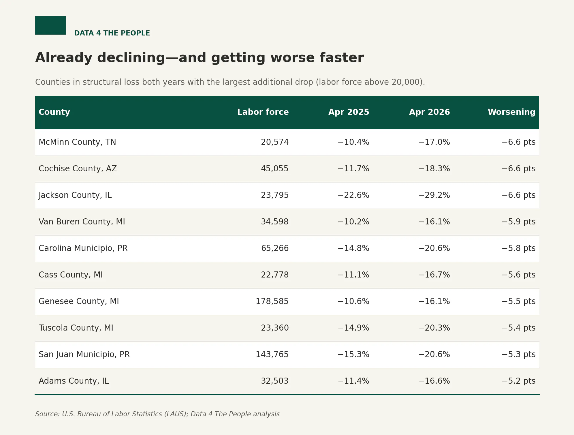
Michigan and Puerto Rico dominate. Genesee County (Flint), with a labor force of nearly 180,000, fell another 5.5 points. San Juan, Puerto Rico - 144,000 strong - dropped from −15.3% to −20.6%. These aren't fragile small towns; they're major regional economies losing ground at an accelerating clip.
The ones that "escaped" - barely
Fifty-eight counties left the structural-loss category over the year. Before you read that as recovery, look at where they went.
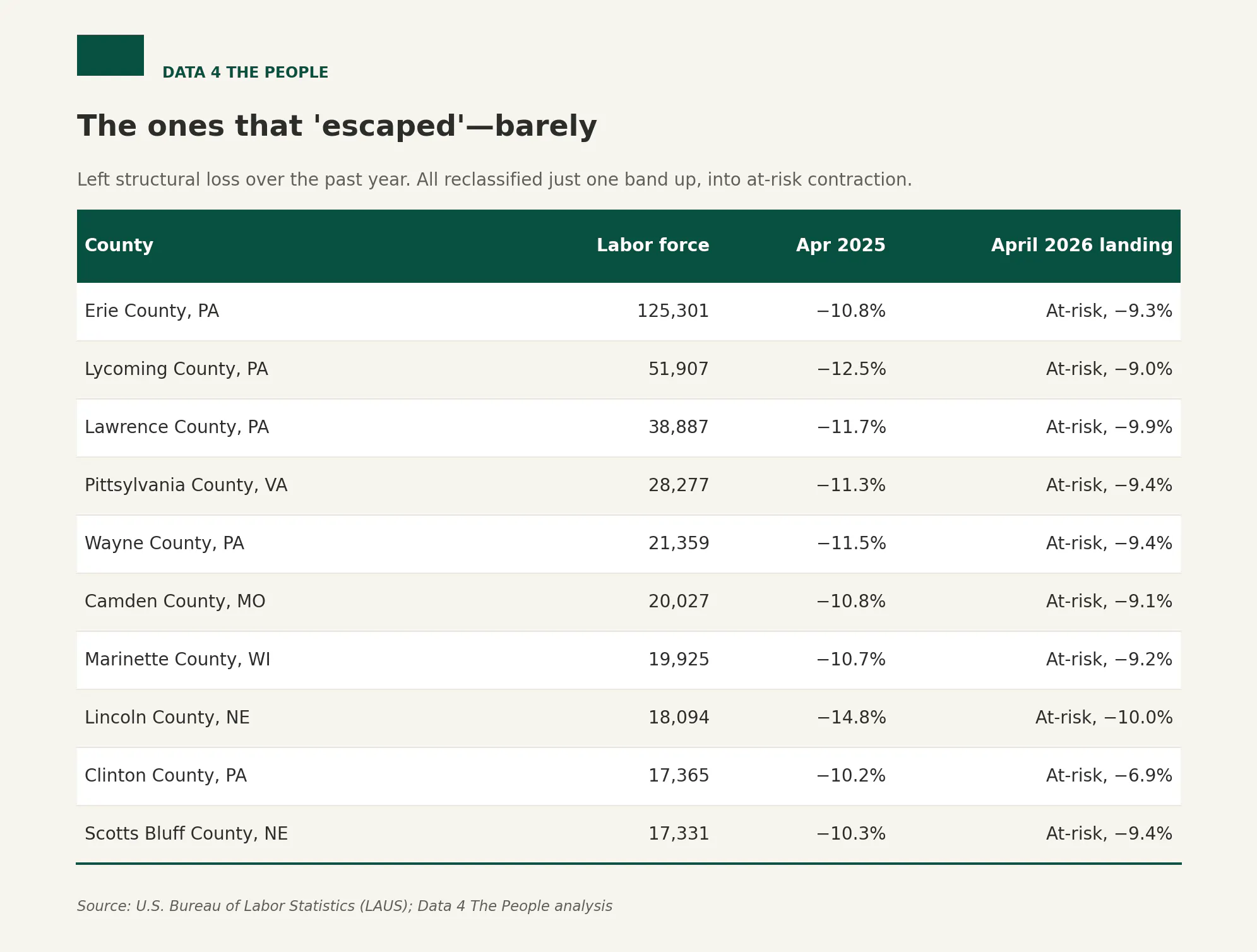
Every county that climbed out moved up exactly one band - into "at-risk contraction" - and most are sitting right on the −10% line. Erie County, Pennsylvania came off the list at −9.3%. Lincoln County, Nebraska at −10.0%, which is to say it's still essentially on the boundary. These are threshold-crossers, not turnarounds. Pennsylvania accounts for a large share of the exits, the mirror image of Illinois and Michigan on the way in. (Four other counties left the list for a less encouraging reason - they dropped out of the dataset entirely. All four are New Orleans-area parishes, a data-coverage gap rather than a recovery.)
What it adds up to
In March we promised to drill into specific geographies in the months ahead, and we still will. But the headline from this update is simpler, and it's the same one the data keeps repeating: this is getting worse, and it's getting worse quickly. A contagion that took 15 years to claim a third of American counties just claimed another 132 in twelve months.
The labor force data does not lie.
Source for all figures: U.S. Bureau of Labor Statistics (LAUS); Data 4 The People analysis. Counties are classified by the percentage change in their labor force over the 20 years ending in the stated month. The April 2025 and April 2026 universes differ by seven counties due to data availability.
Support Data That Serves the Public
Data should empower people, not just institutions. Your support helps us create accessible research, visualizations, and tools that uncover economic inequality and inform better decisions.
Donate
Enjoying this post?
Tell others about it.
More articles like this
Fetching Related Posts
There are no other articles tagged with Data 4 Thought