
Wage inequality by state and city: five takeaways
Where the pay gap is widest, what it looks like in dollars, how it has changed since 2016, and the income wage data cannot see.

Eric Pachman
Published
September 28th 2026
Yesterday we rebuilt our chart of wage inequality by city and state, which shows how payroll wages are split across occupations in every U.S. state and metro area. Here are five things it shows. It covers payroll (W-2) wages only, and the fifth takeaway shows what that leaves out.
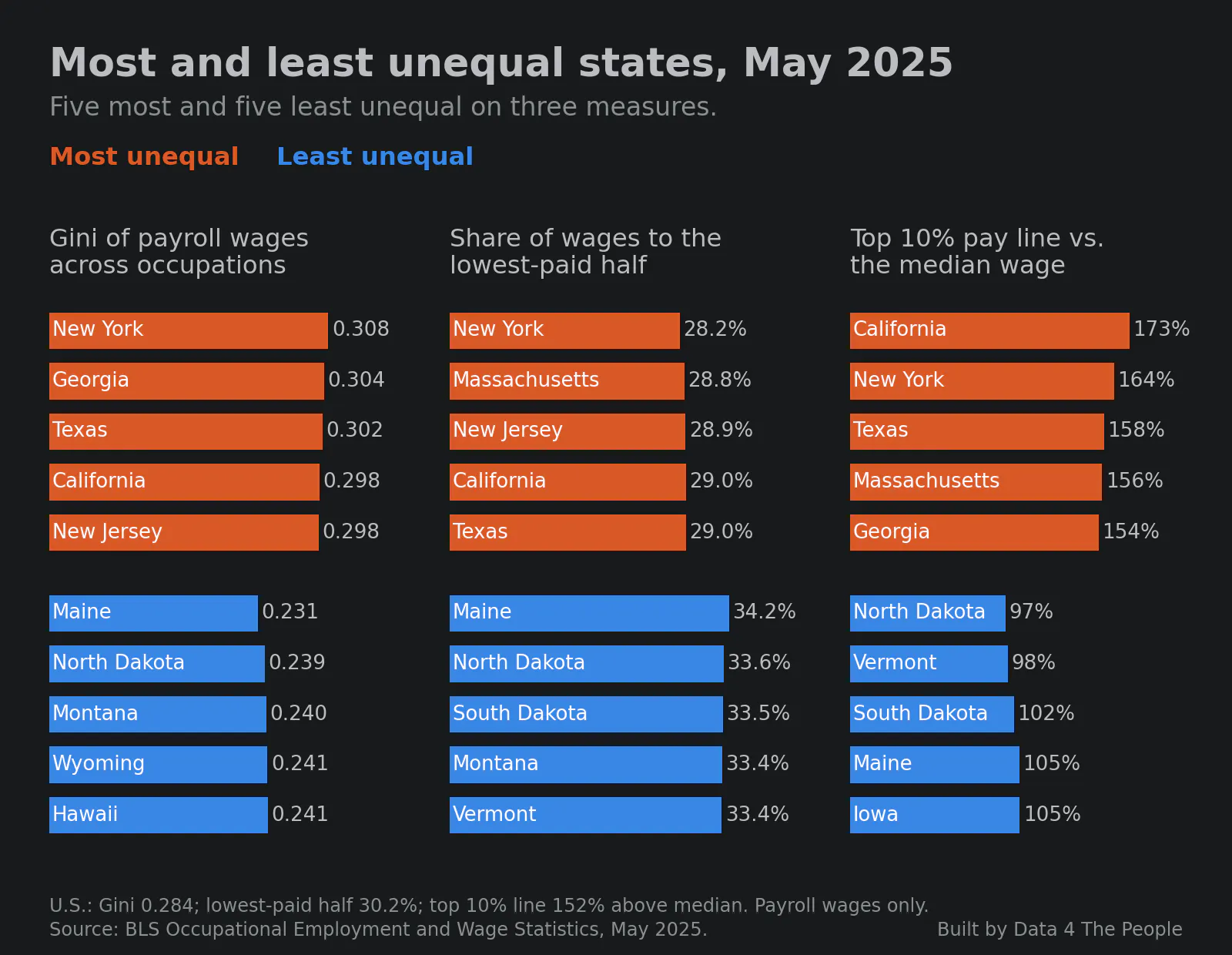
1. New York is the most unequal state on two of three measures
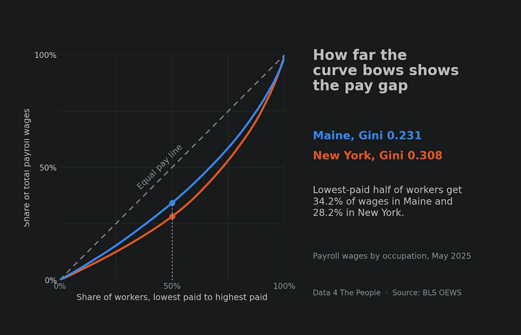
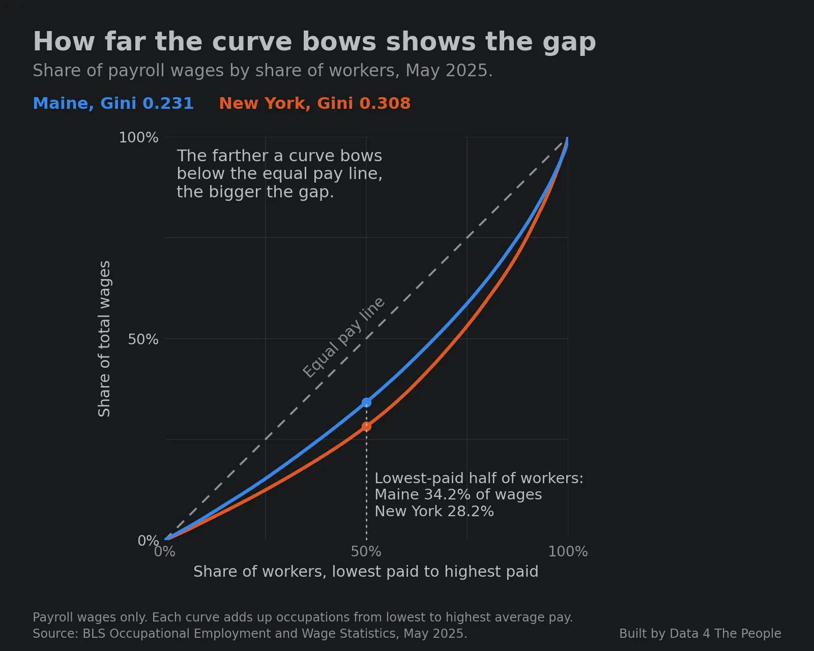
First, what the gap looks like. The chart below puts New York and Maine, the most and least unequal states by the Gini, on the same axes.
We measured the gap three ways: the Gini of payroll wages across occupations, the share of wages that goes to the lowest-paid half of workers, and how far the pay needed to be in the top 10% sits above the median wage. The chart below shows the five most and least unequal states on each.
2. San Jose, New York and San Francisco lead the metro areas
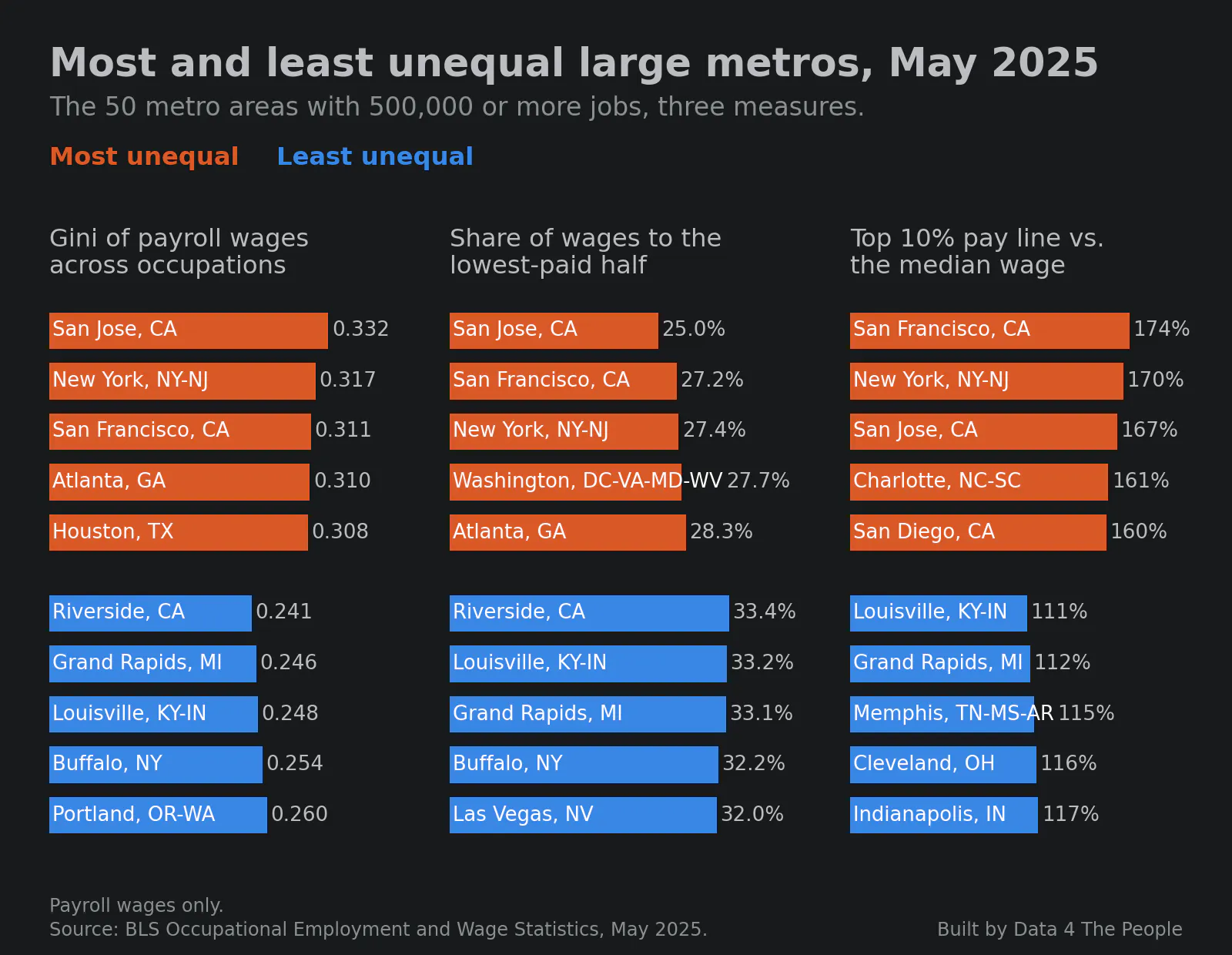
The same three measures for metro areas. San Jose, New York and San Francisco rank in the top five on all three.
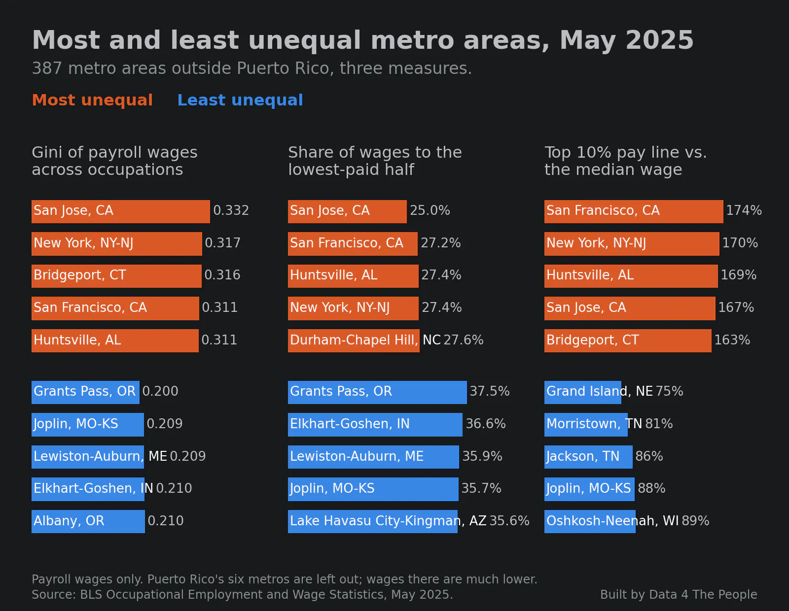
The least unequal places are all small metro areas. The chart below keeps only the 50 with 500,000 or more jobs. The most equal of them is Riverside, CA.
3. In dollars, the high end pulls away
The chart below shows the gap on a paycheck: how much more registered nurses, software developers and lawyers earn than home health and personal care aides in the same metro area.
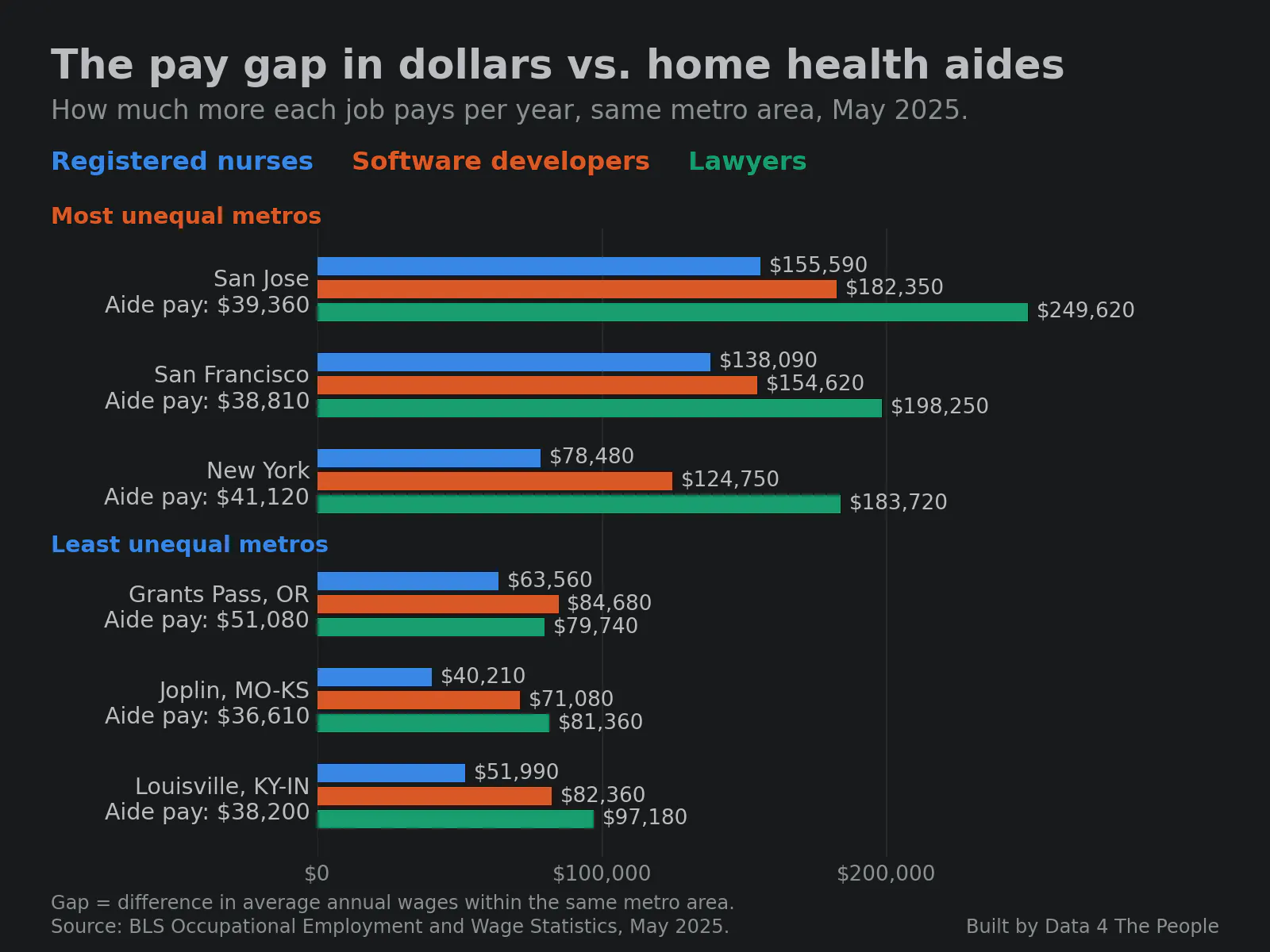
Across these six metro areas, aide pay ranges from $36,610 to $51,080 a year. The gap to lawyers ranges from $79,740 to $249,620. In the New York metro, home health and personal care aides grew from 297,950 jobs in May 2016 to 644,700 in May 2025, and are now its largest occupation.
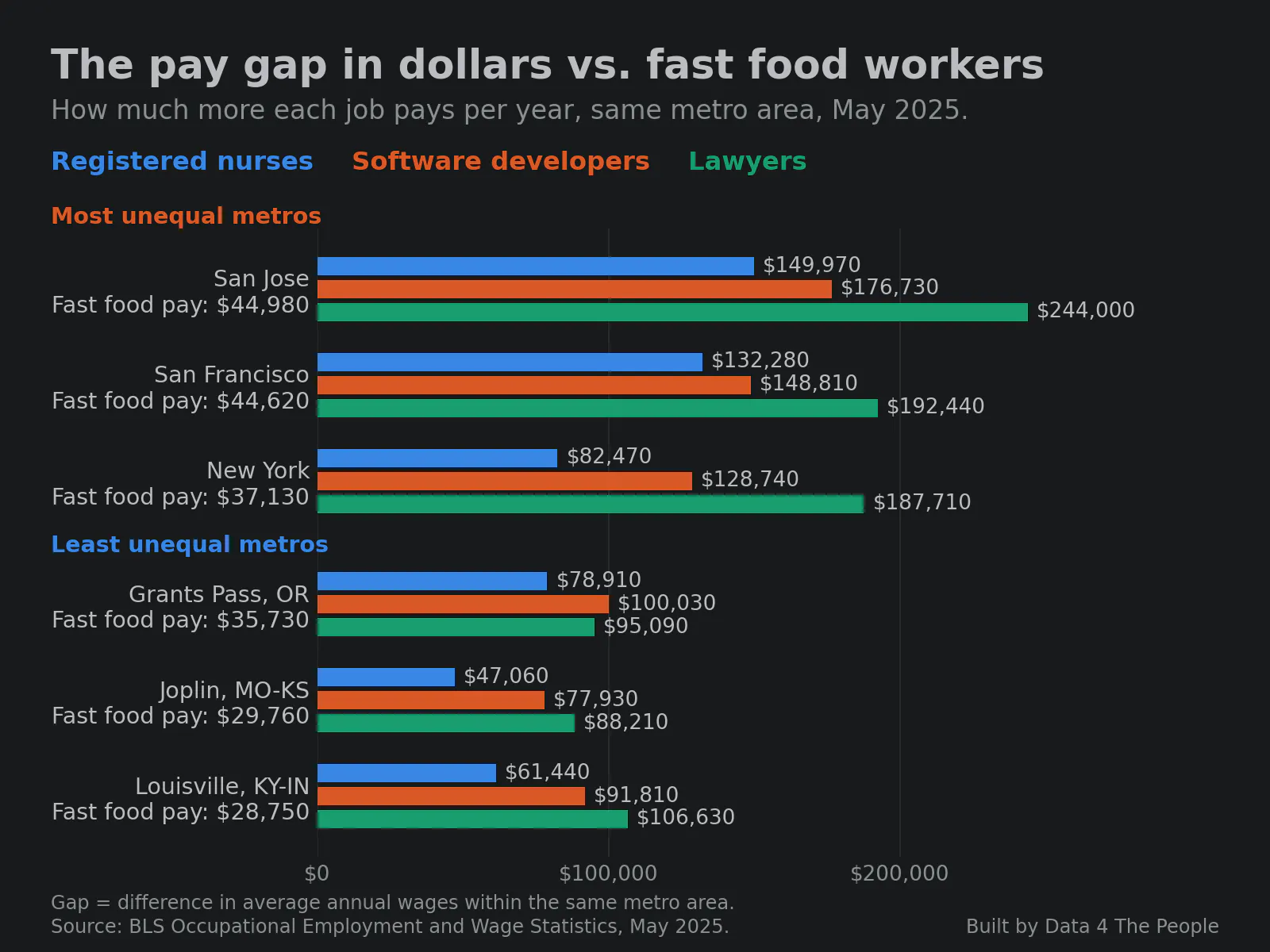
Fast food and counter workers show the same pattern. Their pay is higher in the two California metro areas, where large chains must pay at least $20 an hour, and the gap to the top is still widest there.
4. Overall, the wage gap has gotten narrower since 2016, but it is mixed since 2022
We compared each place's Gini in May 2016 and May 2022 with May 2025, counting a change only if it clears survey noise and our other checks.
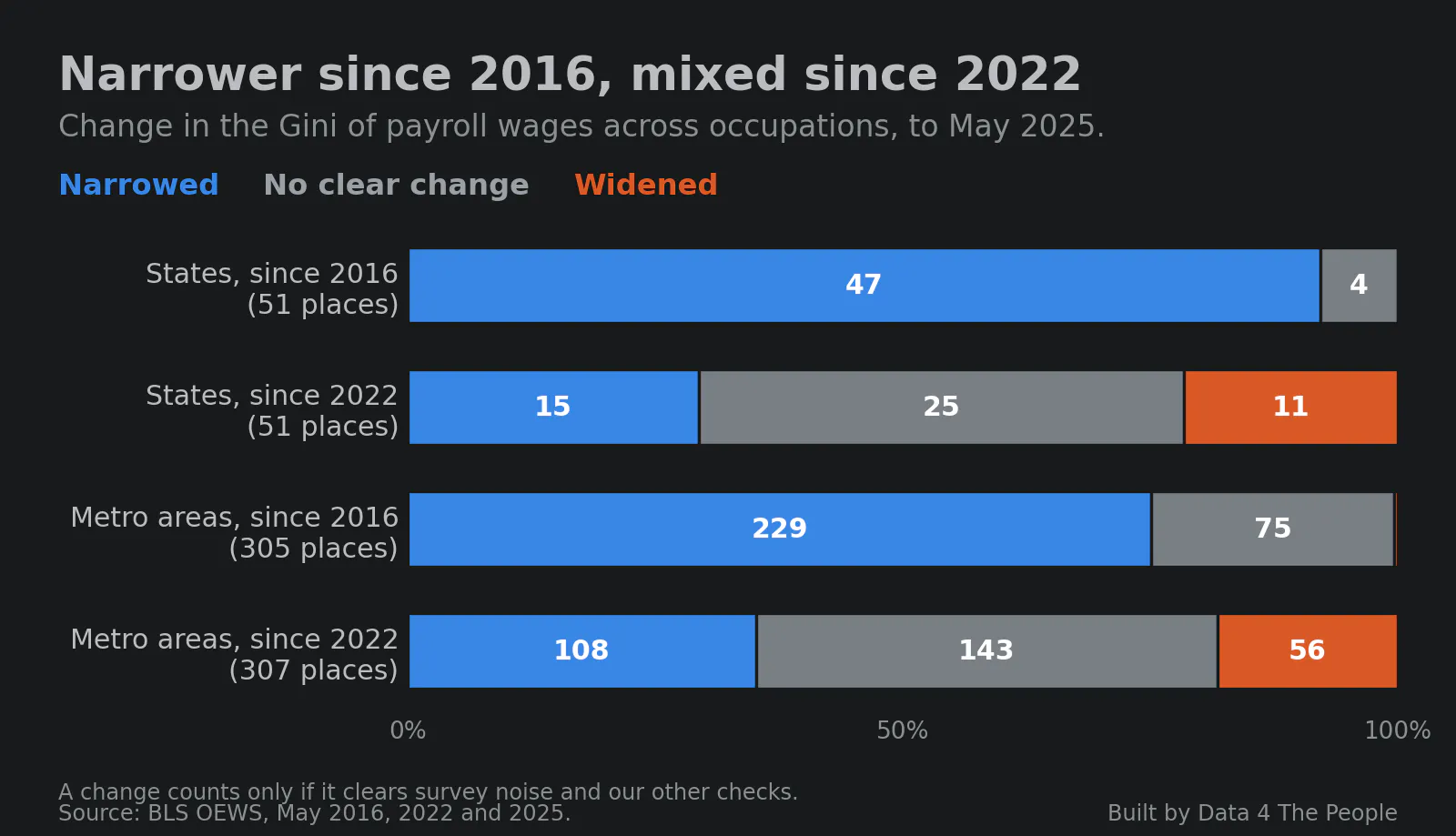
This surprised me, and I found it encouraging. By this measure, most places have become less unequal since 2016.
Since 2022, 11 states widened, led by North Dakota, Arkansas and Pennsylvania. Of the 25 largest metro areas, 23 have comparable data, and three of them widened: Austin, Dallas-Fort Worth and Philadelphia.
5. Wage data misses where the money is
This visualization looks at only one piece of the income picture, so we can't conclude that places are actually becoming less unequal. The visualization covers wages. On 2023 tax returns, wages were most of the income for most filers, but not at the top.
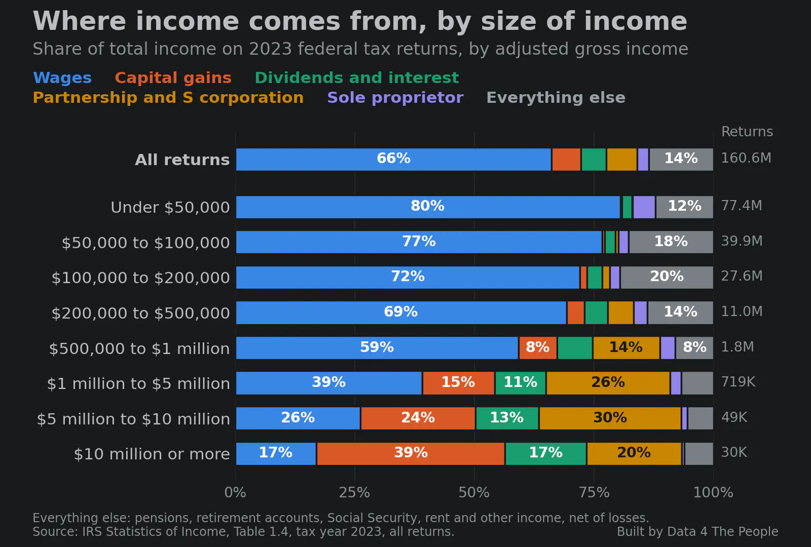
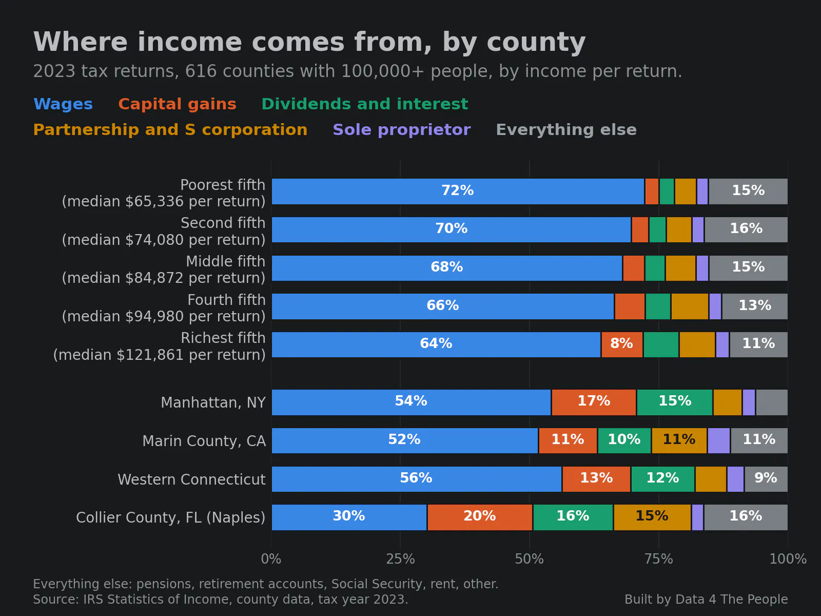
The same holds for places. In the richest fifth of large counties, wages were 64% of income on tax returns, against 72% in the poorest fifth. In Manhattan they were 54%, and in Collier County, FL, home to Naples and many wealthy retirees, 30%.
See it for your place
What this does and does not tell you
- Payroll (W-2) wages only, from the BLS Occupational Employment and Wage Statistics survey, May 2025. It leaves out the self-employed and investment income.
- The Gini here measures gaps between occupations' average pay, not between individual workers.
- Changes over time compare years three apart, so they share no survey data.
- County income is from 2023 tax returns, which leave out unreported income and gains not yet sold.
- The full method is on the chart's page.
Common questions
Which state has the most wage inequality?
New York, by the Gini of payroll wages across occupations (0.308 in May 2025). By the pay needed to be in the top 10% compared with the median, California is first. Maine is the most equal by the Gini.
Is wage inequality getting worse?
Measured as the gap in payroll wages between occupations, it narrowed in 47 of 51 states since 2016. Since 2022 it is mixed: 11 states widened and 15 narrowed. Wage data leaves out investment income, so this does not show whether overall inequality fell.
Where does the income of the richest come from?
On 2023 tax returns of $10 million or more, wages were 17% of income and capital gains 39%.
Support Data That Serves the Public
Data should empower people, not just institutions. Your support helps us create accessible research, visualizations, and tools that uncover economic inequality and inform better decisions.
Donate
Enjoying this post?
Tell others about it.
More articles like this
Fetching Related Posts
There are no other articles tagged with Data 4 Thought