
Why the government's preferred inflation rate has nothing to do with your life
It throws out the prices you see every week - and keeps one nobody is ever charged.

Eric Pachman
Published
June 12th 2026
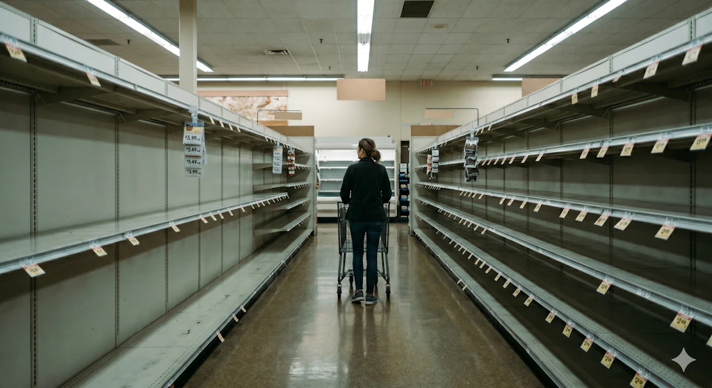
This is the world our economists measure - with the things you buy every week taken out of the picture. (AI Image generated by Gemini)
Data 4 Investors, Not People
Take a look at some of the prices Americans have watched climb over the past year. These numbers were all just released by the Bureau of Labor Statistics two days ago:
- Gasoline: +40.5%
- Tomatoes: +32.0%
- Lettuce: +24.9%
- Coffee: +17.5%
- Uncooked beef steaks: +14.8%
- Candy and chewing gum: +9.3%
- Electricity: +5.9%
What do these items have in common?
Two things. First, they are things we buy nearly every week: the fill-up, the grocery run, the electric bill. They are the prices you watch with your own eyes, more often than any other prices in your life.
Second, they are precisely the prices the body setting our monetary policy has largely decided to ignore.
That's not an accident. It's the design of the number the Federal Reserve watches most closely: core inflation, the Consumer Price Index with food and energy stripped out. The case for it sounds reasonable. Food and energy prices bounce around. They spike on a war, a drought, a refinery outage, things a central bank can't fix with interest rates. So you strip them out to see the "underlying" trend. Clean signal, less noise.
We want to take that logic seriously, and then take it apart. Because when you actually measure the volatility, "too volatile" isn't really the rule being applied. Something else is.
Where core came from
This idea wasn't born in a statistics seminar. It was born in a hunch.
In 1973, food prices were surging, and Fed Chairman Arthur Burns decided the cause was a fluke: an El Niño event had wiped out the Peruvian anchovy harvest the year before, driving up the price of feed, and then of beef, poultry, and pork. A one-off. So Burns instructed his economists to pull food, then a quarter of the entire CPI, out of the index so he could see the "real" trend underneath. One of those economists, Stephen Roach, later wrote that they didn't know it at the time, but they had just invented the core inflation rate.
The academics formalized it afterward. But the origin matters. Core didn't start as a careful finding that food and energy are statistically special. It started with a Fed chairman who didn't like what the headline number was telling him, and went looking for a number he liked better. Fifty years later, we're still using it. So let's check whether the premise holds.
What "volatile" actually looks like
Here's the volatility of seven things Americans pay for, measured the honest way: the standard deviation of each one's year-over-year inflation rate over the last twenty years. Bigger bar, choppier price.
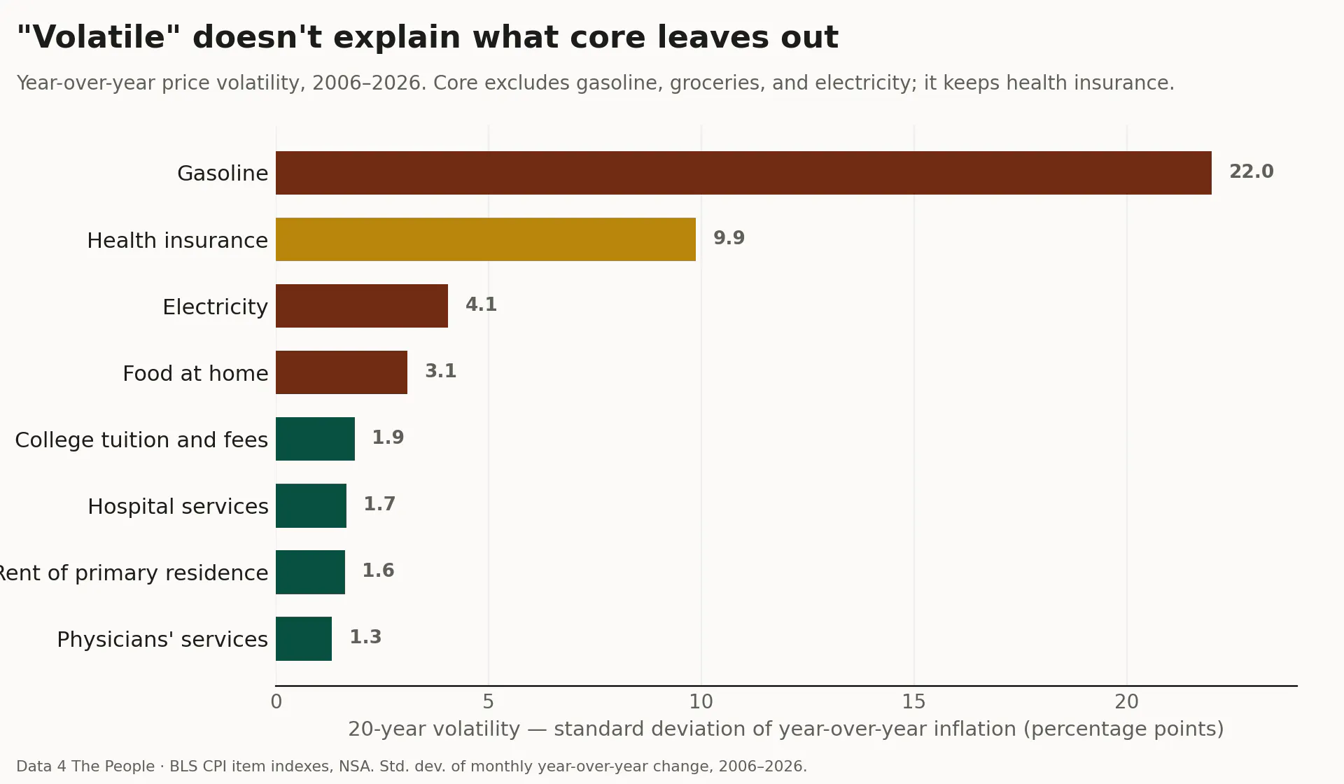
Start with the thing core gets right. Gasoline is genuinely, wildly volatile, with 22 percentage points of standard deviation and yearly swings from down 43% to up 60%. If your goal is a smooth trend line, gasoline is a real problem, and pulling it out is defensible.
But here's where the logic breaks. Food at home isn't gasoline. Groceries come in at 3.1 points, about one-seventh as choppy as gas. They don't belong in the same bucket. One is a genuine outlier; the other sits in the normal range with rent and tuition. The same goes for the electric bill: classified as "energy" and thrown out, yet at 4.1 points it's one of the steadiest recurring bills in American life, about one-fifthas variable as gas.
And then there's the number that gives the game away.
The number core keeps
Look at health insurance: 9.9 percentage points of volatility, swinging from down 37% to up 28%. That's the second choppiest thing on the chart, more than three times as volatile as the groceries core throws out for being unstable.
Yet - Health insurance stays in core.
So the "we exclude things because they're volatile" story collapses on contact with its own data. If core actually sorted by volatility, health insurance would have been one of the first items out the door. It sorts by something else: whether the price is the kind of thing the Fed and markets have decided to look past ~50 years ago. And what they look past happens to be what you encounter most often in your actual life.
The visibility problem
You buy gas once or twice a week, the number lit up in two-foot-tall digits on a sign you drive past whether you stop or not. You buy groceries every few days and watch the total climb at the register. Once a month, the electric bill arrives, attached to keeping the lights on. These are the most frequent, most visible, most felt prices in American life. When people say "everything is more expensive," they mean the pump, the cart, and the bill.
Core inflation removes all three. It has, over time, become the inflation rate devoid of our lived experience - how prices are moving if you ignore the prices you see most often. For a central banker watching a stable trend, maybe that's a defensible abstraction. For a family trying to make it to the end of the month, it's a number engineered to not describe their lived experience.
And the electricity exclusion is about to matter more than ever. Two forces are bearing down on power bills at once. The U.S. is exporting record volumes of liquefied natural gas, pushing up the gas prices that set electricity costs, while data centers powering AI are driving demand to record highs, projected to more than double by 2030. One of the most predictable cost increases coming at households runs straight through the electric bill. Core is built to not see it. As those bills climb, it will keep reporting the "underlying" trend as if the lights were free.
The price nobody pays
And then, having removed the prices you see most often, core leans hardest on a price you never see at all.
The single largest line item in the CPI is Owners' Equivalent Rent, or OER. It's 26% of the headline index, and because stripping out food and energy shrinks everything else, it looms even larger inside core: a full 34% of it. Add actual rent, and shelter alone is more than 40% of core.
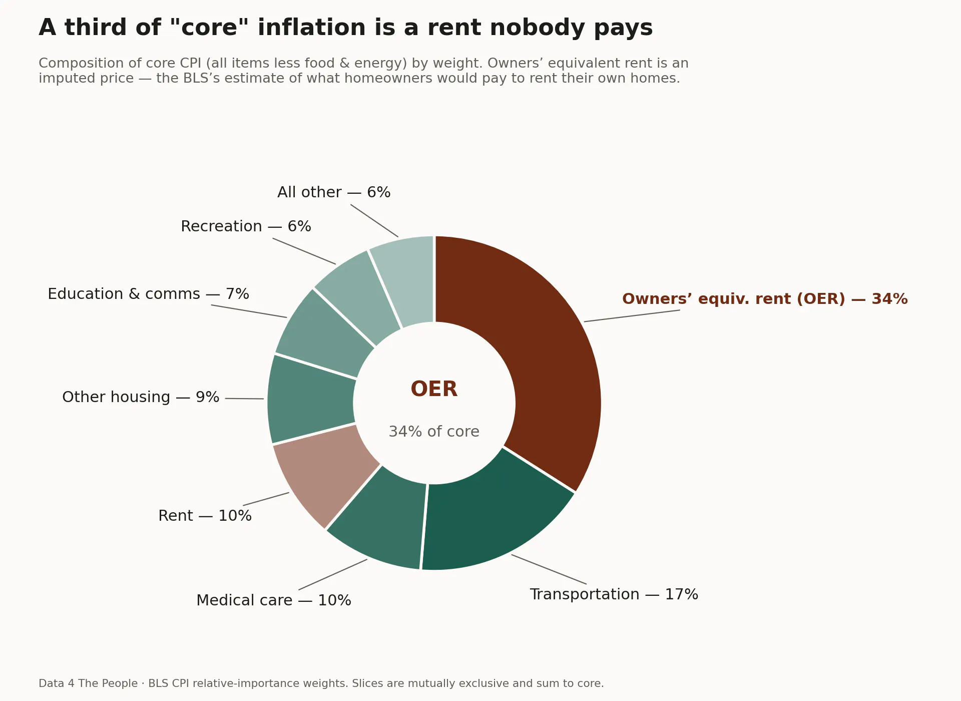
So what is OER? It's the BLS's estimate of how much homeowners would pay to rent their own homes from themselves. It is not a bill. No money changes hands. It's generated by surveying homeowners and asking what they think their house would rent for. That guess - about a price never charged and never paid - is the heaviest single input into the inflation rate that drives Fed policy.
Sit with the full shape of it. The number markets treat as the truest read on inflation:
- throws out gasoline, the most visible price in the country,
- throws out groceries, the most frequent,
- throws out electricity, a steady monthly bill that's about to climb,
- keeps health insurance, three times more volatile than the groceries it excluded,
- and rests more than a quarter of its weight on a rent nobody actually pays.
That is not a measure of what inflation feels like. It's a measure built for someone who needs a smooth series to model - an investor, a trader, a policymaker watching a trend line. Which is fine, as far as it goes. Tools get built for the people who use them.
We'd just ask that we call it what it is.
Core inflation is Data 4 Investors, not 4 People.
We've seen this movie before
If this pattern feels familiar, it's because we've written about it before, in a different context, with the same disease.
Back in 1963, a Social Security economist named Mollie Orshansky built a formula for measuring poverty: take a basic food basket and multiply by three, because food was about a third of a family's budget at the time. A reasonable approximation, for 1963. That formula became the Federal Poverty Level, and more than sixty years later it still decides who qualifies for Medicaid, SNAP, ACA subsidies, and dozens of other programs. It has never been rebuilt. It just gets grossed up for inflation each year and sent back into a world that's changed beyond recognition. Food is now about an eighth of household budgets, not a third. Shelter, healthcare, and childcare grew far faster than groceries, and none of that is in the formula.
Core inflation is the same disease in a different organ. Both are government measures, frozen in an old assumption the world has long since outgrown. Both quietly decide who and what counts as "real." And in both cases, the people harmed by the staleness are the same: the ones living closest to the edge, for whom the gap between the official number and the lived number is the difference between qualifying and not, between keeping up and falling behind.
This is what we keep finding, project after project. Our government sees what it built itself to see. It does not update with the times, not with how it measures poverty, not with how it measures inflation, and it leaves the cost of that inertia to the people least equipped to pay it.
The honest measures exist. The headline number, for all its noise and measurement error, includes the things you bought this week. The Supplemental Poverty Measure, for all its complexity, tries to count what poverty actually costs today. We just don't lead with them. We lead with the calm, frozen, convenient ones, and then wonder why so many Americans feel like the official story has nothing to do with their lives.
Maybe it's time we measured the world as it is, for the people who actually live in it. Not the one we froze in amber decades ago, for the people who find it more convenient and lucrative to pretend we live in an alternate reality.
For informational and educational purposes only. Volatility measured as the standard deviation of monthly year-over-year price change, 2006–2026, using BLS CPI item indexes (not seasonally adjusted); food at home is series CUUR0000SAF11 and electricity is CUUR0000SEHF01. Electricity and piped gas service are classified as energy and excluded from core; water, sewer, and trash remain in core. CPI weights reflect the most recent relative-importance figures. This is analysis, not investment advice.
Support Data That Serves the Public
Data should empower people, not just institutions. Your support helps us create accessible research, visualizations, and tools that uncover economic inequality and inform better decisions.
Donate
Enjoying this post?
Tell others about it.
More articles like this
Fetching Related Posts
There are no other articles tagged with Data 4 Thought