
American Income Fragility
Visualizing the Struggle to Build Wealth in America

Eric Pachman
Published
January 30th 2026
The purpose of Data 4 The People is to create interactive data visualizations to help us understand other people’s life stories and circumstances. My hope is that I can create tools that can build empathy for others, helping their stories become our stories.
To accomplish this, I have decided to take a different approach with this report. It is not an academic research report. It is not investigative journalism. It is not a wonky data-nerd policy piece laden with sarcasm and pop-culture references. My writing has fallen into one of these three buckets for the past decade now. Yet, people still drift apart.
So, today I will try something new. I will use the data I am giving you to tell a story. Is this story true? Yes and no. Can it help build bridges between us? I really hope so.
All I ask is that you give this new approach a shot, and as always, please send me feedback!
It has taken me over half my life to fully embrace that the world runs on stories.
Stories fuel the desire to expel all immigrants, and also fuel the desire to defend them.
Stories are the enablers of wars and genocides, and also the enablers of community service and peaceful activism.
The truth is that stories are both the problem and the solution. We cannot throw out the stories that divide us as we may also lose those that bring us together.
So long that our human brains are not connected to the Pluribus hive mind, we will rely on stories to dictate our actions.
If we give in to this fundamental truth, we then must first ask, where do our stories come from?
- Religion? Yes.
- Our families and upbringing? Yes.
- Our friends and social groups? Yes.
- Traditional media, social media, podcasters, and influencers? Yes.
- Your employer (and your financial incentives)? Yes.
- Your neighbors? Yes.
- Science and research? Yes.
- Data analysis? Yes.
Our stories come from just about everywhere. As a data analyst you may expect me to say that a story coming from data is better than, say, one coming from an influencer. This is not necessarily true. Data analytics has the potential to offer a more complete picture of reality than other story-generating experiences (it is experiential science!) but also carries the potential to be manipulated in very dangerous ways if approached with any bias. In other words, if you bring a fixed view of the world to any data analytics exercise (maybe conditioned by your financial incentives) you can find “evidence” of anything you are looking to prove. You just have to twist the data in just the right way, and viola, you will find evidence of just about anything (e.g., there is no problem with healthcare prices in the U.S., the U.S. economy is currently “booming,” inflation is under control, jobs are not being impacted by AI).
But what if we approach data analysis with a beginner's mind? Can we drop our conditioned views before we open Excel, Tableau, or SQL? That’s when data analysis has the potential to connect rather than divide.
And in my experience, there is no form of data analysis that maximizes this potential more than data visualization. This is because a well constructed data visualization has the potential to tell thousands of stories all at once. I stress the word potential here. On its own, a data visualization is no different than a piece of art hanging on a wall, or for that matter, a rock. When it comes to art, it is up to the viewer to ascribe its meaning and value. Such is true with data visualization. It is up to the user to ascribe meaning to the data by exploring the visualization with an intention to learn.
Ground rules for reading this report
That said, if you choose to continue reading this report, I will ask two things from you:
- Try to set aside what you believe. Read this report with beginner’s mind and an intention to learn, and
- Let the story I tell below become your own. Put yourself in the shoes of this fictional (but very real) person. How do you feel? What are your worries, fears, and anxieties?
If you cannot commit to doing these two things, what follows is a pointless story, and the data visualization I will present is no more valuable than a rock. Don’t waste your time reading any more of this report.
For the rest of you who are willing to follow these two rules, let’s start living the data on how different income levels compare to poverty, and how much “breathing room” we all have before we approach what the government considers to be “poverty” for where you live.
Visualization: The Single Income Stress Test
Below you will find my latest visualization. As the title implies, this shows how sufficient a single-income is to support a family of four.

My definition of "sufficient" is the poverty threshold for a family of four, as per census.gov. Clearly, this is a very aggressive measure of sufficiency, that is most likely, completely unrealistic.
To illustrate, I'll tell you a story.
A note on this story: while the character ("you") may be fictional, all the data presented is real. Fact check the data yourself if you like. This makes the story representative of what life would be like for you had you been in these circumstances. Then consider that millions of Americans are living some version of these circumstances each day.
Raising a family in Salt Lake City, Utah at the Poverty Threshold
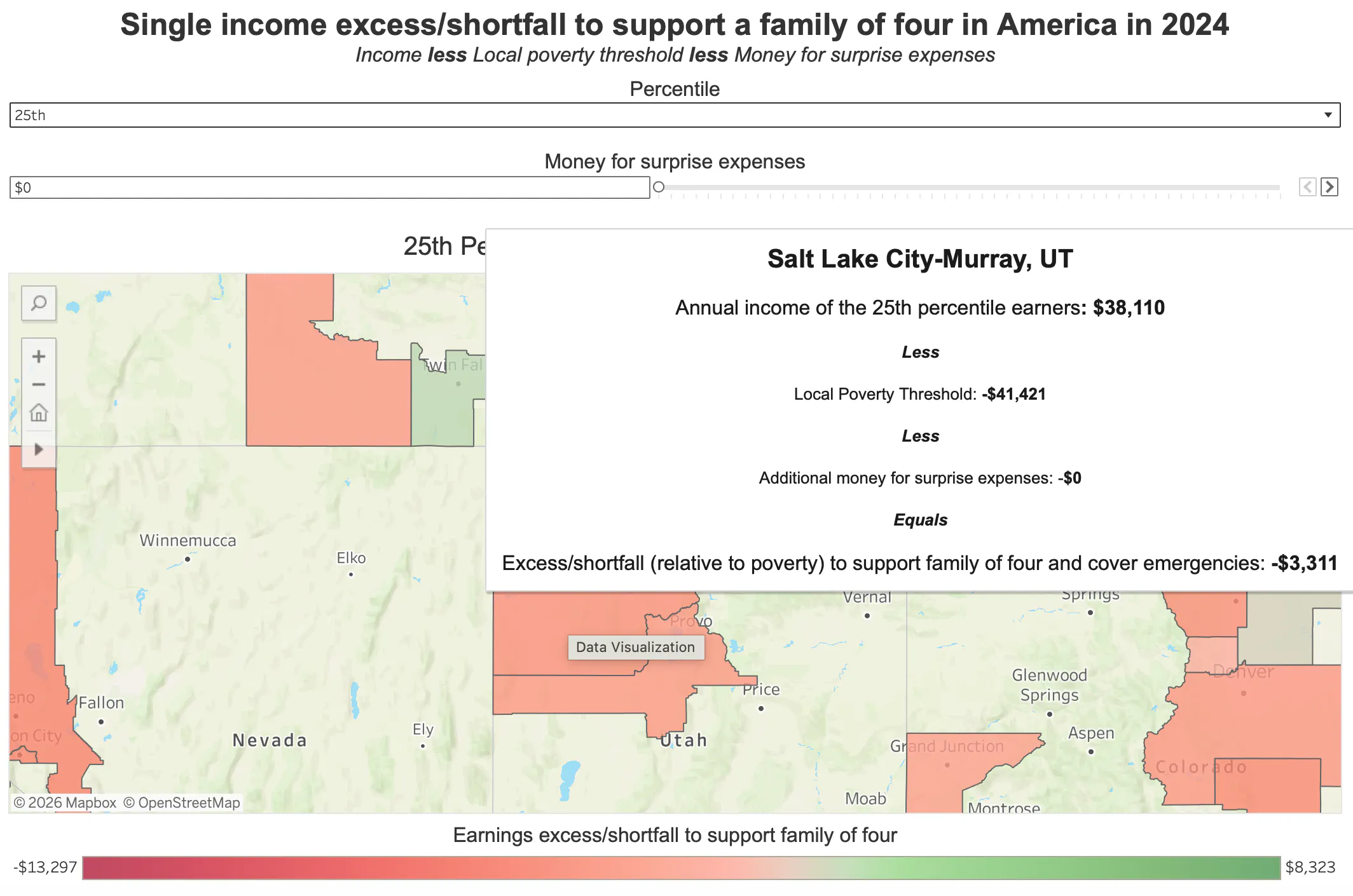
Let’s say you live in Salt Lake City and are trying to support a family of four on a single income which pays right at the $41,421 poverty threshold (which I learned by hovering over this city in my visualization).
According to the USDA, the absolute bare minimum you can spend on groceries (the “Thrifty Plan”) to provide healthy foods for a family of four is $1,002 a month.
Stop right here and check your grocery bill for last month, especially if you have a couple kids (bonus points if one of them is a growing teenager that eats like a vacuum cleaner).
I'll wait...
What did you find?
How realistic is $1,002 a month?
I have personally spent countless hours trying to minimize how much my family spends on groceries for a family of four, especially since I launched this website. After switching most of my grocery shopping to Aldi and sticking to their white-labeled products rather than name brands (a requirement to combat food inflation IMO), I still try to deal hunt at multiple other grocery stores, which takes considerable time - something a family living in poverty doesn't have. No matter how hard I try, I can’t get my “healthy food” grocery bill under $1,750 a month. So I am very skeptical about the veracity of the USDA’s $1,002 per month estimate. Is it based on real life 2026 experience, or was it cooked up (pun intended) by some data analyst (yes, like me) who has no sense of what it's like to live in poverty?
Anyway, let’s for now assume that you live in a magical world where you can get all the healthy groceries you need for ~$12,000 a year. Sadly, living in poverty in Salt Lake City makes you too “rich” to qualify for food assistance through the SNAP program. Utah strictly enforces a cut off of 130% of the “Federal Poverty Level” (which unlike the census data, is unadjusted for cost of living). You make $41,421, above the $40,560 maximum gross income to qualify for SNAP. In other words, unless you find a local food pantry to help, you are on the hook for at least $12,000 a year to feed your family.
But you need a place to live too. As of January 2026, median rent for a two bedroom apartment in Salt Lake City will run you $1,550 to $1,800 a month. But you want your kids in one of the top school districts so they can have a better life than yours. That’s going to put you in the $2,000 per month price range. But only the best for your kids, right? So, you shell out $24,000 a year. Including groceries and that brings your expenses to $36,000, leaving you with just $5,421 for all other living expenses.
But again, this assumes that you actually live in USDA’s fairytale land where you can get all the groceries you need for $1,002 a month. What if reality is closer to $1,500 a month? Your cost to shelter and feed your family would be $42,000 a year. That’s more than you make (in a zero tax world!) but you also need a cell phone, internet, health insurance, and other necessities, not to mention expenses that could enhance your quality of life like a gym membership or dining out once a week with friends. So you turn to credit cards just to sustain your family, which adds more expense in the form of a predatory interest rate (24-26% APRs if you have an average/fair credit rating).
Still with me? You see the point of this thought exercise? If we take our lived experience and apply it to these numbers, we can start to feel how impossible it must be to live in the poverty threshold in a real U.S. city with a real U.S. income and real U.S. expenses.
Now go back to the data visualization and change the “Percentile” drop down to ”25th.” This will show you the 25th percentile income in nearly 400 different metropolitan statistical areas (MSAs) across the U.S. Hover over Salt Lake City - Murray, UT and you will learn that the 25th percentile income in this area was $38,110 per year, below the poverty threshold. In 2024, there were 816,680 total employees in this MSA. This means that 204,170 workers in your city would be worse off than you if they are supporting a family of four on a single income.
Source: Data 4 The People
The Hamster Wheel: More money does not equal more prosperity in America
But our story gets better for you, because you are the essence of what America stands for - grit, resilience, and courage. So, you spend your nights attending a local vocational school to switch professions to one that will pay you the median income in Salt Lake City, which my visualization shows you is $51,430. The vocational school is going to run you between $3,000 to $5,000, plus the childcare expenses while you take classes at night. You do a bit of research (as I just did) and realize that could cost you $8,000 during this one year program. So, you need to find around $12,000 to make this happen. Maybe you turn to credit cards for this. You realize this is going to be costly as you will have to pay $3,000 a year in interest on this, but what other choice do you have?
So, you take the plunge, graduate, and find a job paying $51,430. You feel accomplished as you now make more money than half of the people in your city. But your base expenses have now increased by $3,000 to $45,000 a year (rent, interest, and groceries - assuming the non fairy tale grocery prices). You still only have $6,430 for everything else, and that’s before you account for higher taxes. And maybe you feel that your standard of living should increase a bit, right? A nice dinner once a month? Maybe a vacation? Is that too much to ask?
Maybe not, if you are lucky. But unfortunately you don’t stay lucky. Something happens. Your car needs a new transmission. Your son needs an expensive procedure and you haven’t yet met your sky-high health insurance deductible. Your parents are old and can’t take care of themselves, but they don’t have the savings for an assisted living facility so you need to chip in. Any one of these things can set you back a few thousand dollars or more. If you get really unlucky, several can hit in a single year, which would force you deeper into debt.
Economist poverty calculation <> Real life poverty
The concept of emergency funds is not one that is talked about enough, in my view. Economists concoct numbers on paper that in theory may make sense. But there is a difference between theory and practice. As an engineer, I understand this. Systems must be designed to handle real life volatility, variability, and unknowns. This is what makes a system robust. It must be able to handle shocks.
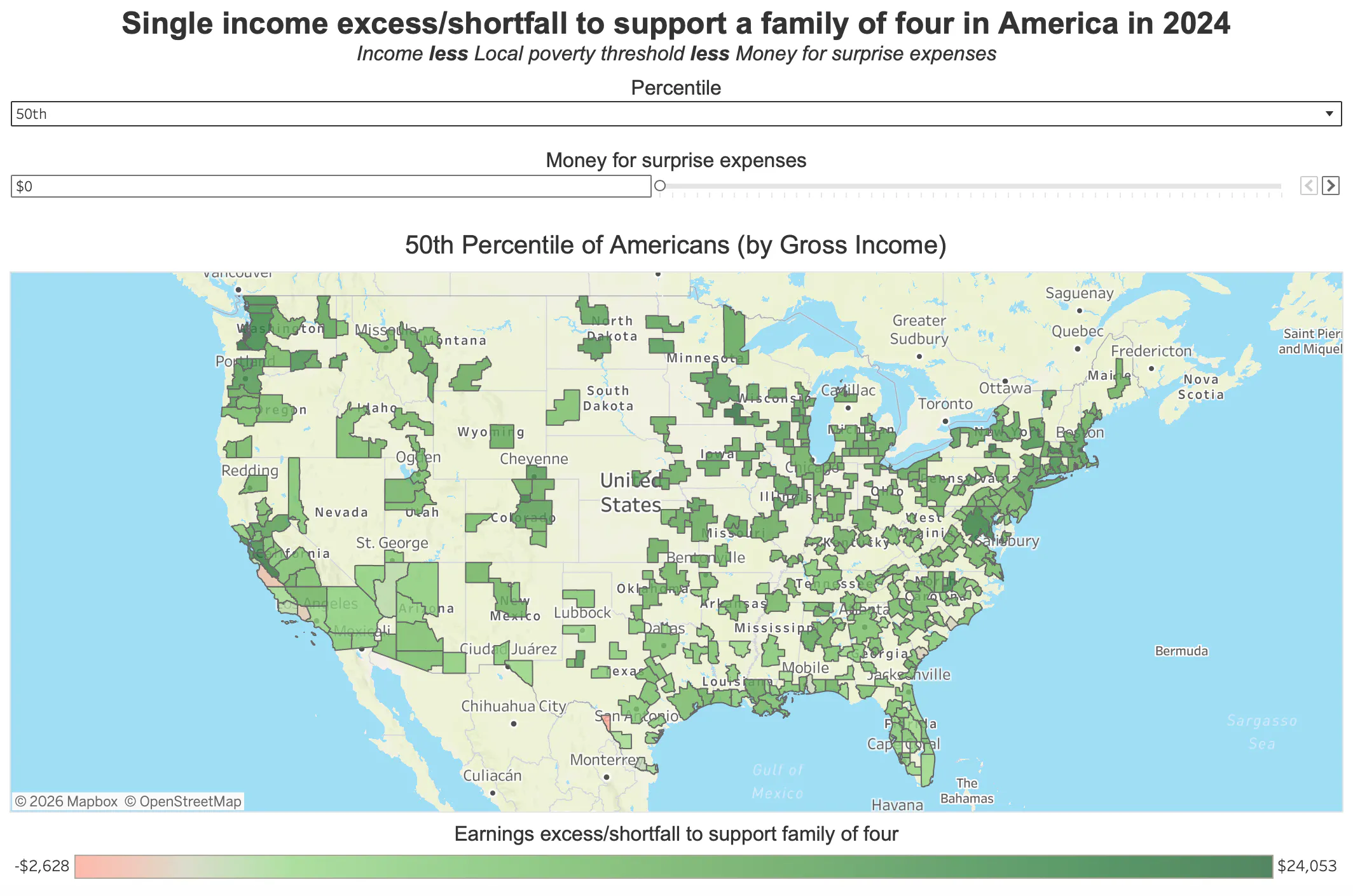
This is why I built a “shock absorber” function into my visualization. You will see a slider called “Money for surprise expenses.” I’ve designed it so you can increase or decrease it by $500 increments. Slide to right and surprise expenses increase, slide to the left and they decrease. The colors in the visualization are based on the money a single-income family of four would have left over after deducting the poverty threshold expenses AND money for surprise expenses from each MSA’s income. To illustrate, first select the 50th percentile and set the Money for surprise expenses to zero. Now look at the chart. Besides a few counties in TX and CA, it’s all green. That means if you can figure out how to support a family of four on the poverty threshold expenses (a near impossible feat based on learnings from this story so far) then you are good. You should have spare money to save, or take a vacation, or partake in the American dream in some manner.
Source: Data 4 The People
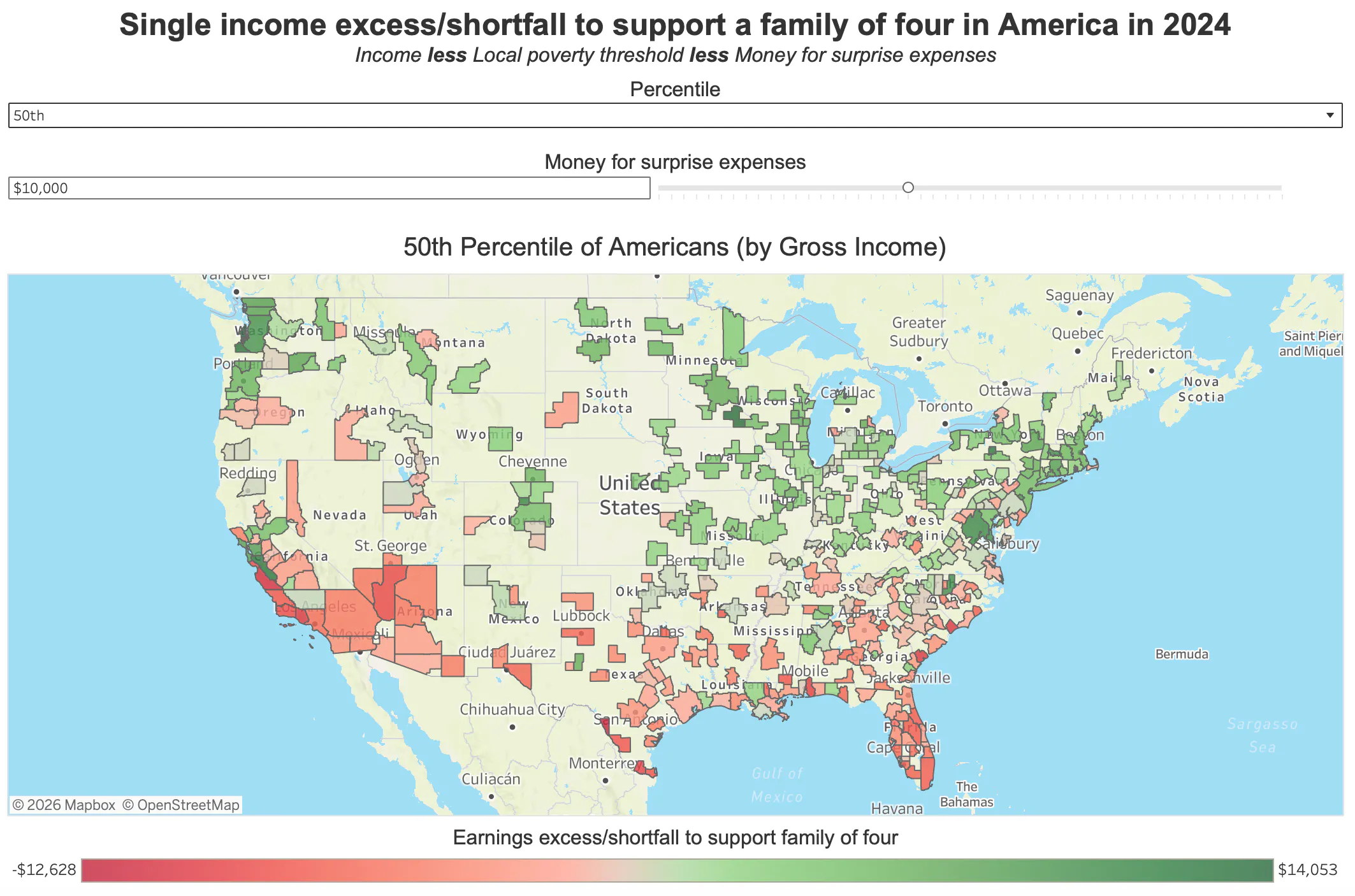
But what if life jumps up and bites you in the rear end? Let’s say, you would ideally like $10,000 in extra income to cover unplanned expenses. Go and change the slider to $10,000 and now look at the map. Half or so of the counties are now red (i.e., below the “adjusted” poverty threshold).
Source: Data 4 The People
Now, what if you really want to take a $5,000 Disney vacation (to, at least for a week, leave the struggle behind) on top of the $10,000 of unplanned expenses? Keep sliding to the right until you reach $15,000. Nearly the entire map is red.
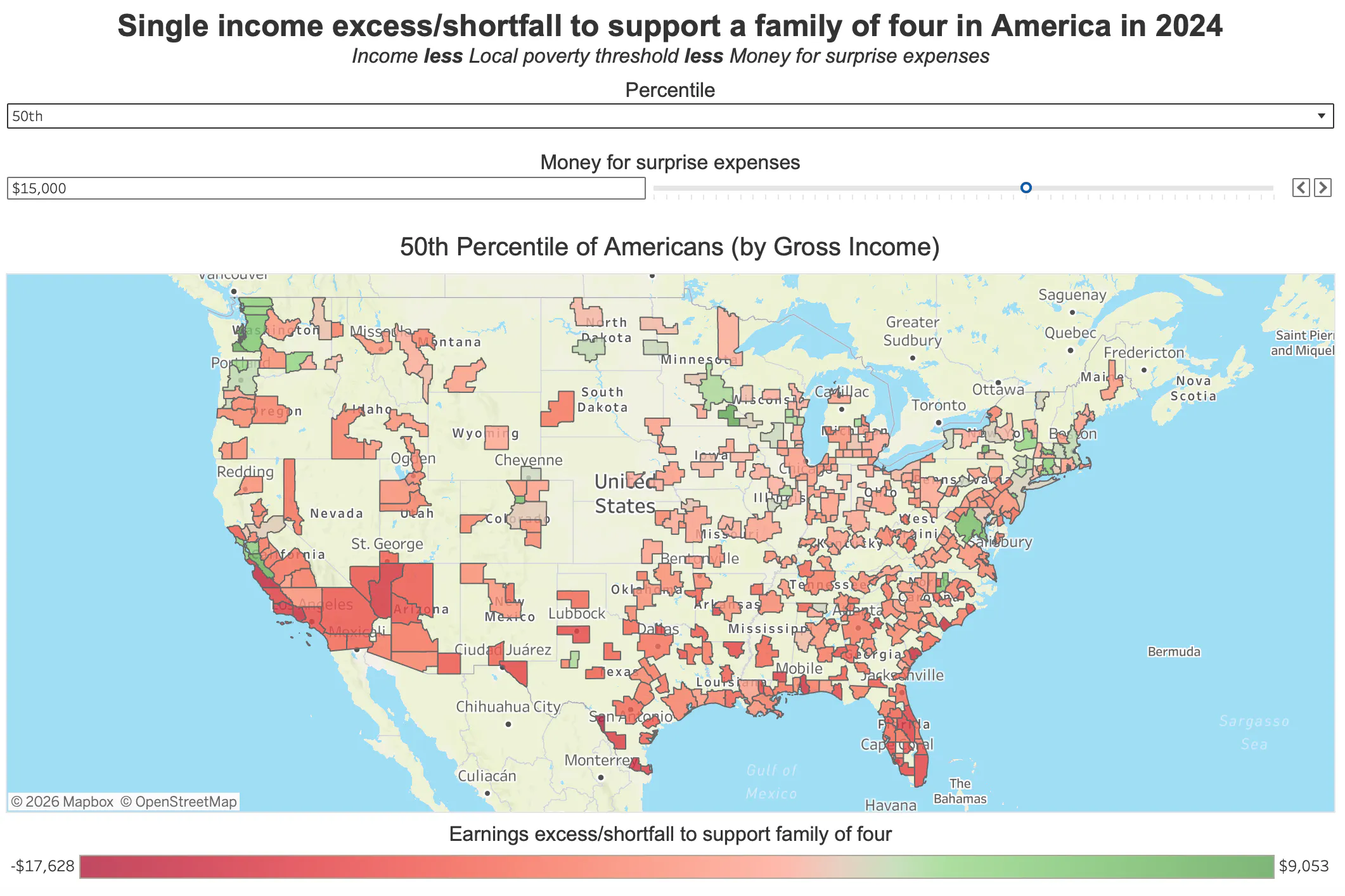
Source: Data 4 The People
Still following?
A mere $15,000 is all that separates the median single-income family of four from poverty across the vast majority of America.
This is not resilience. This is fragility.
From poverty's doorstep to Keeping up with the Joneses
But we are not done with our story.
Following an uplifting montage, you prevail against all odds. With years of hard work and a bit of luck along the way, you make it to the 90th percentile income for Salt Lake City. You now make $126,570 a year. But your family of four still lives in that same two-bedroom apartment. You figure, someone in the top 10% of all earners in your city should be able to buy a nice four-bedroom house in the suburbs. Maybe with a small backyard? A white picket fence? A dog or a cat, or both? The American Dream.
You do some research (as I did) and find that an entry level house that checks your boxes is going to cost $650,000. After paying off all credit card debt, you only have been able to save $25,000 for a house. You talk to a realtor and learn that your monthly all-in mortgage is going to run you around $4,750 a month, or $57,000 a year. You take the plunge, pushing your base expenses (non-fairytale grocery cost + mortgage) to $75,000. You also now need a car (you relied on public transportation before). You’d like to get a cheap used car, but as you look around at the cars in your neighborhood, you worry it is going to be hard to make friends with a $5,000 2006 Mazda 6 sitting in your driveway. So, you opt for a new car, which you are shocked to learn will cost over $1,300 a month when you add insurance, gasoline, registration, and maintenance to your $750+ per month loan payment. That’s $15,600 per year sunk into that new car, bringing your rock bottom base expenses (groceries, mortgage, and car) to $90,600. That leaves you with just over $36,000 of excess income, but those are pre-tax dollars, not post-tax dollars - and now that you are making six figures the gap between your pre-tax and post-tax dollars is getting much wider.
But what about college for your two kids? You’ve sunk all your savings into the house. And you have two kids that are just a few years away from college. You desperately start putting away money for them, maybe $1,000 per month for each child. This will eat up the majority of any excess income you had above your base expenses. But you have done the math. Instate tuition and board is nearly $30,000 a year in Utah, and you make too much to qualify for a Pell Grant. Even if your kids got a part time job to help pay for college, either every spare dollar you make will have to go to schooling or you will be forced to take out a Parent PLUS loan. But what about the vacations? Nice dinners? The American Dream that you have worked so hard to achieve?
Remember, you are the American success story. You are the poster child who lifted yourself up from the 25th percentile wage to the 90th percentile wage through your own grit and determination. Don’t you deserve to treat yourself now that you have “made it,” as your neighbors seem to be doing?
And so you take out the Parent PLUS loan in hopes of giving your kids a chance a better life. But you have adding an amount of debt that you may never pay off. Not with the house, car, and lifestyle you have "earned."
In other words, you have come full circle.
You may not be technically living in poverty anymore. But it feels eerily similar.
The moral of the story
Obviously, this story is fictional. If you have the time to read this, I seriously doubt this is your story.
But, stories don't have to be real to educate. This story tells the real struggles of lots of "you's" living in America, using real data. I have either pulled the data from my data visualization, or I have looked it up on the internet. If anything, I have likely underestimated how difficult it really is to sustain a family of four in my story, as I have failed to quantify the struggle to keep your income as it rises (due to taxes).
But that doesn’t matter. In writing this story, I have, at least for myself, gained an appreciation for what it’s like to work your way up from the bottom in America, which is something I never had to experience. I have taken myself out of my shoes, and created myself a new identity using real data in an attempt to empathize with others.
If this story didn't work for you, I have good news - use my visualization to tell another story. You have hundreds of options. Just choose a location that resonates better with you, and start writing.
This is how we fix things.
We find new stories to replace our old ones.
Using data we can expand our perspective and provide context to our struggles (where I define “our” here as people with means). We can transport ourselves into others' shoes knowing that we are not making up their suffering, but that we are logically constructing it one data point at a time. We don’t just have to “believe.” Using data, we can “experience” the lives of others as one would “experience” flying in a flight simulator. It’s not precisely the real thing, but it’s the best shot we have at truly understanding someone’s life without knowing them.
Maybe it's crazy that data gives me hope.
Maybe it's because I like to give people the benefit of the doubt.
I really do believe there are many great people out there struggling to live the “90% life,” as was illustrated in our story. There are also great people living the “99% life” and even some great ones living the “99.9999% life.”
But everyone suffers in some way no matter their income. As long as they are the protagonist of their own story, I am quite confident they will be stuck in an endless loop of their own suffering.
But it’s possible to break free from this loop and channel our energy into lifting up others. For me, this all started with data. Data opened my eyes to the real world beyond myself.
Data changed the protagonist of my own personal story from “me” to “we.”
I have accepted that I can’t do the same for you. Only you can choose what stories to believe in. But I can offer you data visualizations that can help you learn and experience what life could be like in someone else’s shoes. I sincerely hope you choose to use them for this purpose.
With much gratitude,
~ Eric
Enjoying this post?
Tell others about it.
More articles like this
Fetching Related Posts
There are no other articles tagged with Research